Catch Brouwerij West at Juicy Brews Art Gallery in Chicago, IL on July 20.
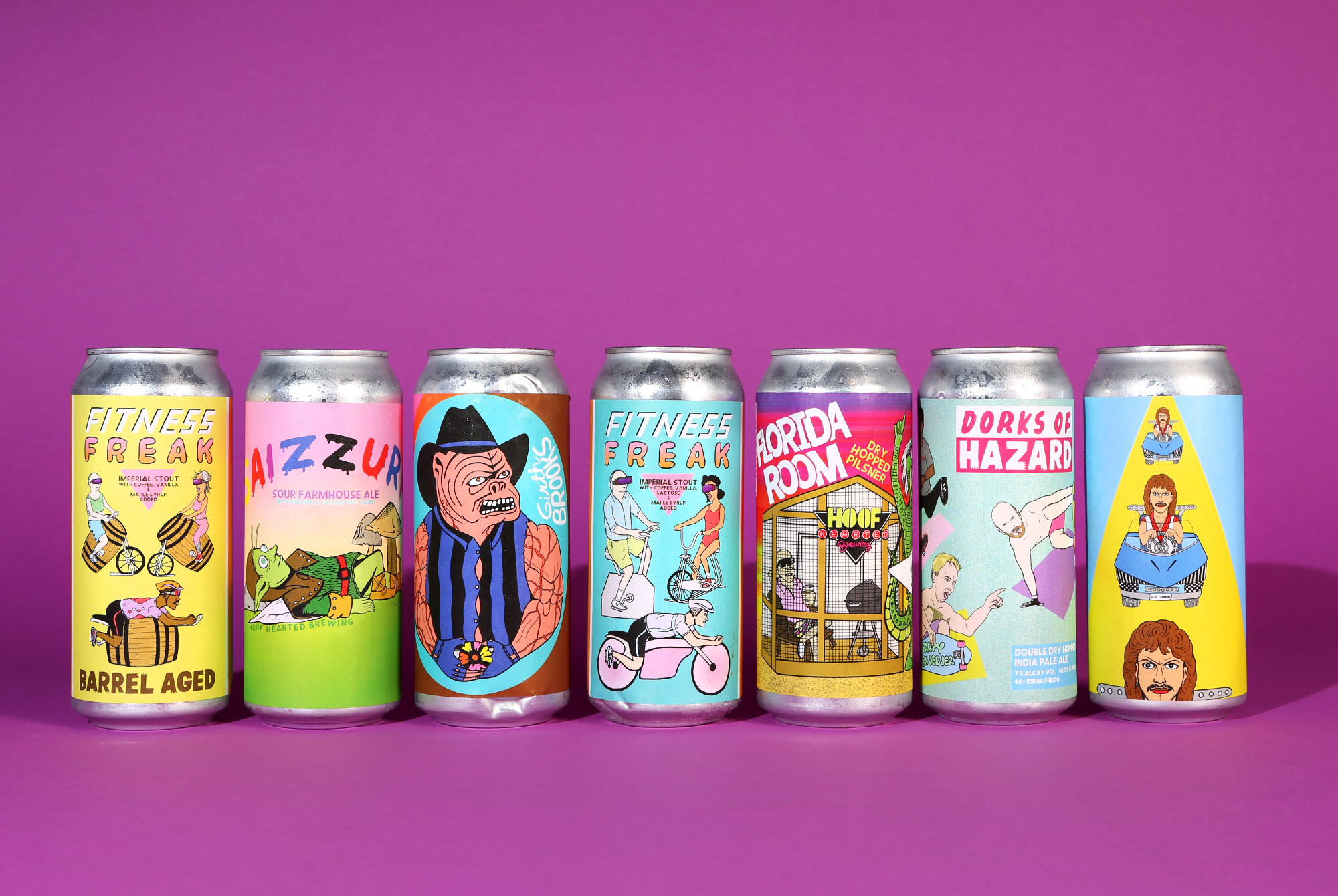
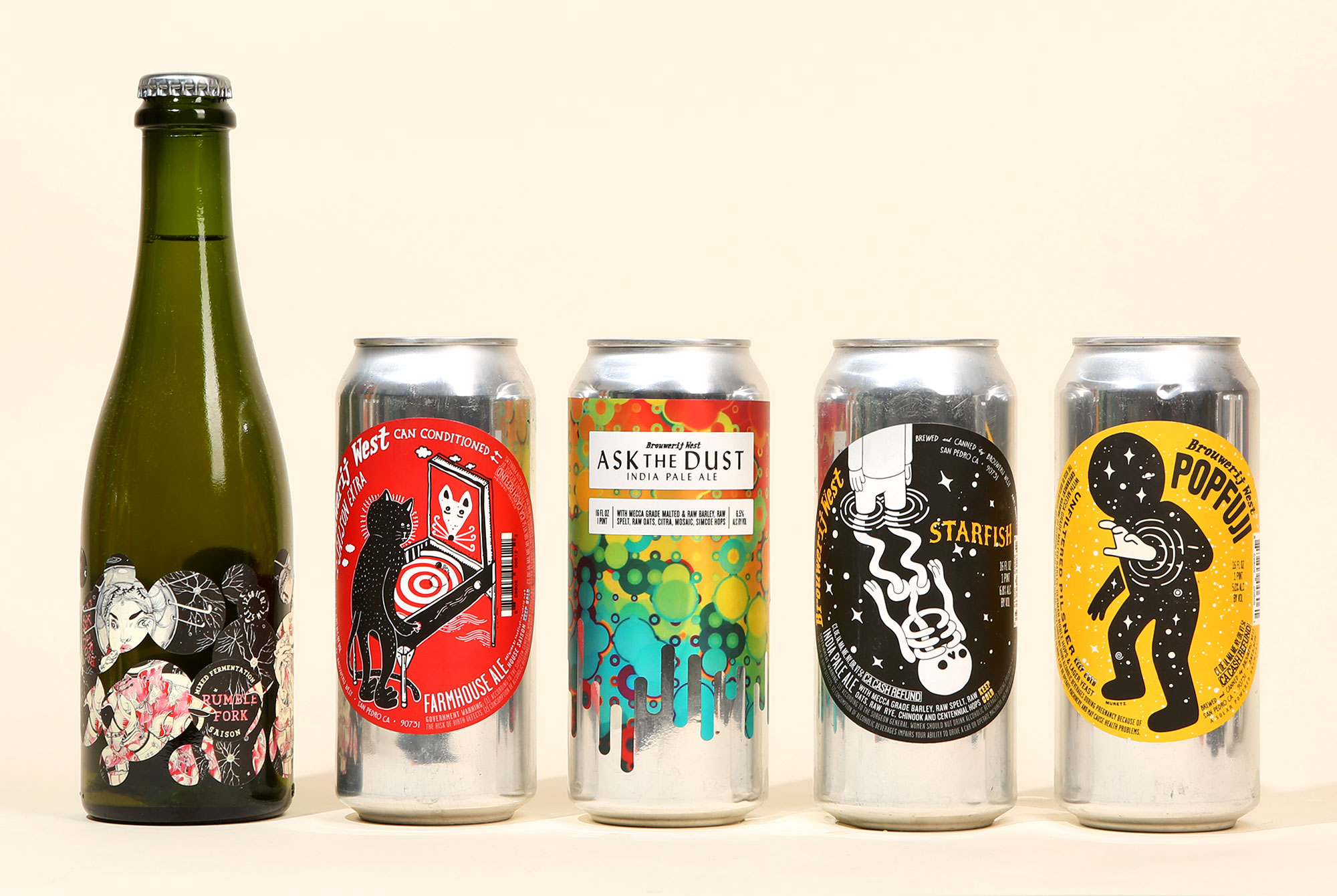
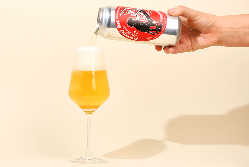
Brouwerij West might have the most eye-catching beer labels in the industry. Not only is the artwork itself stunning, but the San Pedro-based brewery employs a special system that applies two layers of stickers to the can or bottle, creating mosaic-like masterpieces.
“It’s been a ton of work and stress to develop,” brewer Brian Mercer shares about the process. “But it’s very exciting because the possibilities are endless.”
With past releases, the brewery has included hidden easter eggs beneath the labels and has even made a design that folks can peel off and reuse as stickers.
“Our labels are designed to be a secondary canvas in which we build a three-dimensional sculpture out of existing art from artists we partner with,” Mercer explains. “We start by creating relationships with artists, describing our process and hopefully forming a partnership in which we can showcase their talents. At the end of the day, I’m a huge fan of art and love the artists we have worked with.”
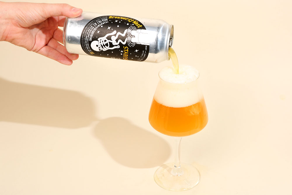
The iconic packaging has certainly helped make a name for the brewery, but Mercer’s beer is just as exceptional as the art he sources. Brouwerij West’s IPA’s are consistently balanced and expressive and Popfuji remains one of our favorite easy-drinking pilsners. Mercer, much like an artist, launched the brewery as a nomadic project, experimenting with new recipes and tinkering away at his creations before deciding to establish a full-fledged business. It was in those early days that Mercer started reaching out to artists. Instead of acting as art director and giving artists instructions, he’d find artists whose work he enjoyed and use existing creations on his beer.
“I try not to interfere too much with the artists/designers and how they should approach the project,” Mercer says. “I think the label is stronger when there is a disconnect between the art and the beer info or name.”
As a result, Mercer has built a brewery that is as much revered for its artwork as its beer. While other breweries might employ one specific artist or designer, Mercer wants to involve as many creatives in the brewery as he can.
“We love the idea of opening a fridge full of Brouwerij West beers and having it feel like you’ve stepped into an art exhibit.”
We decided to reach out to a few of the artists that have designed Brouwerij West’s cans ahead of Juicy Brews Art Gallery, a beer festival on July 20 in Chicago, Illinois, celebrating the art community in craft beer. Catch Brouwerij West at the Art Gallery, pouring beer and sharing beautiful artwork.
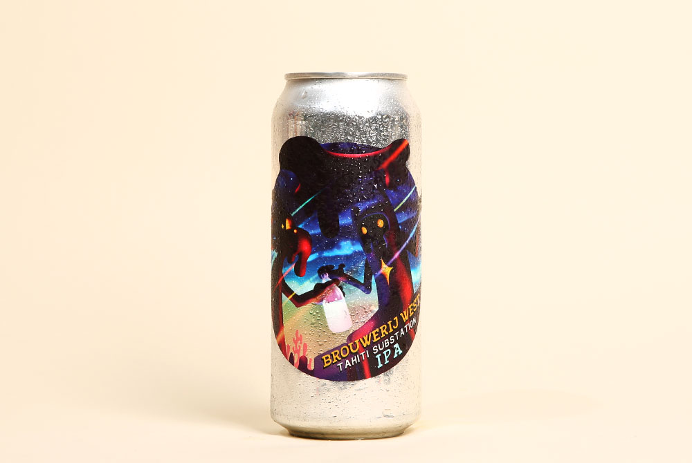
Tahiti Substation
Designed by Aaron Campbell
John Paradiso: How did Brouwerij West find you?
Aaron Campbell: Through my Behance page. They found my Droplets Pt. 4 project where the label artwork for Tahiti Substation is from.
JP: What’s the story behind the artwork?
AC: It’s a depiction of an alternate universe I’m slowly creating as an art series where most of the landscapes and characters are made up of flowing, drippy shapes, with a few hints of real life, such as cars, video games, pop culture, beer, etc. In this scene I imagined these two alien guys just having a conversation in some far away galaxy, where they somehow acquired a 40 oz bottle and a classic car; I’m not sure how their conversation is going but their body language may give some clues.
JP: What’s your favorite beer?
AC: Red Racer Pilsner.
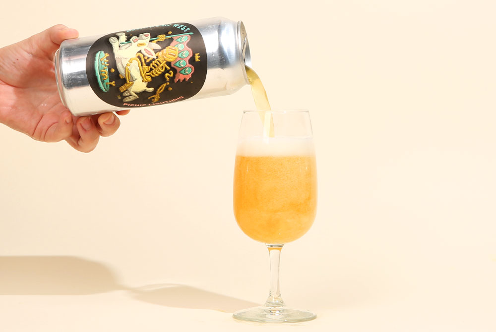
Picnic Lightning
Designed by Dennis Schuster
John Paradiso: How did Brouwerij West start working with you?
Dennis Schuster: In 2017 I went to LA to paint some murals with my buddy Nychos–maybe that’s where they first saw my work and why they contacted me. I’m not sure. Either way, Brouwerij West found me via my Instagram account and reached out.
JP: Is there a story behind the artwork?
DS: The artwork is inspired by the phrase, “Follow the white rabbit” from the Matrix. I’m working a lot with my friends from Rabbiteye Movement, an agency and artist management company from Vienna and San Francisco, and the piece is inspired by their skull rabbit logo. That’s why you see a skeleton riding a rabbit.
JP: What’s your favorite beer?
DS: I’m German, but my favorite beers are definitely from the Czech Republic or Poland. Classic Pilsener is my favorite, and Budweiser (the Czech one) or Tyskie (Poland) are good ones.
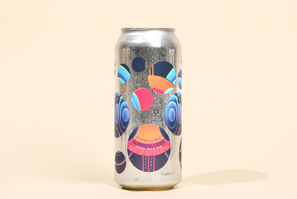
Supercollider
Designed by: Matt Mills
John Paradiso: How did you start working with Brouwerij West?
Matt Mills: So, Brian Mercer from the brewery just sent me an email one day saying that he loved my artwork and wanted to know if he could use it for one of their cans. I don’t know for sure how he found me, but I’m assuming he just stumbled upon my Instagram feed and hit me up from there. Being a beer fan, it wasn’t a hard decision for me to make. And since then, we’ve used my artwork on a couple of the brewery’s other releases.
JP: What’s the story behind the artwork?
MM: I do a lot of work with musicians and record labels to create album artwork. This piece, titled Eargasm, was actually a concept piece I created while working on ideas for a project. It’s supposed to visually represent the emotion of hearing a new song that you immediately fall in love with. Though, the abstractness of my artwork often lends itself to a multitude of different interpretations and applications. I ended up going a different direction for that project and posted this one on Instagram. I guess Brian saw it and thought it would be a good pair for the Supercollider.
JP: What’s your favorite beer?
MM: I’d probably say the Live Oak Primus. When I moved to Austin in 2002, Live Oak was one of the first local breweries I discovered. I had been a fan of their beers for a long time before my first Primus tasting. It was just different than anything I’d ever had before and I’ve been in love with this Weizenbock ever since. I look forward to its release every year. Side note, the Supercollider is pretty damn good too. I’ve got a few stashed in my fridge for special occasions.
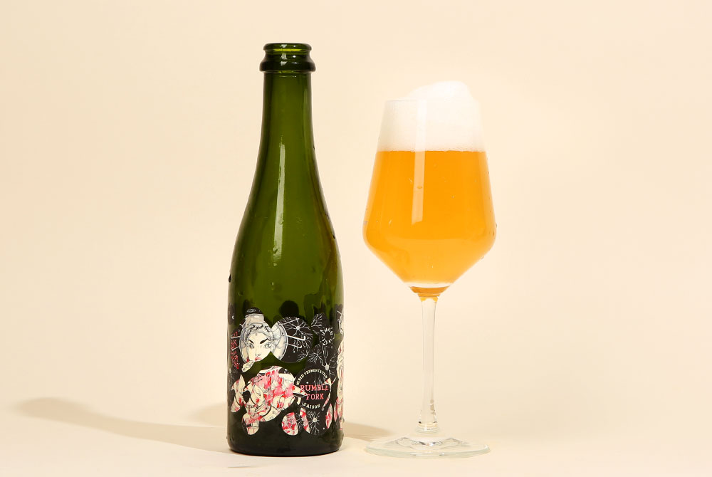
Rumble Fork
Designed by: Lauren YS
John Paradiso: How did Brouwerij West find you?
Lauren YS: I’m not sure how they found me — maybe sonic brain waves?
JP: What’s the story behind the artwork?
LYS: The piece is a Taikonaut, a Chinese Astronaut. I wanted to combine space travel with Chinese fashion because of my interest in Chinese culture and astrophysics.
JP: What’s your favorite beer?
LYS: Rumble Fork of course!
Saison Extra
Designed by Jacob Rolfe
John Paradiso: How did you start working with Brouwerij West?
Jacob Rolfe: In 2012 I was living in Toronto when I was contacted by Brian, who was a ‘traveling brewer’ at the time. I had never heard of such a thing, and couldn’t pronounce the name of his business, but he seemed like a nice guy. He also liked my art which he had seen somewhere and was offering US dollars to design a beer label. US dollars are like gold up here in Canada.
JP: What’s the story behind the artwork?
JR: To me, the cat playing pinball represents our subconscious desires and behaviors. Like a cat’s involuntary fixation on a moving ball, we humans are also constantly reacting. It can be useful to become aware of this process–including when reaching for a beer.
JP: What’s your favorite beer?
JR: Marijuana, hands down (Laughs). I do on occasion enjoy a few drinky-poos, and usually opt for Picaroons Best Bitter when I do. I can get it down the road, it has lots of flavor, and doesn’t cost too much. Beer is taxed like nuts here in Nova Scotia; it’s brutal.
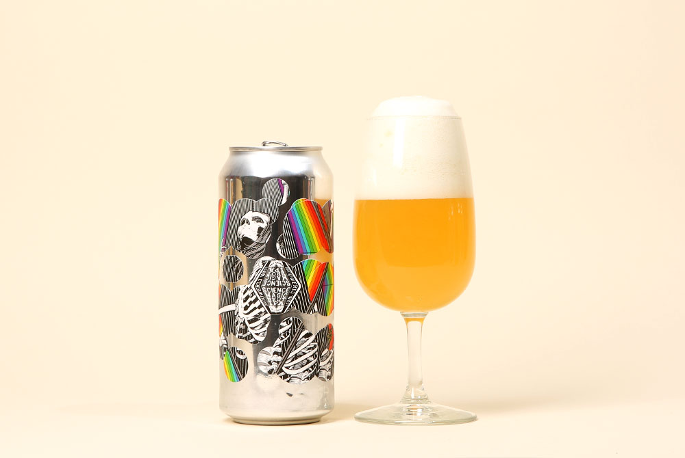
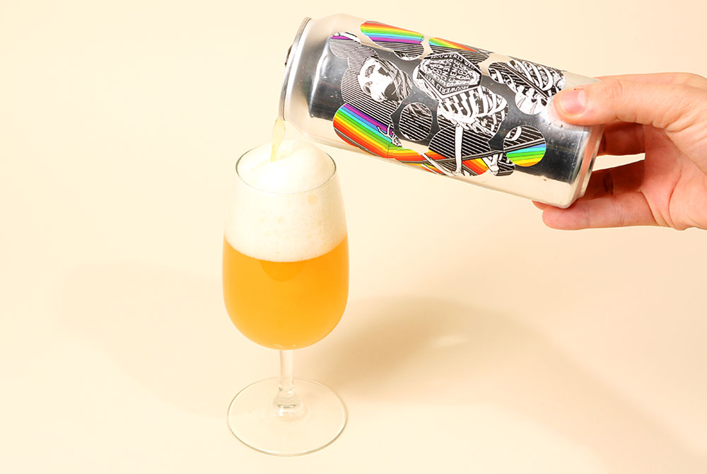
Science Magic
Designed by Ryan Begley
John Paradiso: How did Brouwerij West find you?
Ryan Begley: Brian at Brouwerij West reached out to me because they found my work on Instagram. For all the potential havoc social media presents, it’s also a revolutionary utility for artists to get their work out. I’ve had my work stolen and used without my permission before and I’ve also gained a lot of clients and customers through it. Brian was really awesome to work with. Paid up front and was generous and professional, as well as low key and easy to cooperate with. I can’t say enough good things about my experience with Brouwerji West.
JP: What’s the story behind the artwork?
RB: The artwork is a pen and ink illustration I made a few years ago. I grew up in the ’80s and got really into skateboarding and punk and metal as a kid. The influence of the artists in those subcultures is still with me now and my bastardization of it is pretty evident in my work. Artists like Vernon Courtlandt Johnson, Jim Phillips, and Brian “Pushead” Schroeder are the giants of that era and countless artists and illustrators are standing on their shoulders. Myself included. I loved all the Ed Roth and Ed Newton stuff as a kid too. Frank Frazetta, Derek Riggs who did the Iron Maiden album covers, Bernie Wrightson, and a hundred others I can’t think of at the moment.
It’s all considered low brow but I was drawn in by that artwork and it changed my life. There’s nothing low about it for me. It was all very transcendent and still is. I think part of that spirit is what I was trying to get across in the skeleton and prism illustration.
JP: What’s your favorite beer?
RB: You know, I’m a 39-year-old Straight Edge guy. I don’t drink alcohol or do drugs of any kind but I have no judgments on anyone who chooses to. All the beer in my house is my wife’s! I’m a huge believer in small business and that’s why I chose to work with Brouwerij West.
From my experience, they treat the artists who design their can art very well. And I’ve had plenty of bad experiences with businesses who don’t respect the artists who create their products’ visual identity. So I guess I’d have to say my favorite beer is the one that helped support me and my family which is Science Magic. Best beer experience I’ve ever had.
Catch Brouwerij West at Juicy Brews Art Gallery in Chicago, IL on July 20.
Liked this article? Sign up for our newsletter to get the best craft beer writing on the web delivered straight to your inbox.