Shop
5 Questions with the Artists Behind Foam’s Gorgeous Can Art
It's a work of art.
Photography by J. Travis Smith
Catch Foam Brewers at Juicy Brews Summer Craft Beer Invitational in Richmond, VA on June 10.
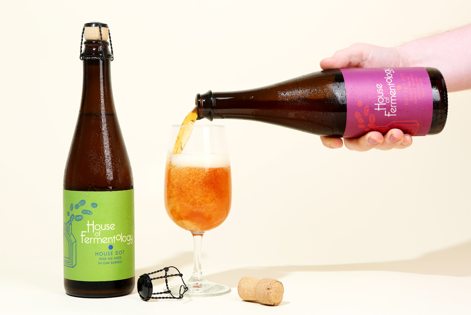
We’ve been impressed with Foam’s world-class beers for a while now. The Burlington-based brewery has been consistently producing balanced, juicy IPAs, thirst-quenching pilsners, and funky farmhouse ales since opening. And soon they’ll be adding House of Fermentology to the Foam brand, bringing an impressive lineup of stellar wild ales to the normal rotation.
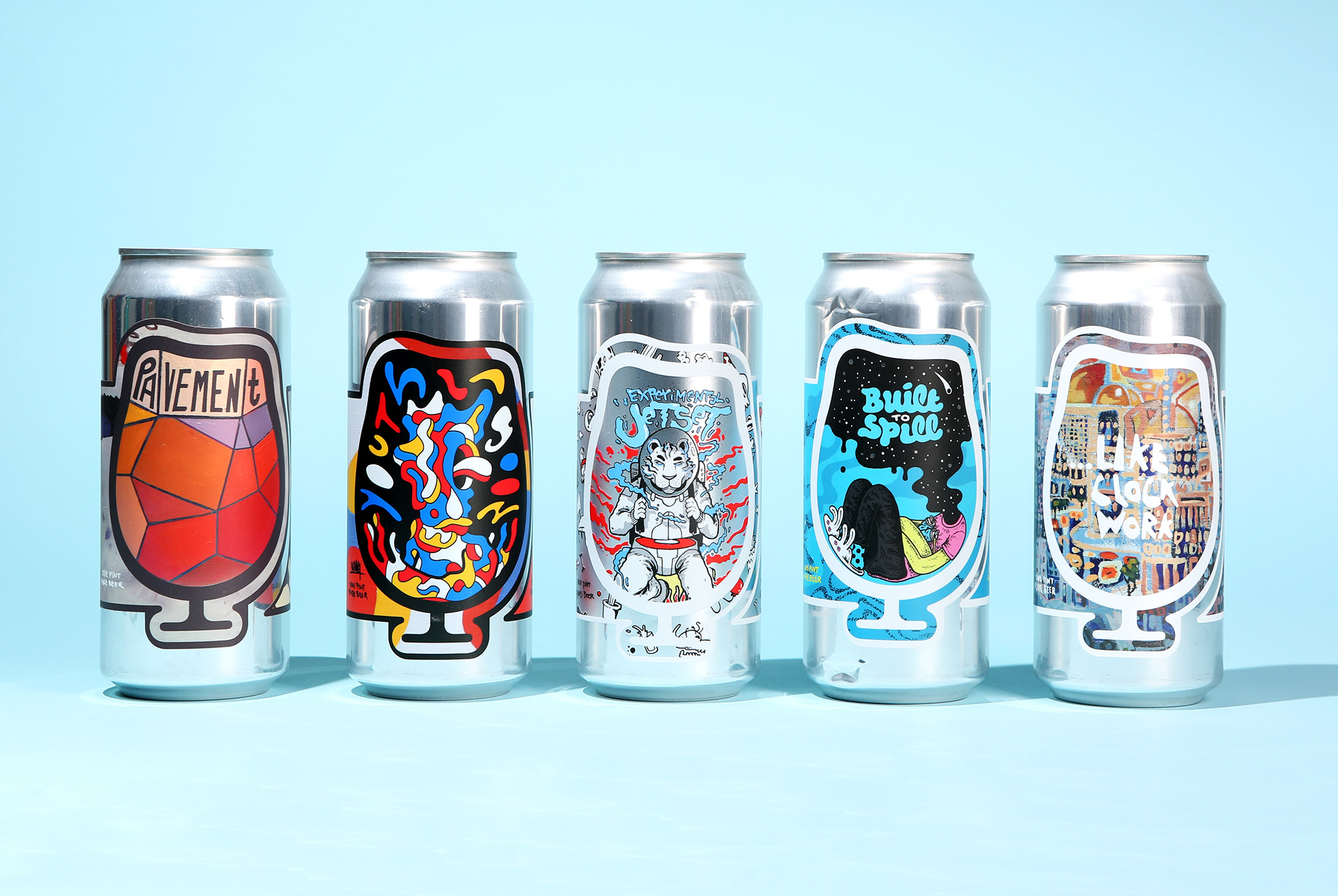
One of the many things that drew us into Foam was their gorgeous can artwork. Jon Farmer, one of the co-founders, works directly with the artists for each can. Instead of having one artist on staff to design every can, Farmer finds different designers to work on individual cans. “Since the beginning, we thought of ourselves as a collective group creating something greater than just one person or the sum of all the individual parts,” Farmer shared. “That idea spreads beyond the beer we make. While it is certainly more work than hiring a single designer or artist for all of our labels, I think it speaks to who we are and what kind of awesome community exists here in Vermont. Each beer is able to have its own unique identity and thoughtful design.”
It doesn’t hurt that well-designed beer labels tend to be part of a consumer’s buying decision. “I like to think that our beer and the art can each stand alone and speak for themselves,” Farmer continued. “However, we live in a time where Instagram and Untappd greatly influence beer trends and I’ll be the first to admit that it helps to have art that stands out in an Instagram post. It increases exposure and improves perception, thus driving more people to the brewery.”
I reached out to a few of the artists who have designed Foam’s beer cans to learn a little bit more about how a beautiful piece of art ends up on an aluminum canvas.
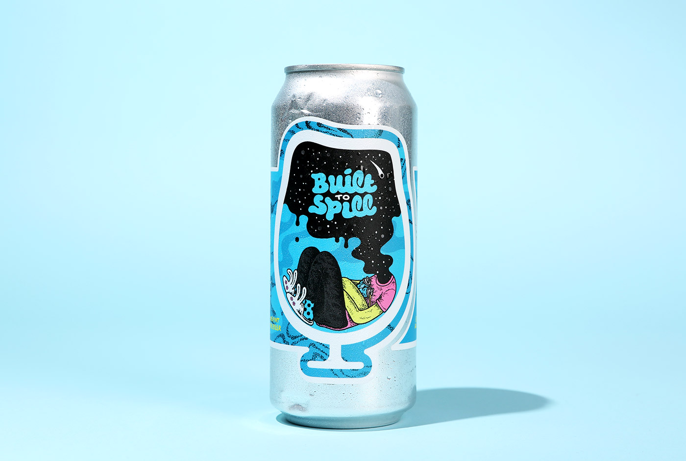
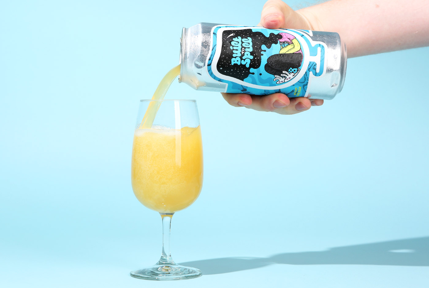
Built to Spill
Designed by Jackson Tupper
Why did you want to work with Foam?
Jackson Tupper: Burlington has such a strong community, so having the opportunity to establish relationships with other local artists, craftsmen, and entrepreneurs that I support is really worthwhile to me. I love what Foam is doing — from their beer to their promotion of the local music and art culture here in Burlington.
JP: What direction did they give you?
JT: Built To Spill is named after the band Built To Spill which is a shared influence between the founders at Foam. They gave me a good balance of creative freedom and solid direction that the artwork should tie to their music in some way.
JP: How did you come up with the finished design?
JT: My artwork draws inspiration from Built To Spill’s songwriting and touches on recurring themes within my own body of work. Hidden within the artwork are clues that tie directly to the lyrics of their song Big Dipper.
JP: Beer buying is becoming increasingly more visual. In a lot of cases, consumers purchase beer based on how cool the label art is. Do you have any thoughts on this?
JT: I think in most cases everything has become more visual. Between social media and advertising, art and visual information have a stronger influence on people than ever before. Everybody wants to purchase things that are personalized to them or that they can identify with, and brands specifically target consumers in this way. In terms of beer, taste is generally the priority. But without the ability to sample beers in person, the can design still empowers the consumer to make a choice based on their own personal preference or style.
JP: What’s your favorite beer?
JT: Fiddlehead IPA and Peak Organic Fresh Cut Pilsner.
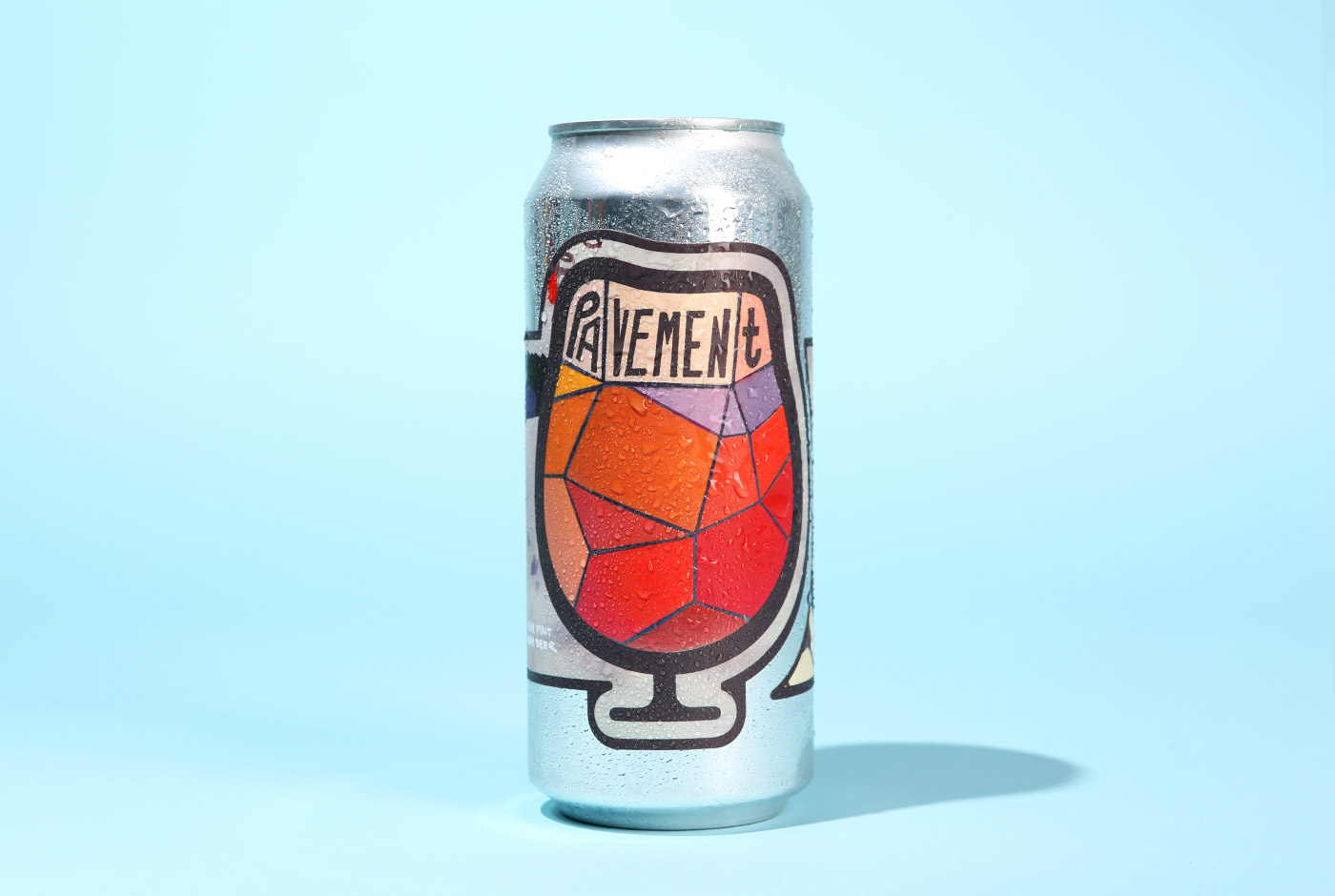
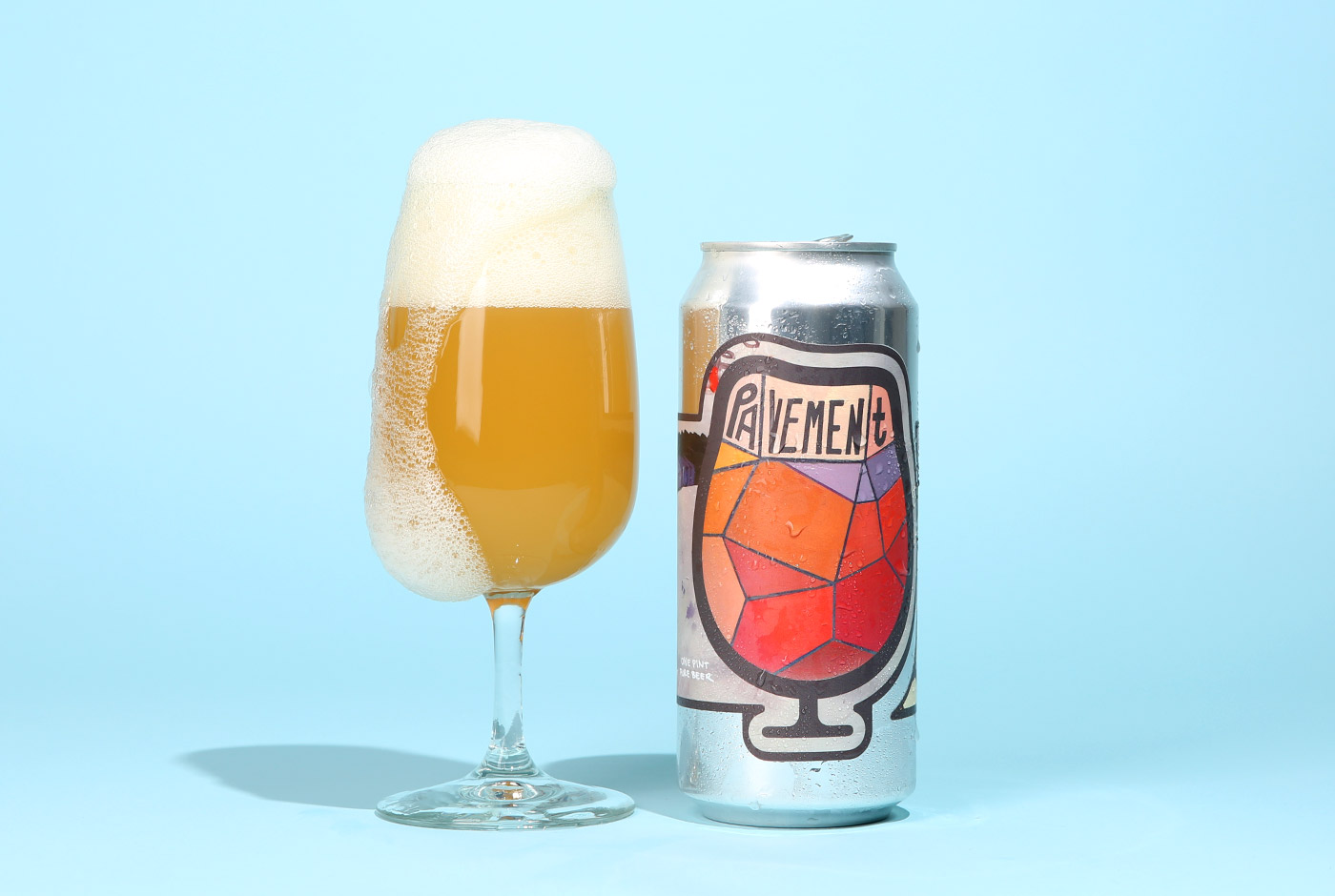
Pavement
Designed by Mary Lacy
John Paradiso: Why did you want to work with Foam?
Mary Lacy: I usually do murals. I had been on a mural tour for 9 months prior to doing the can. It was really challenging and I stayed sober almost the whole time. It was a lot of fun trying out a new canvas, after being so focused on murals–and doing so at home–all while drinking some yummy beer.
JP: What direction did they give you?
ML: The beer I designed the can for is called Pavement, named after the band. They wanted me to get inspiration from the Pavement album art. The keys that wrap around the can references the album Slanted and Enchanted.
JP: How did you come up with the finished design?
ML: I began by designing it on the computer. I am very self-taught in Illustrator and usually only use it for mural plans. While we liked the concepts I was coming up with, the final product wasn’t working for either of us on the computer. Then I decided to just paint what I had designed on the computer and that’s when it clicked.
JP: Beer buying is becoming increasingly more visual. In a lot of cases, consumers purchase beer based on how cool the label art is. Do you have any thoughts on this?
ML: I understand the risks in this. But I also appreciate how much breweries are supporting artists these days.
JP: What’s your favorite beer?
ML: Margaritas.
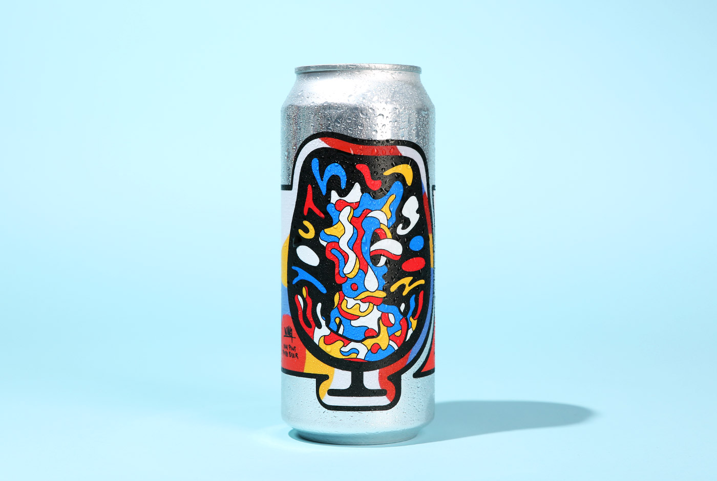
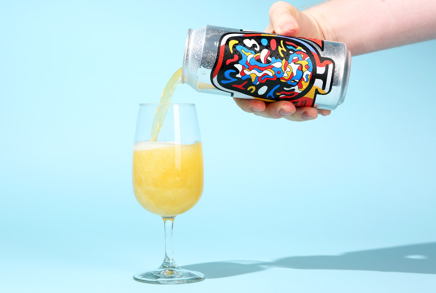
Youth Lagoon
Designed by: Will Gebhard
John Paradiso: Why did you want to work with Foam?
Will Gebhard: They make a damn good beer. It’s always a pleasure working with driven people who are passionate about what they do.
JP: What direction did they give you?
WG: Youth Lagoon (the beer) was named for Youth Lagoon (the band). Jon Farmer showed me their album “The Year of Hibernation” and told me to run with it.
JP: How did you come up with the finished design?
WG: Intensive research (drinking Foam beers and listening to “The Year of Hibernation” on repeat for about a week). I found a weightlessness in the music and kept that in mind while working on the can.
JP: Beer buying is becoming increasingly more visual. In a lot of cases, consumers purchase beer based on how cool the label art is. Do you have any thoughts on this?
WG: It makes sense. Beer and art go hand in hand. Working with Foam was unique in that they do not sell cans outside of the brewery so the label did not need to square off against others on a shelf.
JP: What’s your favorite beer?
WG: Living in Burlington I’m pretty spoiled when it comes to good beer. That said, Narraganset does the trick.
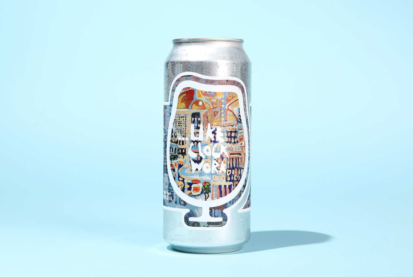
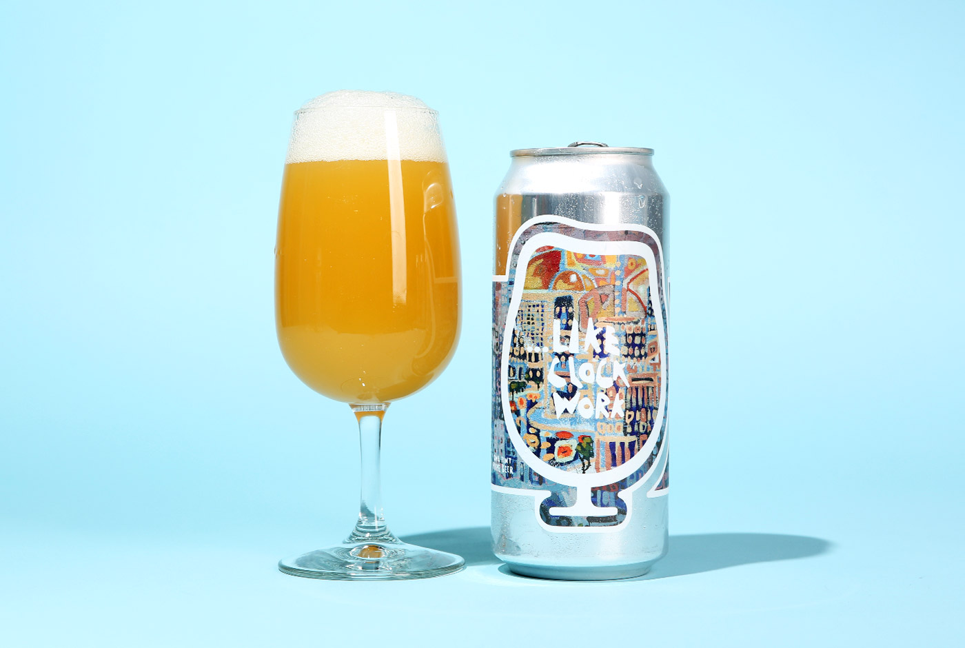
…Like Clockwork
Designed by Charlie Hudson
John Paradiso: Why did you want to work with Foam?
Charlie Hudson: The Foam team actually reached out to me a couple years back. They had been sitting in a local restaurant and saw a series of my drawings hanging up in there. We first met when they were still renovating their brewery and we got along immediately. I love beer and so when I heard about the background of Foam and everyone’s history in the industry, I was super excited to work with them.
JP: What direction did they give you?
CH: My first job for Foam was painting the huge, 75 ft mural that is in the back of their brewery. As far as direction went, I proposed a couple ideas that I had sketched out in my notebook, and we ended up going with one of a city fading into abstraction. Once the idea was started, they gave me all the freedom I wanted to move around with it while painting.
I talked with Todd and the other guys a lot about the similarities of brewing and painting. I’m the kind of painter that likes to just initially make moves and then step back and add more and more layers as necessary. Once I’ve started a painting, it’s just about following my own formula, my artistic process. I spent about a month going back to the wall and painting, balancing out colors and composition as needed and adding more and more intricate little details. Then, once my eye moved through the whole mural and couldn’t find anything to change or any section that stuck out as wrong, I knew it was done.
JP: How did you come up with the finished design?
CH: I stood out looking at the mural with Todd and mentioned to him how the sun that I had painted in it looked like clockwork to me. We both liked the name and that’s what the mural was titled. Not too long after that, Foam had created a beer inspired by the mural, …Like Clockwork. It’s appropriate because, to me, when the artistic process (and also the brewing process I assume) is going well, it feels “like clockwork.” Every move made flows perfectly to the next, like gears in a clock.
For the can design, it was just about working off of a bunch of photo combinations, finding a way to fit a 75 ft mural onto an 8 inch, obscure shape. I thought the section around the sun was crucial to have highlighted in the label–since the name comes from it–and also the bright oranges that I used to reflect the beers own color. After that choice was made, I used some of the deeper blues and purple sections to create the wrap-around. It’s all tied together with my handwritten font, which I drew and vectorized myself to match the kind of purposefully wonky shapes inside the artwork.
JP: Beer buying is becoming increasingly more visual. In a lot of cases, consumers purchase beer based on how cool the label art is. Do you have any thoughts on this?
CH: I, of course, think that buying beer should first and foremost be about the product you’re drinking. A good label with good artwork won’t make the beer taste any better. However, a good label with good artwork will always add to the experience of drinking that beer. The experience of drinking …Like Clockwork from the can is so cool to me. The beer itself was inspired by and created to match with the artwork. Having that can in your hand as you drink the beer, you just get to think like, “Wow, so this is what those guys were looking at and thinking off while creating this taste.”
JP: What’s your favorite beer?
CH: As far as my favorite beer goes, I’d have to say …Like Clockwork. But really anything that Foam makes. I’m also super into the sour beers that House of Fermentology makes.
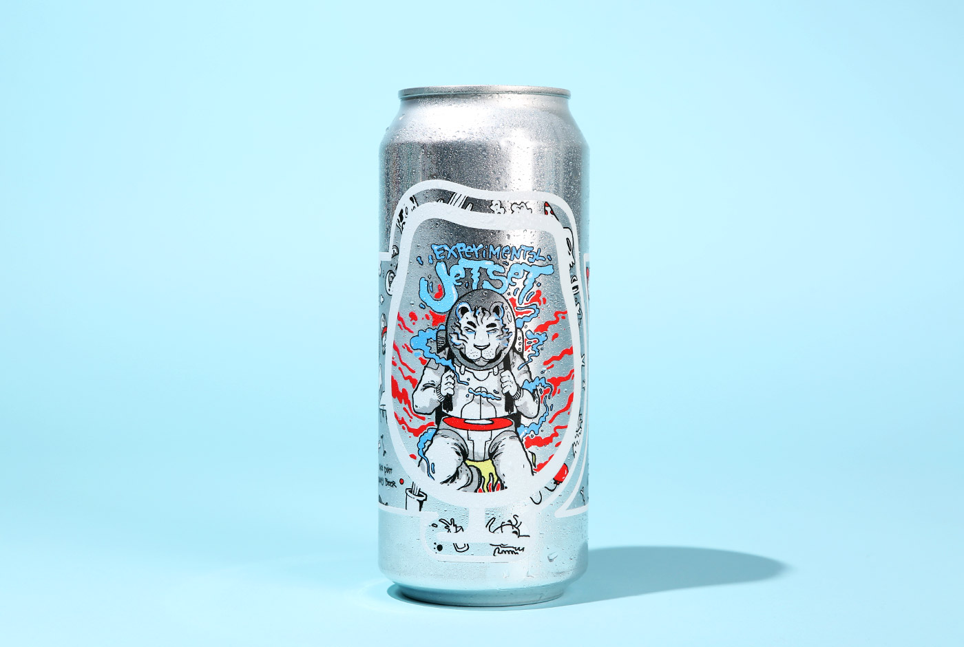
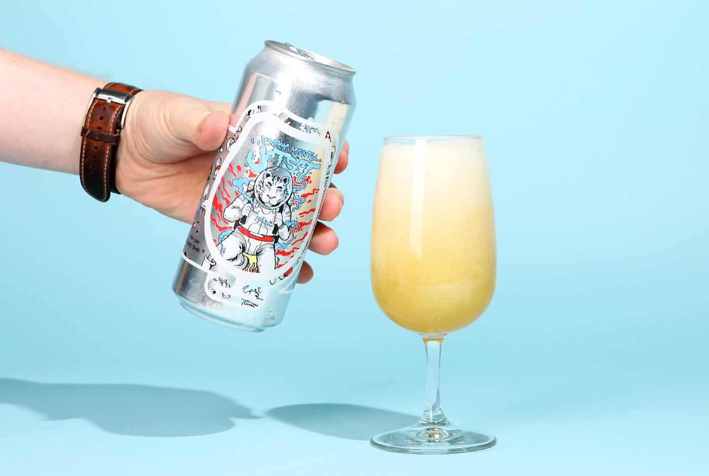
Experimental Jet Set
Designed by Max Hodgson
John Paradiso: Why did you want to work with Foam?
Max Hodgson: I wanted to work with Foam because I really admired the way those guys were running their business and the fact that the beer is amazing didn’t hurt either.
JP: What direction did they give you?
MH: They gave me some ideas and inspiration to run with. I created a few different designs and we just went with the space tiger, it was all very natural and enjoyable.
JP: How did you come up with the finished design?
MH: The guys had made note of some similar previous work I’d done in regards to the tiger and I thought it would look pretty awesome as well so we went for it. The wrap around design of the different objects is something I’ve done a fair amount and we thought the two in conjunction would do the trick. I’m very happy with how it turned out.
JP: Beer buying is becoming increasingly more visual. In a lot of cases, consumers purchase beer based on how cool the label art is. Do you have any thoughts on this?
MH: I think it’s awesome to be able to showcase art in general and craft another layer of meaning or story around the beer. I think good beer will always speak for itself and if the design is very attractive I think it just adds to it.
JP: What’s your favorite beer?
MH: I have a lot of beer I’m pretty fond of, honestly the fellas at Foam do an amazing job and I’m not just saying that. I’m also a fan of Switchback and plenty of other Vermont breweries. Shiner Bock and Red Stripe do the trick as well.
Catch Foam Brewers at Juicy Brews Summer Craft Beer Invitational in Richmond, VA on June 10.
About The Author
John A. Paradiso
Currently Drinking:
Saison Dupont
John A. Paradiso is the former managing editor at Hop Culture Magazine and current managing editor at Cool Material. His interests include listening to the tunes of King Gizzard and the Lizard Wizzard and watching Wes Anderson films. His Wednesdays are spent picking up comics at the local comic book shop and his weekends are spent watching Premier League soccer. He's probably down to get a beer later.