


This content was originally published by The Hop Review, a digital magazine that joined the Hop Culture family in March 2020.
This piece was written by Jack Muldowney.
SAN FRANCISCO, CA
If you’ve ever been to San Francisco, there is a good chance you are familiar with the historic Presidio, part of the National Park Service. This area spanning the bay and leading up to the Golden Gate is not only some of the most scenic park space in the country, but has a storied military history as well. It’s within one of these former Army buildings that you can find the new Fort Point Beer Company.
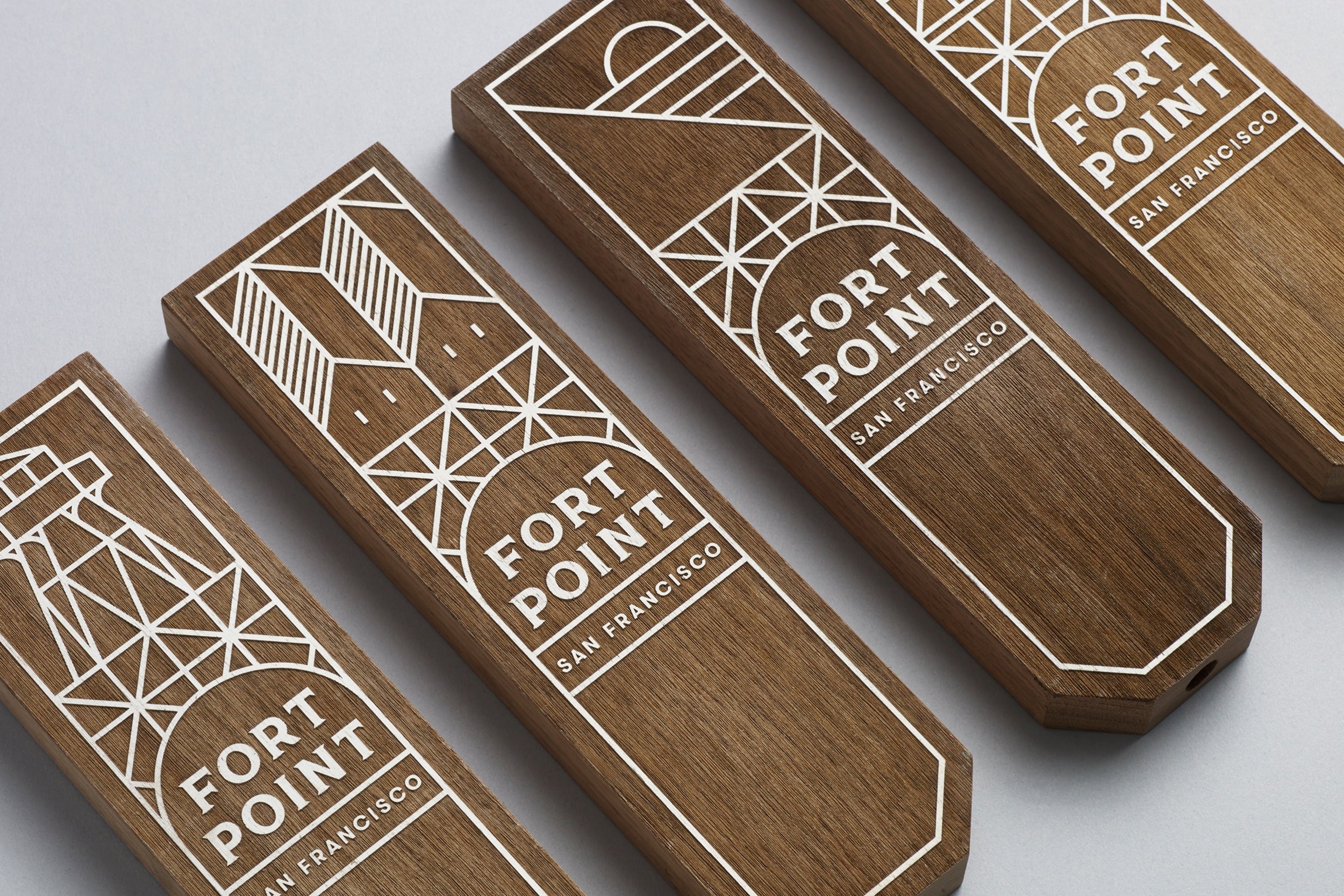
Pulling inspiration from the nearby bridge arches and Bay architecture, Manual Creative (SF) has nailed the San Francisco aesthetic and mood. Doing so with possibly the best use of the ever-trendy bulky linework illustration. The way these arched labels work alongside each other, and on the eurostyle bottles, is spot on. The color scheme is beautiful. They work flawlessly as a system. And the style carries over to the tap handles and business cards seamlessly. You’d be comfortable sharing this bottle in Dolores Park or table side at one of the city’s top restaurants.
This is my favorite departure for a beer brand I have seen in a while. And it’s perfectly San Franciscan. Cheers, Manual.


“Their mission is to create balanced, thoughtful beers that reference traditional styles, but are by no means bound to them.”
![]()
Images from Manual Creative’s website.