


This content was originally published by The Hop Review, a digital magazine that joined the Hop Culture family in March 2020.
This piece was written by Jack Muldowney.
JACKSONVILLE, FL
I personally don’t often equate ‘Florida’ with ‘craft beer,’ per se. Consider it my Midwest ignorance, but even if I tried hard enough I could probably only think of Cigar City if I were put on the spot. So, it was refreshing to to realize that this branding effort for Bold City Brewery (that I know I’d seen somewhere before…) hails from the Sunshine State.
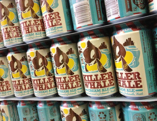
As if the Mad Manatee wasn’t a dead giveaway, this packaging definitely comes across as ‘Florida’ beer. Design juggernaut Kendrick Kidd gets credit for this bright and fun 2- and 3-color design. Already having done bottle designs for the brewery, he followed that up with some really great, hearty can illustrations, in his distinct style. As well as t-shirt, 12-pack case, 6-pack carrier, and tap handle designs…did I miss anything else?


“The goal was to stay true to the existing brand and labels, but develop a system that more tightly unified all of the packaging across the board (as well as other branded efforts). Based on inspiration from the brewery’s warehouse floor, and the owner’s bust-ass work ethic, I chose a slanted stripe similar to ones found on loading docks to help define the family of the pieces… the small adjustment felt like a natural fit for the earnest, Jacksonville brand. ”


Images from Kendrick Kidd / kendrickkidd.com