


This content was originally published by The Hop Review, a digital magazine that joined the Hop Culture family in March 2020.
This piece was written by Jack Muldowney.
SAN DIEGO, CA
Beer & Branding: White Labs Yeast
In the world of craft beer, the shelves are becoming increasingly crowded with graphic-novel-esque illustrations, beers meant to portray as wines and any other number of flashy visual approaches. On the other side of the coin exists the far less glamorous portion of craft brewing; in the form hop pellet packets, generic bags of grain and yeast culture test tubes. Today, we’re taking a look at that latter, seemingly non-sexy stuff.
With all of the attention that goes into (many, not all) beer brands and packaging, it’s exciting to see that the makers of these brewing ingredients are starting to take a look at the value of a refined branding effort. As is the case with White Labs, “the industry leader in the creation of liquid yeast for brewers, distillers and winemakers worldwide.” The identity refresh was created in conjunction with ‘a new breakthrough manufacturing technology, packaging system, and brand repositioning,’ as told by the creative force behind the change, MiresBall Brand Design.

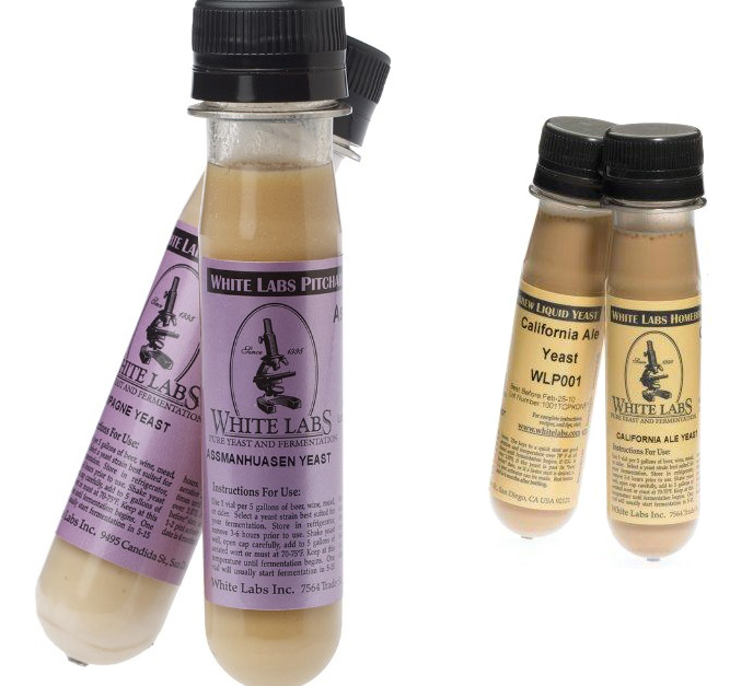

“The identity signals White Labs’ commitment to science, education and craft, and its goal to continually raise the bar in the art of fermentation.”


The new look is the perfect marriage of smart stripped down type and color, and witty graphic references (see that beer bottle as the microscope lens? Clever.) This is a welcome change for an otherwise bland scientific-feeling identity. The logo alone was begging for a change. I mean, that engraved type look? 1995 can keep that. And the use of color with the new packaging is really a beautiful touch, using an unexpected palette. The only thing amiss here: why the need for a carabiner?… But really, you can’t ask for much better for a yeast brand. Hats off, White Labs and MiresBall.