This content was originally published by The Hop Review, a digital magazine that joined the Hop Culture family in March 2020.
This piece was written by Jack Muldowney.
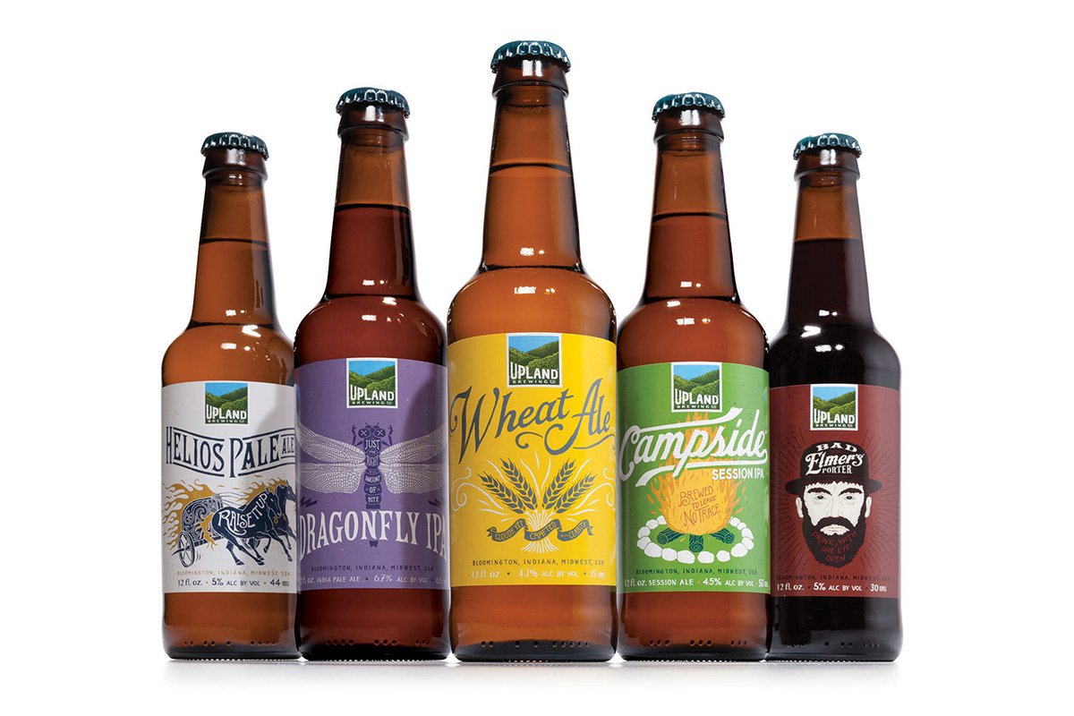
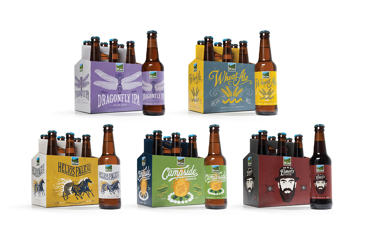
Earlier this week, popular Midwest-based Upland Brewing Company unveiled a completely refreshed look to their previously tired branding. Gone are the days of the washed out, gradated Bloomington sky peering over those rolling hills. Also nixed is that scrappy looking font combo. And I’m sure I speak for many fans of the brewery when I say “Cheers to that!”

Never heard of Upland Brewing Company, you say? Well, that likely means you are not from Indiana, haven’t yet read our interview with Upland brewer Patrick Lynch or, it means you are not in yet in one of their growing markets (they did just get to the Chicago shelves in September). Either way, it’s safe to assume you will be hearing and seeing more of them soon enough. Upland has grown their fan base with staples such as such as Upland Wheat Ale and Dragonfly IPA. The brewery name is reference to the unexpected foothills that can be found in and around it’s southern Indiana home. It’s also worth noting that Upland has succeeded at “embodying the progressive spirit of Bloomington, the college town it calls home. Living sustainably, supporting local musicians and artist, locally sourcing ingredients—all of these are vital parts of Upland DNA.”
Consistently considered one of the state’s top breweries, it became increasingly clear that this Indiana brewer’s packaging and identity needed to evolve.
“Nothing brings out the psychological disorders in a brewery like a good ol fashioned fight around branding a new beer — We finally decided to bring some order to that chaos.”
And help came by way of Indianapolis-based design firm Young & Laramore. The brand also got help from a couple other well-known illustrators; The hand-crafted nature of the beer is reflected in the extensive use of hand-lettered type and illustrations, whether in the distinctive hills logo (illustrated by Colorado artist The Bungaloo), or in the packaging and related materials (done by France’s BMD Design). And thanks to these folks, we’ve got more pleasant looking cases of beer on the shelves.