This content was originally published by The Hop Review, a digital magazine that joined the Hop Culture family in March 2020.
This piece was written by Jack Muldowney.
NORTH CORNWALL, ENGLAND
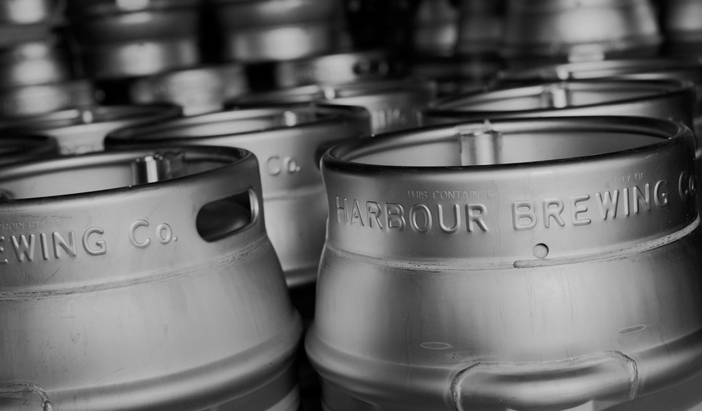
Harbour Brewing Company is a small craft operation out of North Cornwall, England that was founded in 2012. It’s branding, created by Cornwall-based A-Side Studio, is a nod to traditional nautical style, mixed with modern typography and accents. The utilization of photography on the brewery’s website (taken by photographer James Darling) ties it all together, allowing for visual nods to the namesake, and setting the mood for the classic-meets-modern identity system.
“Harbour is a craft brewery based on the north coast of Cornwall. Launched in February 2012, it now exports as far as Australia. Closer to home, Harbour can be found in the finest bars, deli’s and offlicenses across the UK.”
The large slab-serif “H” is really the defining element of the brand. Intentionally, it is the most recognizable element of the brand and really shines in the application of the tap handle badges. The nautical map frame motif and rolling wave lines are nice touches that add to the the consistency as well. Contrarily, I am a bit thrown off by the compass star motif as a brand element. It’s stock-icon-feel and contrast to the rest of the graphics cheapen the brand slightly. And although type center-overlaid on photography has been a bit trendy, the photography remains the strong. All in all, this identity definitely has that classic British pub feel to it, with a modern application. This brand would definitely find it’s home in a seaside watering hole, where ESBs and IPAs are poured by the masses.
Design and images by A-Side Studio. Photography by James Darling.
TYPOGRAPHY: 6/10
LABEL SYSTEM: 8/10
COLORS: 7/10
CONSISTENCY: 9/10


