This content was originally published by The Hop Review, a digital magazine that joined the Hop Culture family in March 2020.
This piece was written by Jack Muldowney.
LIMBURG, NETHERLANDS
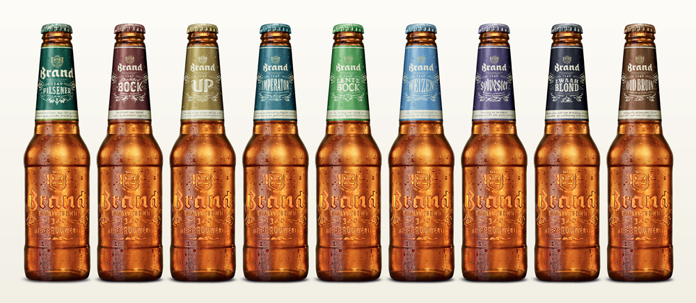
Beer from the Netherlands might get ya thinking about Heineken, Amstel or Grolsch. But there’s another brand that would be nice to see on the shelves, if anything just for aesthetic purposes. Fittingly, that brand of beer is…Brand Bier. A brewery in operation since 1340, this offering from the land of the Dutch has taken a bold stance against design monotony, by pairing down their packaging to ‘label-less’ bottles. Sure, technically there are labels. But ticked up under the crown on the bottle’s neck. The rest of the bottle is void of substrate. Just classic, crisp-lettered embossed glass. Not groundbreaking (see: Carlsberg), but still worth noting – and respect, when you consider trying to break a nearly-700-year-old brewery’s habit of stale branding. Amsterdam-based firm VBAT tackled this Brand rebrand:

These are the kind of rebrands that restore my faith in the power of design – especially amongst the macros, the “big guys.” In a time when the internet and store shelves seem to be going the way of the overly-nostalgic (with the hand lettering, textured illustrations and uber-hipster aesthetic), it’s nice to see a timeless approach applied to a product for the masses. No, I’ve never heard of Brand before this, but it gets me interested in the brand, no doubt. Plus, it reminds me plenty of one of my other favorite “big brand” rebrands: Seagrams. Now, these are some sharp brands I’d be willing to stock my fridge with…
Images from brand.nl


