


This content was originally published by The Hop Review, a digital magazine that joined the Hop Culture family in March 2020.
This piece was written by Jack Muldowney.
NAPERVILLE, IL
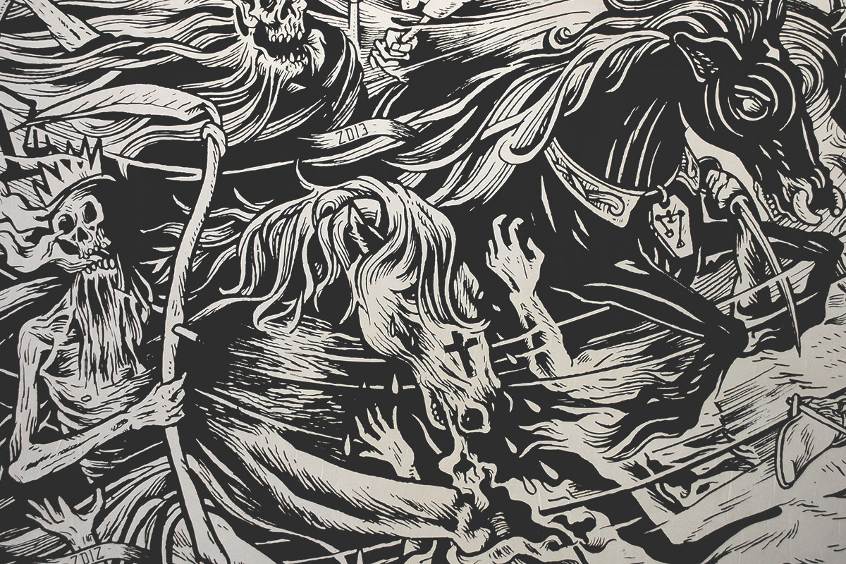
You could argue that there are few breweries outside of the city’s limits brewing beer as consistent and as delicious as Solemn Oath. And to pair with their never-miss-a-beat brews is an equally as strong visual identity. In my opinion, SOB might be one of Chicago’s most well thought out and impressive brands – from logo, to taproom, to illustration and murals, to packaging and swag. It’s all just that good. That’s in no small part due to artist-in-residence, Jourdon Gullett. As acting Creative Director, he has been able to implement his distinctive (mostly) black and white illustration across several brand touch points. It’s the type of style I’d imagine to be found at a Nordic version of a Day of the Dead celebration; if Scandinavia did that sort of thing.
We asked Jourdon for his approach behind the aesthetic and the SOB brand: “In the beginning, the development of Solemn Oath’s visual identity was very open ended – make it fun, make it dark, or don’t. No matter what, do what you do. That was the amount of direction I began with from John Barley, the owner of the brewery. Having that creative freedom is huge as an artist. Skateboarding was an important patch of common ground between John and myself and has been a major influence in a lot of my work for the brewery. I would also note artists like Frank Frazetta and Jose Guadalupe Posada. Over the last few years working together, we’ve developed hundreds of illustrations, some more involved than others. “The weirder, the better” is a common phrase we keep coming back to, one that I think wraps it all up pretty well.”


Images provided by Jourdon Gullett, Solemn Oath Brewery.
For more images of the brand and brewery, check out our previous interview with SOB Founder, John Barley, here.
