


This content was originally published by The Hop Review, a digital magazine that joined the Hop Culture family in March 2020.
This piece was written by Jack Muldowney.
SAN FRANCISCO, CA
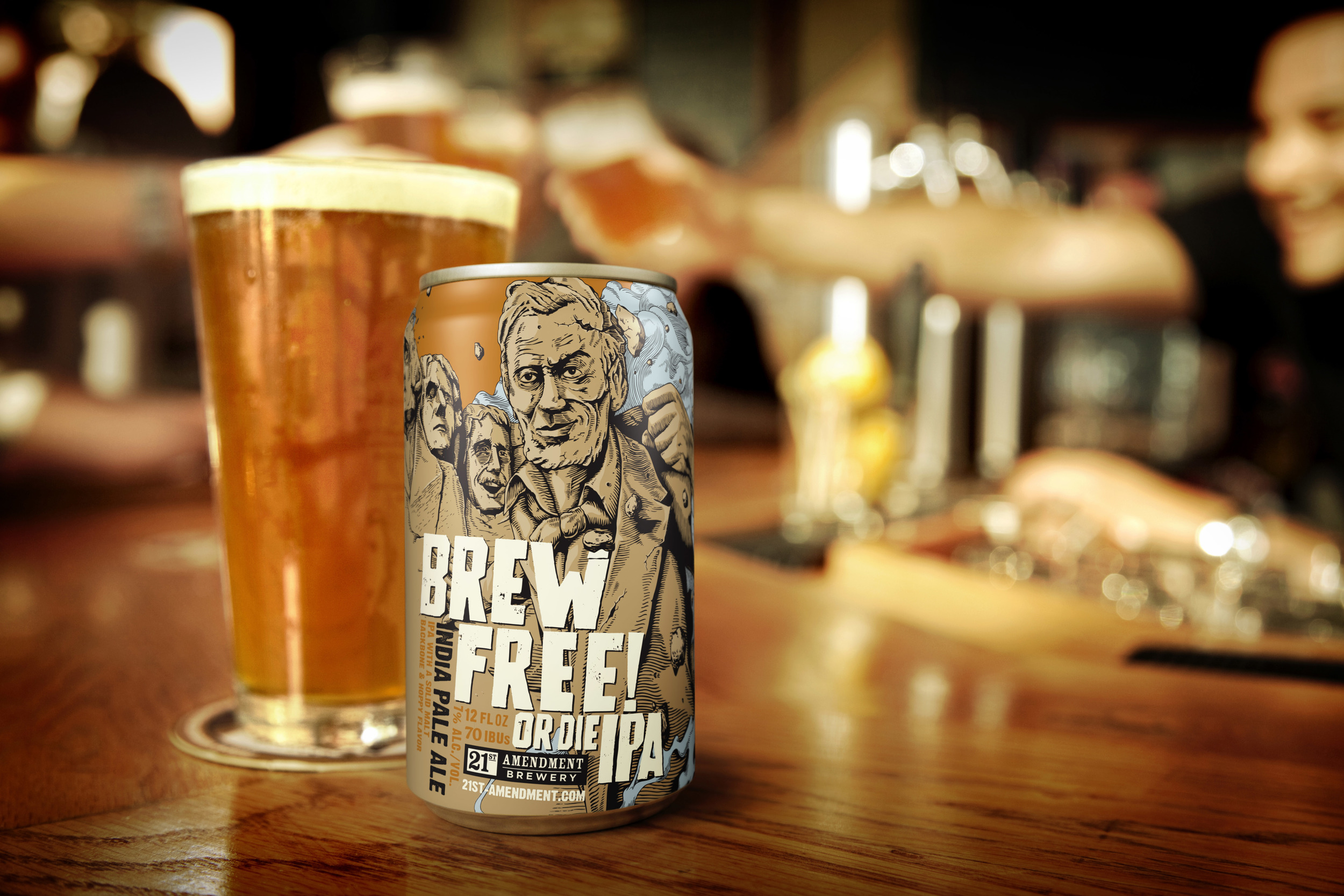
San Francisco is home to some of the best design in the country. So it should come as no surprise that the city also houses one of the better looking beer brands on the West Coast. This brewery, 21st Amendment, has built their brand around cans that tell a story, through strong illustration. And, of course, plenty of patriotic reference – it’s no wonder one of their biggest selling markets is D.C. And with their expansion into the Chicago market (and our recent talk with co-founder, Nico Freccia), we thought we’d take a deeper look at their packaging and identity.
Portland-based branding agency, TBD, gets the nod for 21st’s look and feel, and execution – while lead illustrator credits go to the talented London-based Joe Wilson. In reference to packaging, co-founder Shaun O’Sullivan was quoted in saying: “[Cans] are interesting for marketing and telling the story as the can is 360 degrees of space unlike doing a beer label on a bottle. That, coupled with the box the cans come in, and we really have a great canvas to get our story across…and of course, cans are cool.”
Having been canning beer since 2008 – well ahead of the can revolution – 21st Amendment has compiled plenty of good looking aluminum over the years:


“Both Nico Freccia, my business partner, and I are very involved with the design process and next to creating new beers, this is my favorite thing about making beer.”


“In the end no matter how hard the process might be, we are always happy with what we produce; they are unique in their direction, but distinctly 21st Amendment.”

Photography courtesy of 21A & TBD
Be sure to check out our Interview with co-founder, Nico Freccia as well, for an in-depth look at their expansion and what it means to 21A to join the Chicago market.