This content was originally published by The Hop Review, a digital magazine that joined the Hop Culture family in March 2020.
This piece was written by Jack Muldowney.
NORTHCENTER, CHICAGO
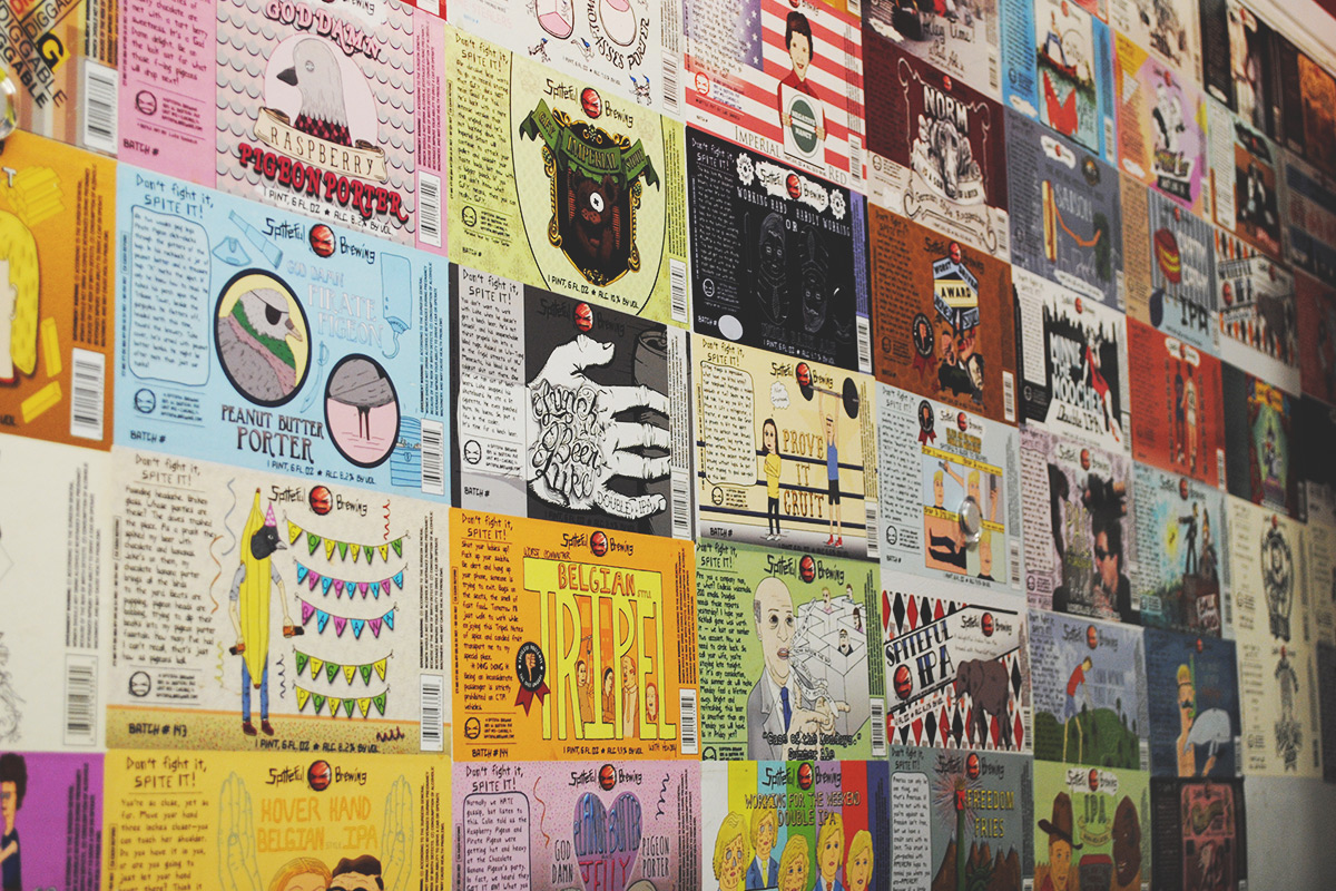
Spiteful Brewing is a Chicago entity you’ve most certainly seen all around town by this point, despite maybe not knowing where in town they actually are located. Tucked in the basement of a nondescript Northcenter-meets-Ravenswood building, they are producing arguably some of the city’s best beer. But just as impressive as their stellar brews, are their efficiency (managed on a 3.5 BBL system) and branding (see below). That is in no small part to one fifth of their crew, in-house creative team…Luke Snobeck. We asked Luke to give us his perspective on the Spiteful brand and what the design approach means exactly:
“Spiteful’s branding comes from within. The brand is who we are and reflects our culture. We start by naming our beers. The design follows suite. I prefer to hand draw my images and finalize the color and layout in the computer, as opposed to creating them entirely with computer programs. That allows me to keep the artwork less refined and somewhat crude compared to a polished graphic design look, which fits our attitude as a company. We stay away from the corporate look, not that there’s anything wrong with that, it’s just not us. I also incorporate humor into a lot of our labels. Adding humor creates another layer for the consumer to read into, it becomes more than a one note beer name and label. A storyline starts to form, which sometimes is obvious and sometimes more ambiguous.”
Well said, Luke. We’re happy to share this insight, and a handful of Spiteful’s distinctly quirky tongue-in-cheek label artwork.
“I incorporate humor into a lot of our labels. Adding humor creates another layer for the consumer to read into, it becomes more than a one note beer name and label. A storyline starts to form, which sometimes is obvious and sometimes more ambiguous.”
“Spiteful’s branding comes from within. The brand is who we are and reflects our culture.”
Product photography and label artwork provided by Luke Snobeck of Spiteful Brewing. Logo design by Chris Murphy. Some photos by The Hop Review. For a further insight on Spiteful and their brewery, read our interview with Business Guy #2, Calvin Frederickson, here.


