


This content was originally published by The Hop Review, a digital magazine that joined the Hop Culture family in March 2020.
This piece was written by Jack Muldowney.
ST. LOUIS, MO
After 140+ years in business, Budweiser has rolled out a new look. And it’s an impressive attention to detail, and all-around clean refinement. We take a look at the refresh, through the eyes of the designers who took on the task, firm Jones Knowles Ritchie:
People gravitate towards brands that have a unique story to tell, and few have as rich a history as Budweiser. Since 1876, the brand has represented uncompromising quality and relentless ambition, reflected through the craft and care that goes into brewing every beer. Our task was to capture this spirit through design.
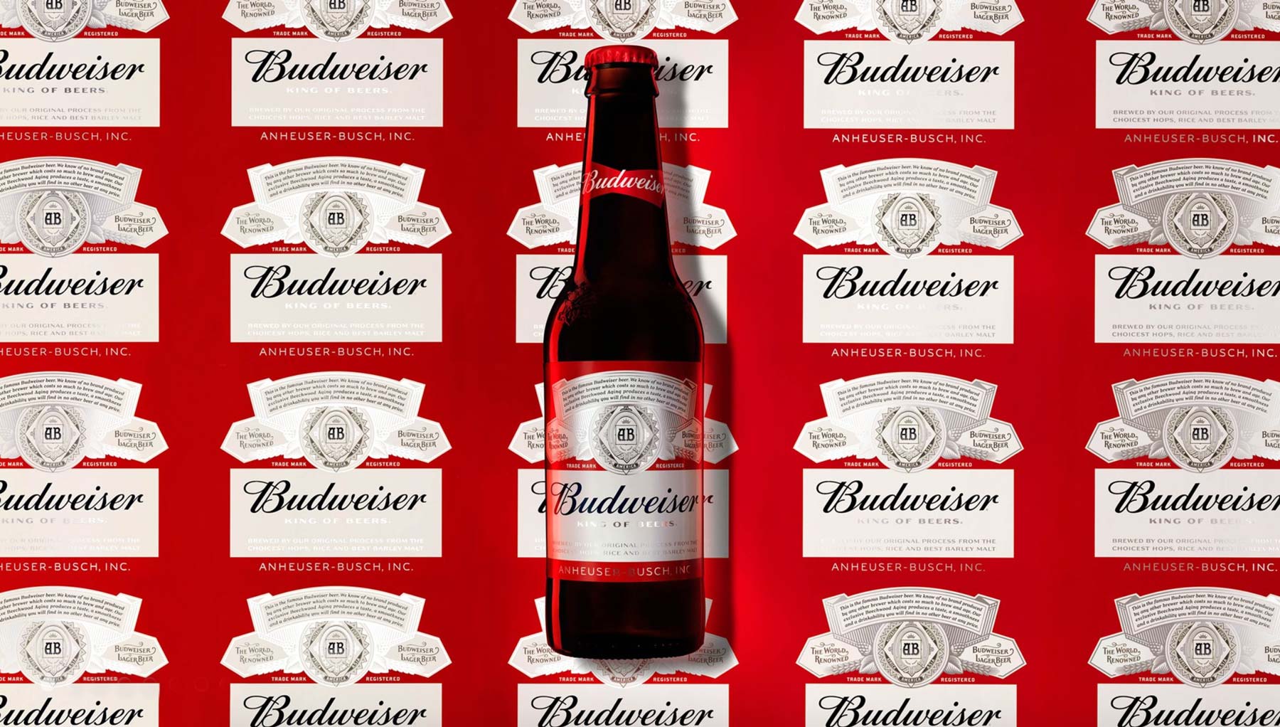
True craftsmanship, inside and out
Recognising that it was time to align the brand identity with the beer itself, Budweiser partnered with our NYC team to refresh their packaging and visual identity. Starting with an exploration of the brand’s history, we uncovered the depth of Budweiser’s rich iconography. We then sweated the details, working alongside the world’s best to craft each element by hand.
It’s all in the detail
From there, we created two bespoke typefaces to communicate the brand’s principles and a simplified bow tie icon to deliver a more contemporary identity for today’s audience.
First brewed in 1876, Budweiser is one of the best-selling beers in the United States and probably one of the most recognized beers here and abroad. Budweiser is the flagship brand of Anheuser-Busch, that reportedly holds a 48.3 percent share of U.S. beer sales to retailers. (If this intro sounds familiar, since you remember every single paragraph I write, it’s recycled from this 2011 post, the last time Budweiser made a significant design change.) Set to be fully implemented by end of February, Budweiser began rolling out a new look in September, designed by Jones Knowles Ritchie (jkr), the same firm that designed the last version and the recently reviewed Bud Light. Typographic details by Toronto-based Ian Brignell.


Images from Jones Knowles Ritchie.