


This content was originally published by The Hop Review, a digital magazine that joined the Hop Culture family in March 2020.
This piece was written by Jack Muldowney.
TOLEDO, SPAIN
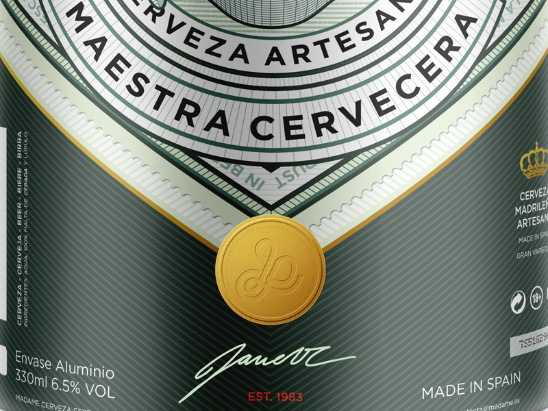
We’ve covered some of Spain’s impressive beer design before (see here, and here), but a recent discovery has impressed us with a classic-meets-modern take on beer packaging. At first glance, the bottles and cans designed for this Toledo beer operation, Madame Cerveza, appear fairly traditional. But a closer look highlights supreme attention to detail, and clean linework of a very modern approach.
Created by Spanish designer, Jorge Rico, this brewery appears to be in planning (given the lack of available content regarding the operation), but it’s design is clearly well on it’s way to a polished product. The double green, white and brass are a welcome look for a beer not named “Heineken”, and those angles are striking – especially with the multi-can lineup. And not enough can be said about the attention to detail (just see the close crops below of the can artwork and portrait logo – wow).
We’ll have to keep an eye on this one. The graphics are just too good to miss. And, those swing top bottles – well done. Cheers to Toledo!


Images from Dribbble.com designer, Jorge Rico.