


This content was originally published by The Hop Review, a digital magazine that joined the Hop Culture family in March 2020.
This piece was written by Jack Muldowney.
LONDON, UK

If you’ve ever been to the UK, their is a very strong chance you have enjoyed a pint or three of Young’s. Or, at the very least, have stepped foot in one of their 220 tied-house style pubs. It’s a heritage brand that, in recent years, became unfortunately associated with a more dated approach to beer–a stodgy, dusty brand that many knew of solely for cask ales.
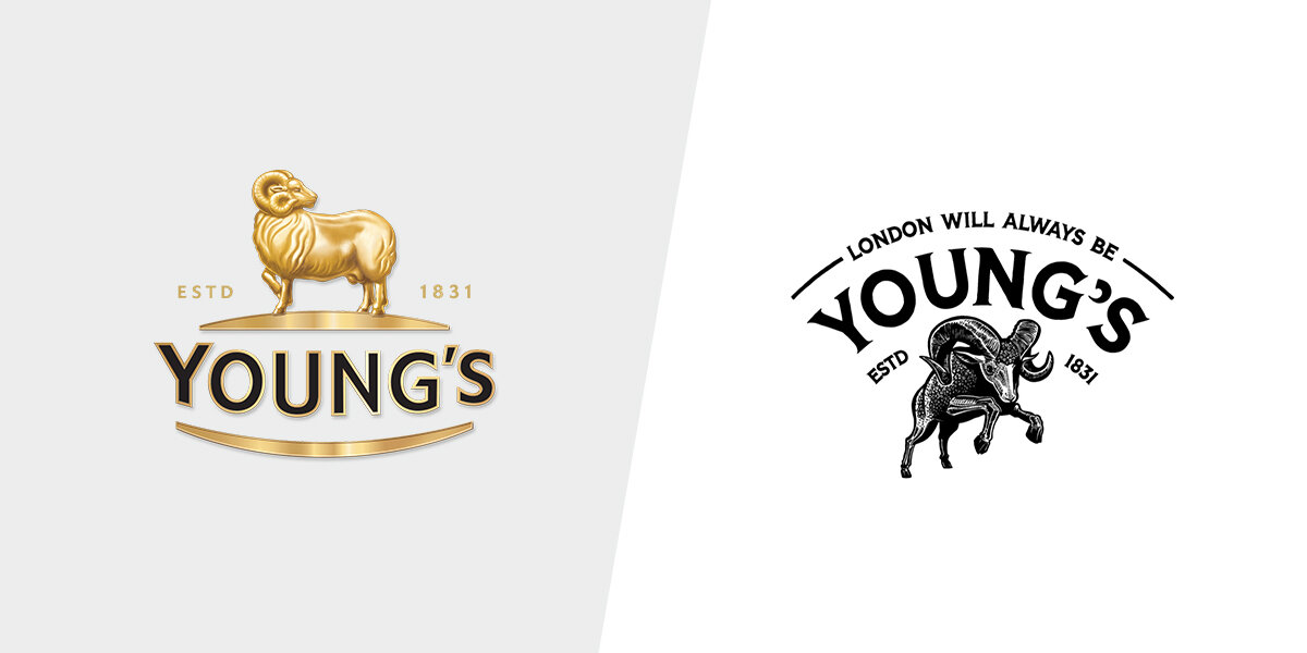
Young’s is a beer brand well-known across the UK, and began as “The Ram Brewery” dating back to 1831. And just recently, Cornwall-based design agency, Kingdom & Sparrow, was hired to rebrand this celebrated UK heritage beer brand, to adapt to a newer generation of beer-drinkers. The firm was brought in to give the brand relevance in today’s market, “whilst maintaining their history, provenance and credibility as brewers.”
The creative team created a series of confident and attention-grabbing brand assets to help eliminate younger consumers’ perceptions of cask ale, and stand up to contemporary competitors on the bar and shelf. The most obvious refreshment of the brand? The bright color palette. And, the more energetic ram illustration…
“Most notably, we’ve injected some attitude into Young’s iconic ram emblem. Previously depicted as static and shy, the new hand-drawn ram leaps confidently over the London skyline.” says K&S Creative Director, Johnny Paton.
Kingdom & Sparrow brought all of this together to create a consistent, coherent brand design system that would connect with consumers across all formats and beer styles.
Another major brand development was with Young’s flagship English Bitter. Strategy Director, Sophie Cowles, explains, “One of our main challenges was to revitalize the flagship ‘Bitter’. The associations with bitter are a barrier to purchase for some of the newer generation of beer drinkers, so to establish this as their core product and hark back to Young’s original recipes, we named it ‘London Original’.”
Paton went on to say, “Ultimately, we’ve worked together to create a brand that is revolutionary for the brewery, but has classic bones to stand the test of time.”
And, we suppose, time certainly will tell.


“One of our main challenges was to revitalize the flagship ‘Bitter’. The associations with bitter are a barrier to purchase for some of the newer generation of beer drinkers, so to establish this as their core product and hark back to Young’s original recipes, we named it ‘London Original’.”


“With the core brand message of ‘Take London Head On’, we took Young’s on a bold journey. We wanted to incorporate their heritage, whilst embracing how London and the beer industry had evolved.”


–––
Design & images via Kingdom & Sparrow.