


This content was originally published by The Hop Review, a digital magazine that joined the Hop Culture family in March 2020.
This piece was written by Jack Muldowney.
COOPERSTOWN, NY
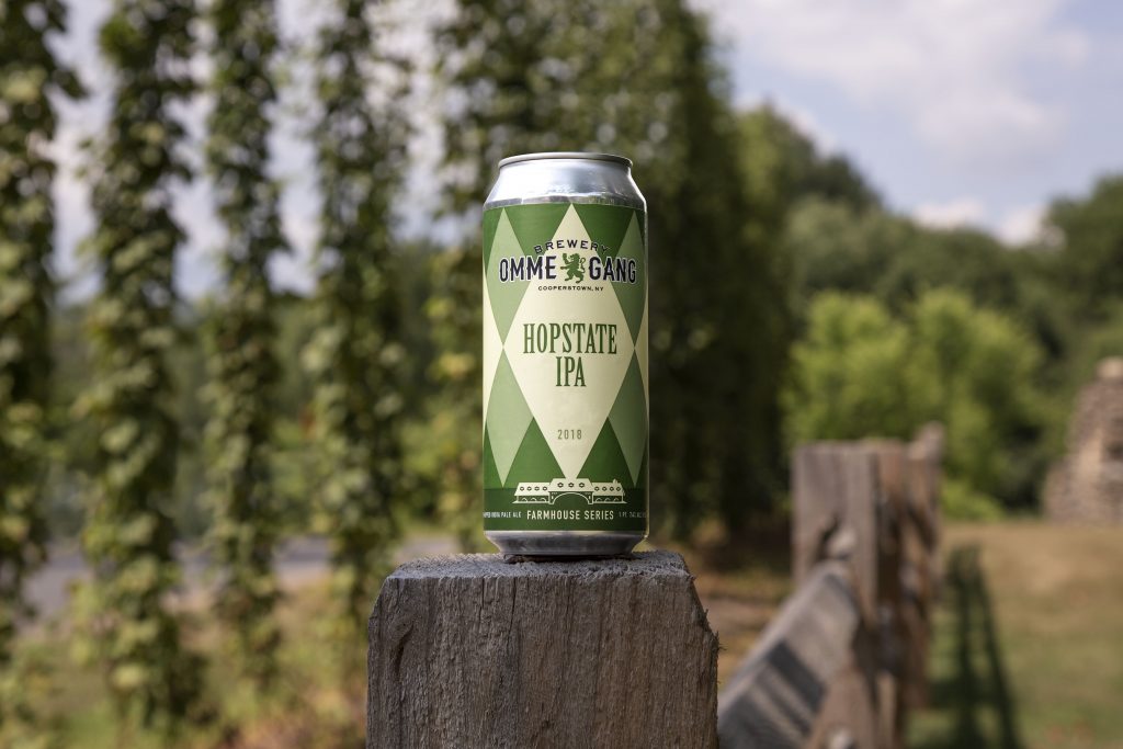
Ommegang, the Belgian-inspired brewery that began back in 1997 on 136 acres of land that was formerly a hop farm in Central New York, has refined its look. As the first farmstead brewery built in the U.S. in over a hundred years, it made sense to carry over some of the brewery’s now-iconic ‘harlequin’ aesthetic. Ommegang last got a refresh to its packaging and logo–utilizing these checkered patterns–back in 2012. Now, these diamond shapes take center stage, in a bold new packaging system that immediately reads ‘Ommegang.’
From Brewery Ommegang’s website: “We’re excited to begin the new year with a new look. Working with CF Napa Brand Design in Napa, CA, and illustrator Tad Carpenter of Carpenter Collective, we have thoughtfully redesigned every element of our brand to deliver packaging as elegant as our beer.
One of our goals was to make it easier for consumers to find our beers in the increasingly crowded craft environment,” explains president, Doug Campbell. “That’s been accomplished through consistent application of our key brand iconography, style of illustration, and color palette.”
These new bottles will begin to roll out through the beginning of 2019, so keep an eye out. And may we just say, we’re now even more excited to visit the brewery in the spring. We’re coming for ya, Cooperstown!


“Our year-round beers now enjoy rich, vibrant colors and a clean, uncluttered appearance. The well-known harlequin pattern serves as a backdrop for a series of bold silhouettes created by Tad Carpenter of Carpenter Collective. Each illustration is intended to evoke the story behind the beer.
”


“Our new Limited Release packaging employs more subtle colors and foregoes illustrations, allowing the name alone to describe what waits within.
”


–––
Images via
Ommegang.
Design & illustration by CF Napa Brand Design and Carpenter Collective.
