This content was originally published by The Hop Review, a digital magazine that joined the Hop Culture family in March 2020.
This piece was written by Jack Muldowney.
TORONTO, CAN
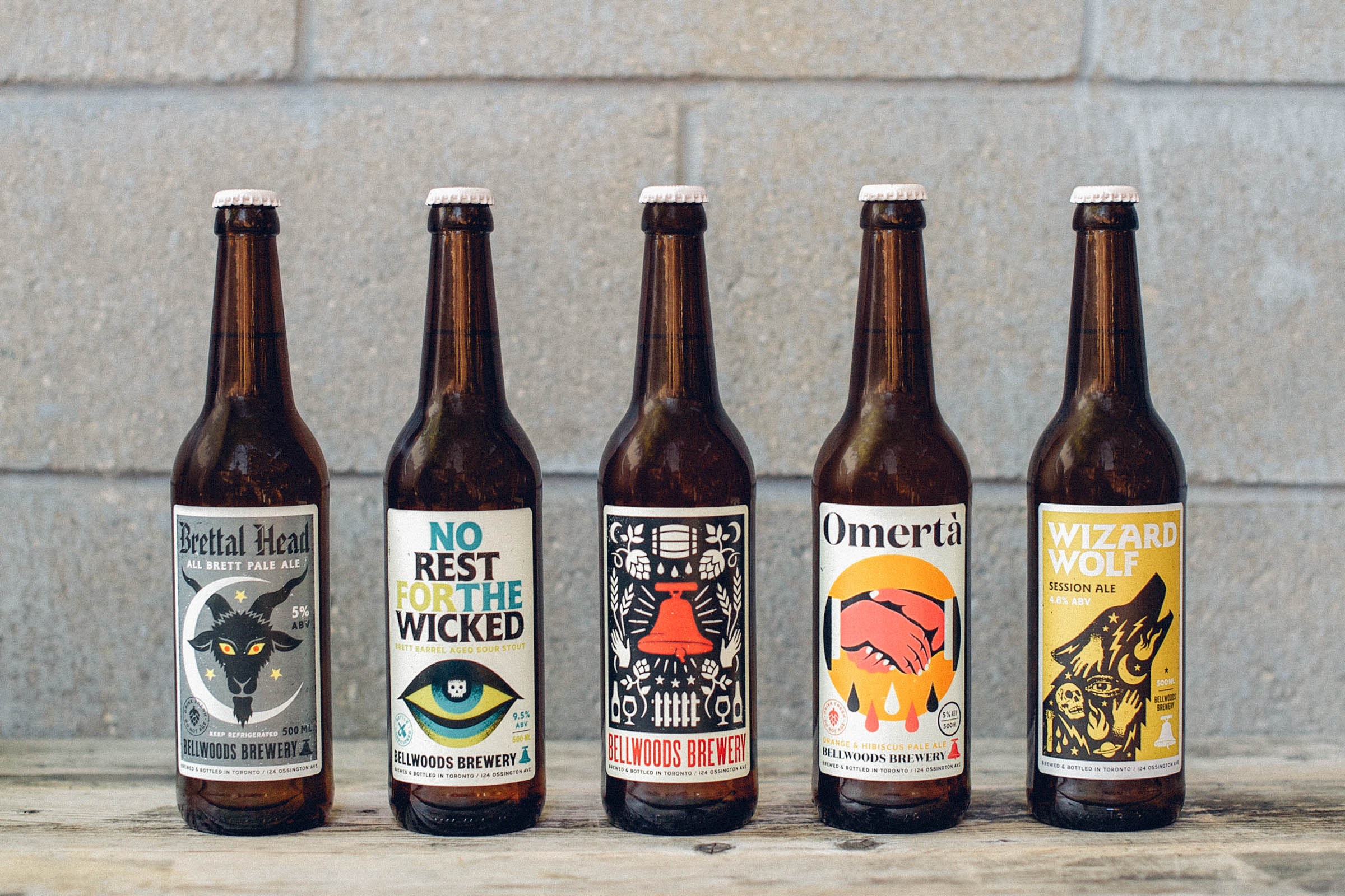
Anyone who’s been to Toronto and in search of a good beer has likely been directed to Bellwoods Brewery (Recently named RateBeer Best Brewery in Ontario) on the city’s west end. Their flagship space–the brewpub and bottle shop on Ossington Avenue–is an anchor in the Little Portugal community, and a beacon for fans of craft. From juicy IPAs, to barrel-aged sours, to coconut porters, their lineup is as fun as it is experimental. And, thanks to the brewery’s former next-door neighbors, Doublenaut Design, their labels carry the same attitude.
Described by Bellwoods founder, Luke Pestl, as “gig posters on a bottle,” the design work somehow manages that fine line between boldly attention-grabbing, yet consistently beautiful. The distinct illustration is a product of the aesthetic that has helped Doublenaut make a name for themselves, and borrows from the visual approach of concert posters and music packaging. And with an average of one to two new label designs per month, the design duo has had to keep pace with the rapidly growing brewery. And, in the end, they’ve combined to create an expansive portfolio of some of beer’s best designs (for a deeper look behind the design process, visit Bellwood Brewery’s blog, here).
The 500mL bottles provide a consistent and roomy space to showcase the artwork, and many of the labels even end up as posters, for purchase at the brewery’s shop. This adaptable, and collectable, approach is unique to beer, and I can imagine is one that you will start to see a lot more from breweries near and far.

“[Doublenaut] had intentionally designed the labels as sorta ‘posters on a bottle.’ They were doing a lot of screenprinting already–gig posters, etc.”
“The design is very important. We spend a lot of time just working on that, and we let the Doublenaut guys do their thing.”

–––
Photos from The Hop Review, where noted, & BellwoodsBrewery.com.
Label artwork from Doublenaut.com.
For a deeper look behind the design process, visit Bellwood Brewery’s blog, here. And, be sure to read our interview from February 2016, with Toronto’s Bellwoods Brewery Founder, Luke Pestl, here.


