


This content was originally published by The Hop Review, a digital magazine that joined the Hop Culture family in March 2020.
This piece was written by Jack Muldowney.
BIRMINGHAM, UK
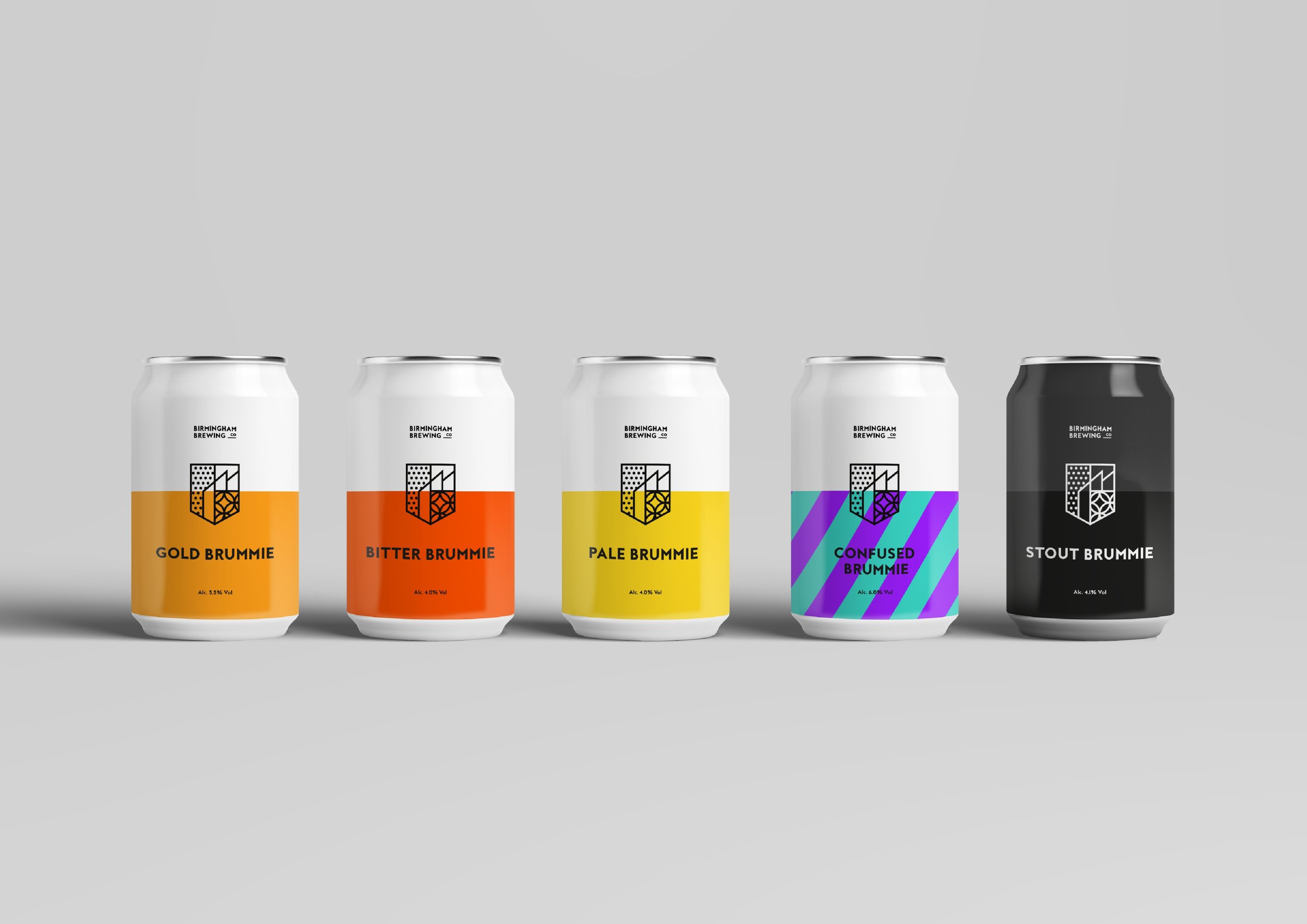
One new brewery in the UK is taking its inspiration from the city’s aesthetic that it calls home. Birmingham Brewing Company launched in late 2016, and from the start staked its claim on a distinctive modern look.
We asked BBC founder Paul Harwood what specifically supplied the inspiration to the brewery. “The concept behind the branding was to create a modern, minimalist logo which represented Birmingham and the Brewery. The dots of the left hand side were inspired by the cladding on the outside of Selfridges at the Bullring Shopping Centre. The circles in the bottom right were inspired by the cladding on the Library of Birmingham. And finally the rooftops in the middle represent industry in Birmingham, as well as the warehouse roof at the Brewery.”
We took the same inquiry and ran it past BBC’s designer, Tom Evans: “We wanted a strong brand that would immediately represent the local area. I wanted to create a brand that had a sense of it’s heritage and it’s place in history as well as capturing the exciting vibrant new spirit of modern Birmingham. For me there is nothing more symbolic of Birmingham than it’s architecture, from its industrial past to its fearless use of pattern in iconic new buildings making them instantly identifiable. So I wanted to combine these elements into the brand, using bold pattern and color to hopefully create a similarly unique and instantly recognizable brand.”
A nod to a city based on industry, done in the most modern way possible. Well done, BBC.


“We wanted a strong brand that would immediately represent the local area. For me there is nothing more symbolic of Birmingham than it’s architecture, from its industrial past to its fearless use of pattern in iconic new buildings making them instantly identifiable. So I wanted to combine these elements into the brand, using bold pattern and color…”


Images provided by Birmingham Brewing Co. & Tom Evans Design.
