


This content was originally published by The Hop Review, a digital magazine that joined the Hop Culture family in March 2020.
This piece was written by Jack Muldowney.
Blainville, Quebec
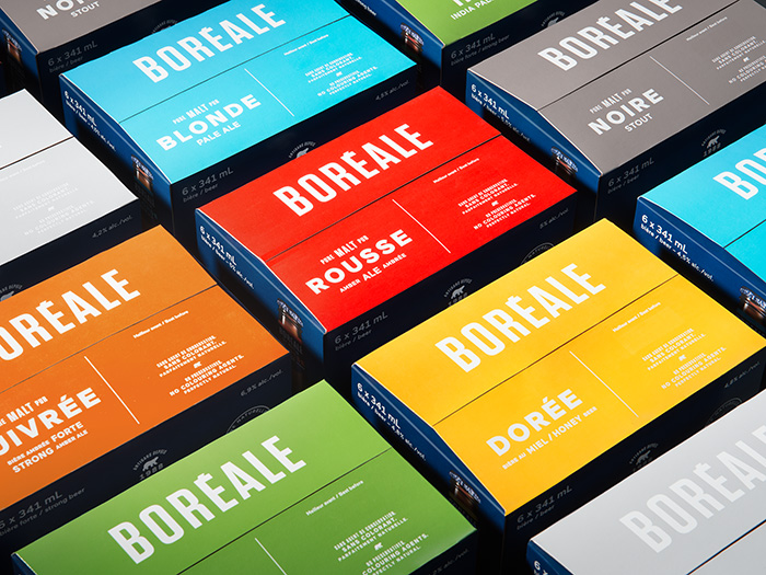
If you’re a Canadian brewery named Les Brasseurs du Nord–which translates to “The Brewers of the North”–it’s almost a given that you go after a nordic or ‘polar’ aesthetic. Such is the case with Quebec’s Boréale, a beer by the aforementioned brewery, designed by studio lg2 boutique. The brewery’s flagship brand consists of seven different beers, ranging from a witbier to an IPA to a stout.
Front and center in Boréale’s design is an iconic, and majestic, polar bear illustration. There’s no mistaking the ‘up north’ feel of this beer–even if at first glance, you mistake its logo for a bottled water brand. And as one of Quebec’s leading craft brewers (since 1987), it was imperative that their packaging get some re-consideration. While the color palate is a bit remedial for my taste, the system works like a charm. It’s sharp, clean, easy to navigate between beer styles, and evokes an immediately refreshing image.


“Freed from the main logo, the emblematic bear is enhanced and is at the heart of the new identity. Everything has been designed to attract consumers, to invite them to reconsider and rediscover Boréale products.”


“The image update is inspired by its new positioning, “Celebrate life naturally”, a nod to Boréale’s legacy, its authenticity, the call of the wild, the thirst for freedom and the rejection of the superficial.”


–––
Images from lg2boutique.com