This content was originally published by The Hop Review, a digital magazine that joined the Hop Culture family in March 2020.
This piece was written by Jack Muldowney.
KANSAS CITY, MO
Boulevard Brewing Company announced its new packaging and logo designs back in fall 2015. But have since been rolling out the new packaging designs into other markets, throughout the following year. We recently interviewed Boulevard’s creative minds behind the design, here, to discuss the rebrand and its approach.
Austin, Texas design firm, Helms Workshop, was tapped to work with the Boulevard team to strategically refine, redesign and ultimately reignite the brand.
“The Boulevard brand evolved organically over their first 25 years as pioneers in craft brewing. Each new beer was packaged with an independently designed label, which became a challenge for both the brewery and for drinkers as the brand grew. As the product family expanded and distribution spread it became difficult to recognize the brand in a crowded market.”
Helms and the Boulevard design team dived deep into Boulevard’s brand history, equity and identity. With new insight into the brand, they developed a system that simplifies the brand identity while amplifying brand impact and voice. A refined color palette, consistent typographic choices, and a uniform illustration style “allowed Boulevard to consistently stand out while preserving the down-to-earth, humble wit and light-hearted personality of the brand.”
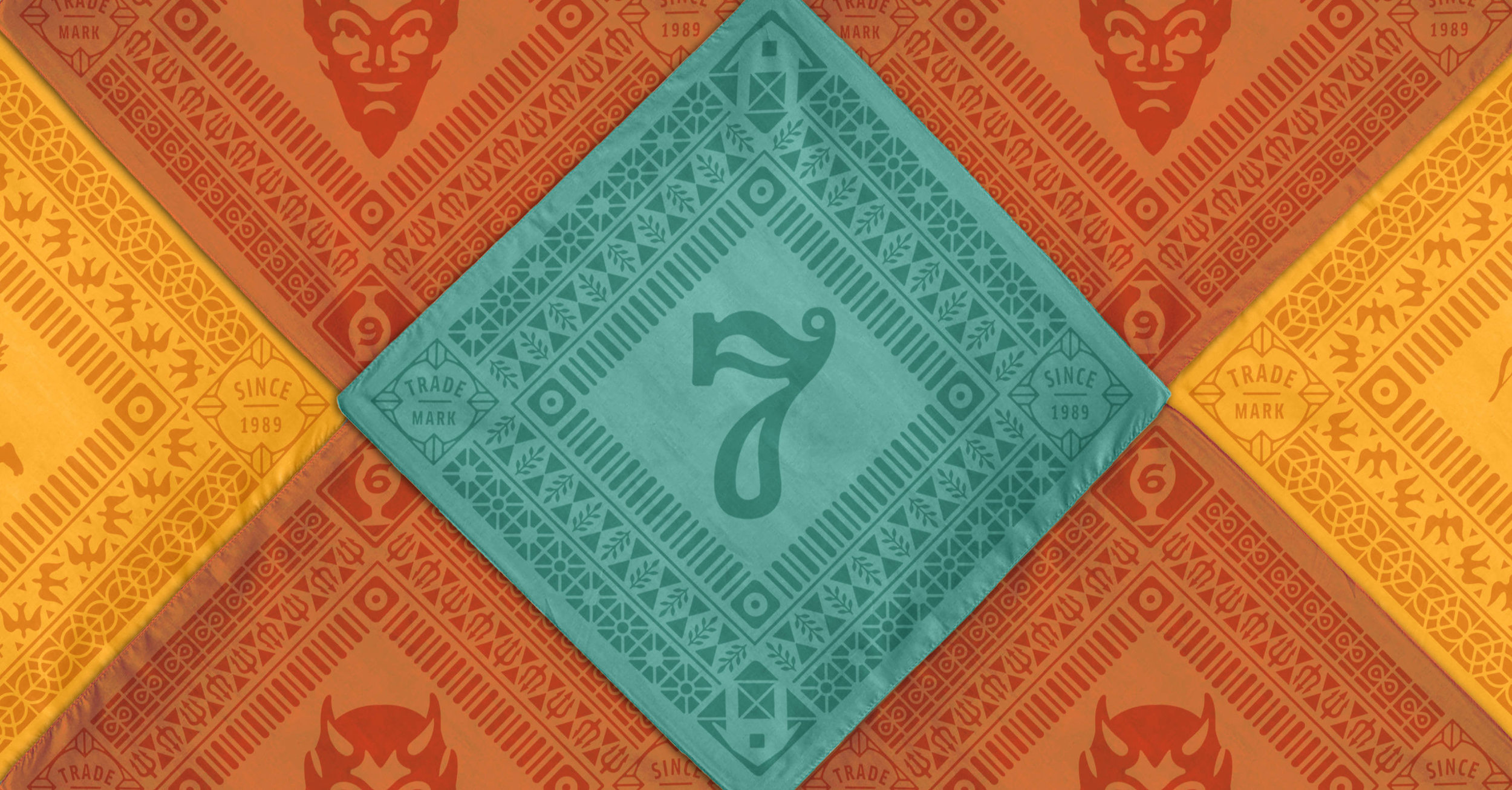
To create a packaging platform for current and future beers, the solution was found in the logo itself. The distinct diamond shape, rooted in the brand’s original aesthetic, has been pulled out and applied to the entire lineup of beers. This creates a distinct and playful packaging system that Boulevard can stand behind indefinitely.
Helms further described the new brand’s approach, “Together, the new brand system aligns the full Boulevard portfolio, lays groundwork for efficient and effective design for future beers, and ensures a cohesive brand identity that drinkers—old and new—recognize as unmistakably Boulevard.”

“A refined color palette, consistent typographic choices, and a uniform illustration style allowed Boulevard to consistently stand out while preserving the down-to-earth, humble wit and light-hearted personality of the brand.”
–––
Tank 7 & Tshirt photography by Lakeshore Beverage, for The Hop Review.
All other images by Helms Workshop.
Be sure to check out our interview with Boulevard Brewing Creative Director, Brent Anderson, and designer Frank Norton, here.


