


This content was originally published by The Hop Review, a digital magazine that joined the Hop Culture family in March 2020.
This piece was written by Jack Muldowney.
COPENHAGEN, DK
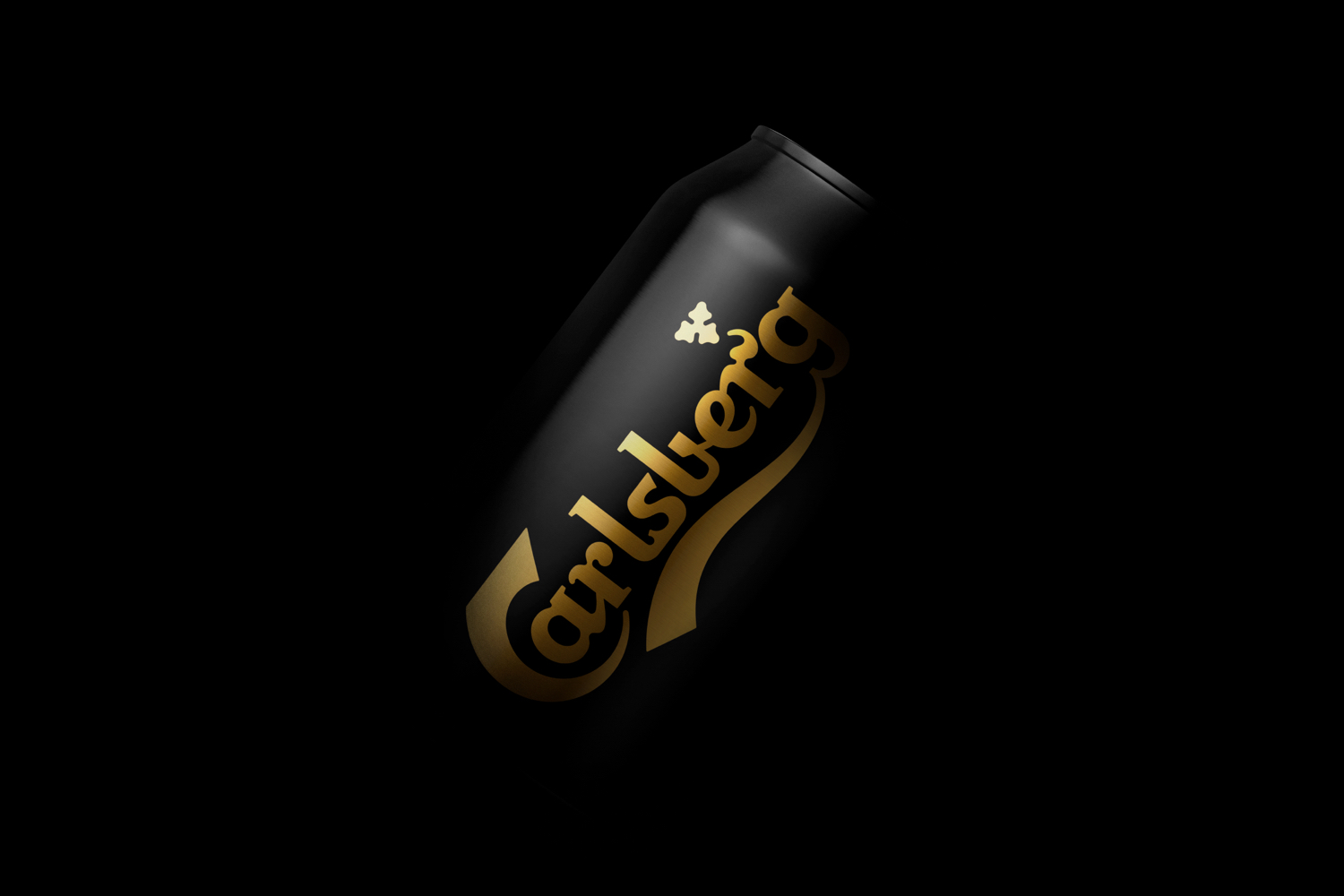
Long-time Carlsberg design partner, Copenhagen-based firm Kontrapunkt, recently lent their services again, to help the Danish brewery progress its minimalist design aesthetic. We saw in October of 2016 that Carlsberg released a simplistic hop-icon-centric can design for their iconic lager into the German market. And now, they’re back at it, refreshing the look for the dark lager, Carlsberg Black Gold, as well. The design advances the minimalist approach by ditching the ‘bottle label’ oval approach from before, and combines it with a slick matte can with gold accents and all black lid. And, the iconic hop icon is present as a die-cut in the lid’s tab – a nice detail, no doubt.
From the Kontrapunkt site: “From the cool cat of beers to an overlooked lager in the Carlsberg range, Black Gold needed a facelift to revive its relevance. Paying homage to the historic Black Gold bottles, we designed a darker than dark can that reflects the bold and more full-bodied pilsner experience.
Black Gold is in family with Carlsberg’s regular pilsner but has a slightly higher alcohol percentage and a more intense and sincere flavor. As the alpha male of the Carlsberg portfolio, we saturated the black and golden colors to dial up the contrast and give the design the richness of the beer itself.”


–––
Images from Kontrapunkt. Thanks to BP&O for the tip.
![]()

SUGGESTED
Be sure to check out our feature of Carlsberg’s new can designs, from October 2016, here: