


This content was originally published by The Hop Review, a digital magazine that joined the Hop Culture family in March 2020.
This piece was written by Jack Muldowney.
DUBLIN, IRELAND
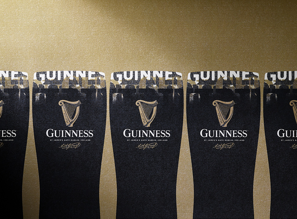
Guinness has long been defined as being “a pint of the black stuff”–one of the world’s most famous beers, and no doubt it’s most famous stout. But Guinness has also been long associated with one other element: the harp. The harp came to be when it was created to honor Ireland’s first king, Brian Boru, after warding off the Normans in the 12th century. It’s become a synonymous symbol of the Emerald Isle, and of course Guinness.
But over time, the harp that so defined the Dublin brewery began to lose its character and had most recently morphed into a flat vector graphic that was seen in the brand until most recently. Now, a more embellished and detailed harp has been applied to the logo and brand identity, paired with a refined and more classic stenciled serif typeface. The new design also draws inspiration from “Est. 1759” lettering found in the Guinness Storehouse, as well as nods to Dublin’s River Liffey with wavy lines in the harp’s detail.
To tackle this new design venture, Guinness (more likely holding company Diageo) hired London-based creative firm Design Bridge. “Our challenge was to breathe life back into the harp and let it sing once again,” mentioned Creative Director Tim Vary.
A deeper explanation of the creative approach and inspiration is pulled from the Design Bridge website:
“The Guinness Storehouse–an atmospheric building located in the heart of St James’s Gate Brewery–provides an inspirational environment to soak up the history of the brand. It was here that we uncovered stories like the legend of the ‘Brian Boru’ harp, a powerful symbol of Ireland’s national identity and heritage, and the inspiration for the original Guinness harp.
Our new harp design is influenced by the rich heritage of the brand and each element has its own story to tell, such as the Est.1759 type, which can be traced back to the metal stamped lettering imprinted in the ironwork and oak barrels at the Guinness Storehouse.
To reintroduce craftsmanship to the Guinness harp, we spent time with harp makers to inspire authenticity in our new design, and we worked closely with renowned illustrator Gerry Barney to bring it to life. Gerry is no stranger to Guinness, having drawn a version of the harp in the 1960s. Details like his hand-drawn typography for the new word mark (classically proportioned, and inspired by the first Guinness print adverts in the 1920s and early hand-printed labels) reflect the craft that goes into creating the distinctive beers that Guinness is known for. Collaborating with letterpress specialists New North Press, we experimented with different materials and layers to build up the brand mark, adding that all-important depth, tactility and drama.
The new harp is a sympathetic revolution of the original brand mark–a contemporary take on the brand’s heritage. We think Arthur Guinness would be proud.”
It makes me wonder if this more considered and detailed approach to logo illustration is the next trend in design, away from the long popular flat vector adaptations. Whether this is the case or not, we’ll have to wait and see. For now, we’ll applaud Guinness and Design Bridge for giving such a thoughtful approach to a logomark known the world over.


“Our new harp design is influenced by the rich heritage of the brand and each element has its own story to tell, such as the Est.1759 type, which can be traced back to the metal stamped lettering imprinted in the ironwork and oak barrels at the Guinness Storehouse.”


Images from DesignBridge.com