


This content was originally published by The Hop Review, a digital magazine that joined the Hop Culture family in March 2020.
This piece was written by Jack Muldowney.
BOWMANVILLE, CHICAGO
As Chicago had to reinvent itself post-1871, so too have a handful of the city’s current breweries, they’re finding out. Petty battles over naming rights turned Strange Pelican into Aquanaut. A trademark slip-up saw Atlas (historically a Chicago brewery since 1891) come back as Burnt City. And the latest of the bunch has pushed South Loop Brewing Co. to reinvent itself as the more ‘ownable’ namesake, Hop Butcher for the World–that’s a play on the famous city nickname coined in the 1914 Carl Sandberg poem, for those wondering.
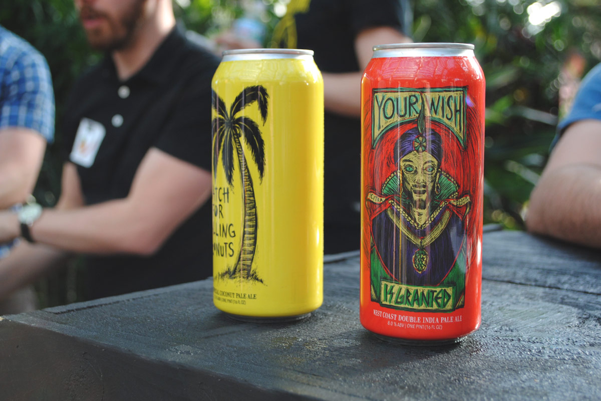
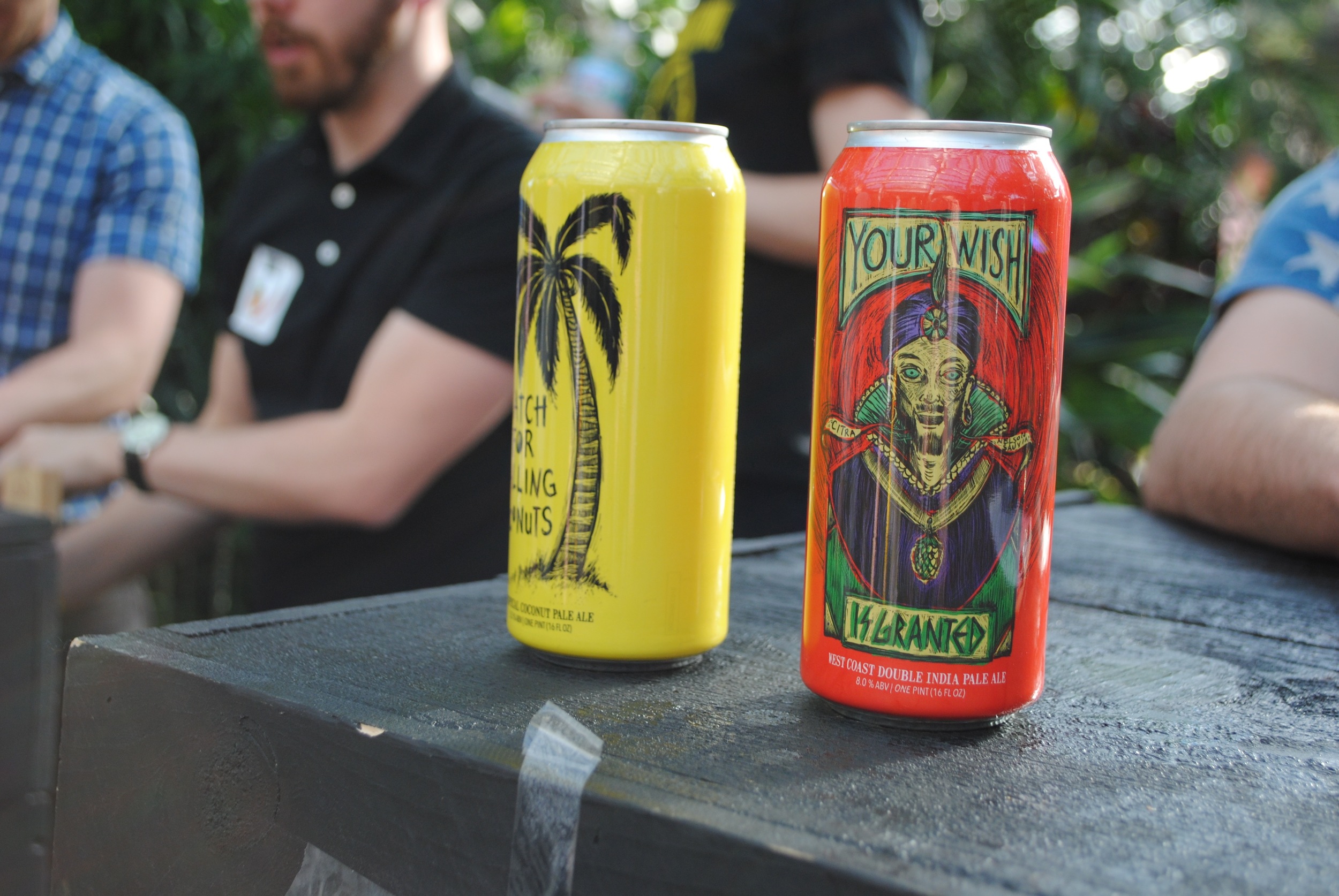
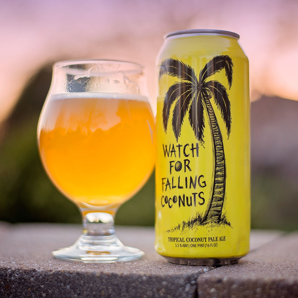
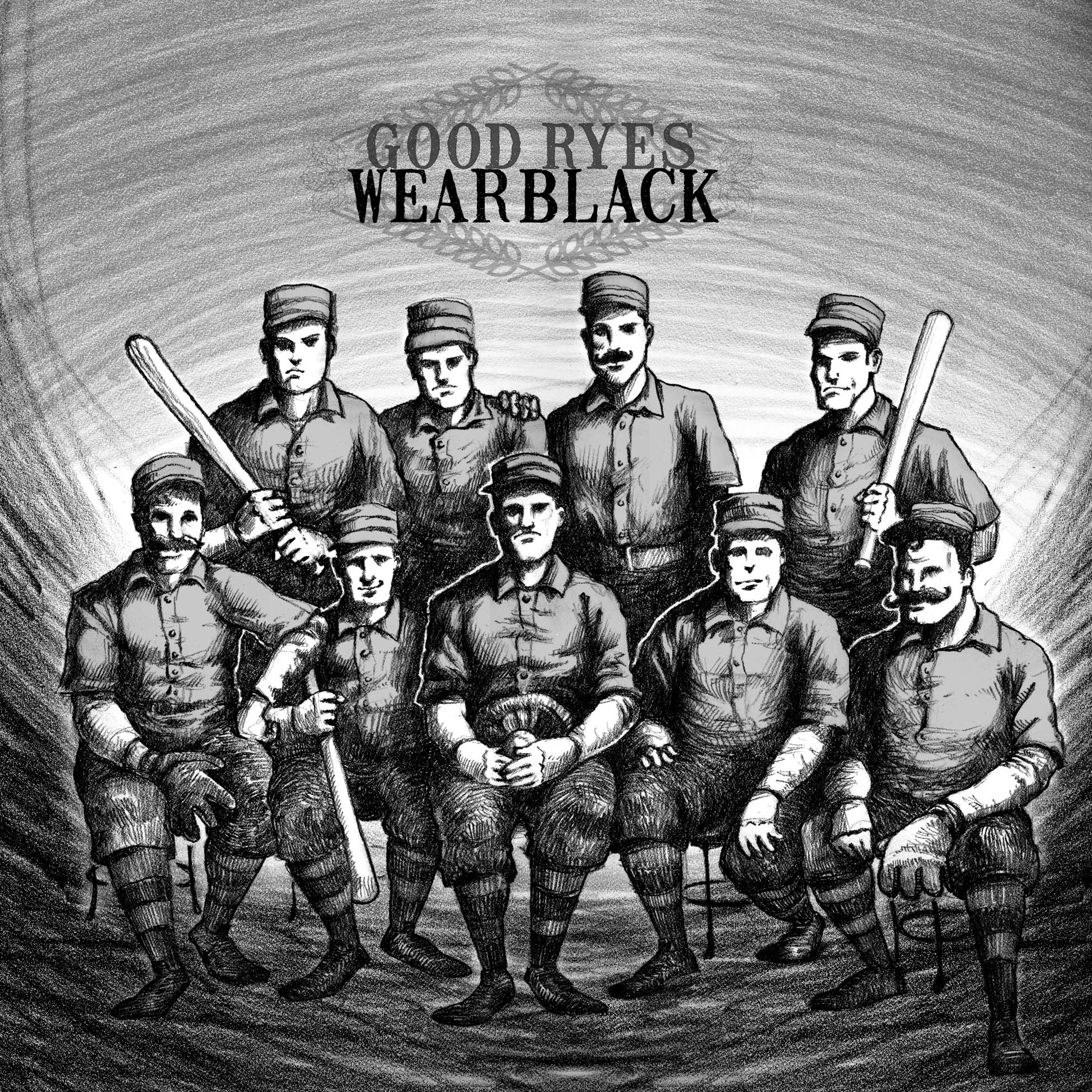
With the new name comes some new looks for their beers, along with some of their former namesake’s lineup. Good Ryes Wear Black and The World’s Colombian Coffee Exposition do a great job of showcasing noteworthy milestones in the city’s past. While new offerings include the un-Chicago-y Your Wish Is Granted IPA and Watch for Falling Coconuts Pale Ale. Add in the decadent Milkstachio (collaboration with DryHop Brewers) and juicy APA, Alemerica the Beautiful, and you have one hell of an impressive–and distinctively illustrated–lineup.
Much of that aesthetic praise goes to Chicago artist, Dan Grzeca (pronounced “Jet-sah,” FYI). His trademark scratchboard illustrations have graced the gig posters of Andrew Bird, Built to Spill and Of Montreal, to name a few. Now, we’re lucky to have his raw, gritty drawings front and center on Hop Butcher’s 16-oz. cans. And they’ve never looked better.
“I work as analog as possible in image making. I never edit the original scratchboard drawing in Photoshop–instead, that tool is used to assemble the layers of color for the cans,” said Grzeca. “I like to keep as tactile a look as my approach to creating images.”
HBFTW Co-founder, Jeremiah Zimmer, added that the packaging approach was intentionally bold, and meant to showcase Grzeca’s designs.
“We wanted bold, colorful and concise and we wanted it to come from a place with a Chicago aesthetic. Dan Grzeca brings that. His scratchboard style is as unique as it gets. He’s well-respected around Chicago and the artist community and he is born and raised in the city as well. We loved what he brought with the Milkstachio piece and then got to see how well it worked in-market on retail shelves. Thus, it became an obvious template: Bold can color, consistent layout across all cans, some thoughtful ‘blank space’ to let the design take center stage.”
Zimmer added, “We don’t brand the face of our cans with ‘Hop Butcher For The World.’ We want Dan’s creation to first convey the beer’s personality. We want consumers to see our cans on the shelf, step closer to look at that central image and know (if eventually) before they even turn the can to see our logo that it’s us…that it’s a Hop Butcher For The World beer.”


“Hop Butcher For The World is a brand that reeks of Chicago, but is able to resonate with the rest of the beer-loving world just as well. It gives us the freedom to have some fun with our beer names (like ‘Milkstachio’ and ‘Watch For Falling Coconuts’) and still own a meaningful connection to Chicago’s rich history (a la ‘World’s Colombian Coffee Exposition’).”


Photography provided by Hop Butcher for the World, unless noted otherwise.
