


This content was originally published by The Hop Review, a digital magazine that joined the Hop Culture family in March 2020.
This piece was written by Jack Muldowney.
LONDON, UK
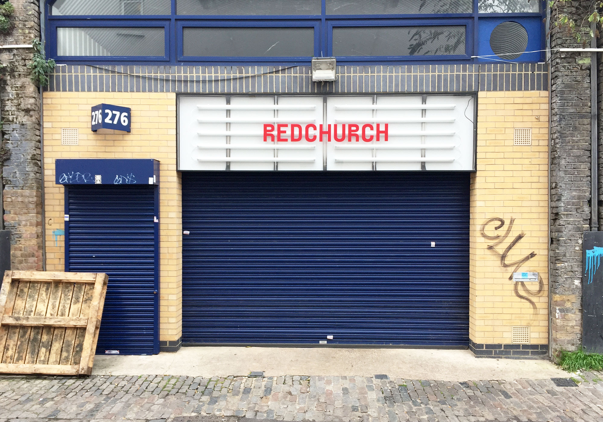
In the east end of London, past the trendy Shoreditch neighborhood, is the Bethnal Green locale. It’s here–slightly down an industrial corridor, sandwiched between motorcycle and auto garages–where the small Redchurch Brewery sits. The brewery’s taproom rests under the curved roofline of a railway arch (a popular site for taprooms in London, it seems). And it’s communal seating spills out onto a large concrete slab out front, making for a welcoming patio.
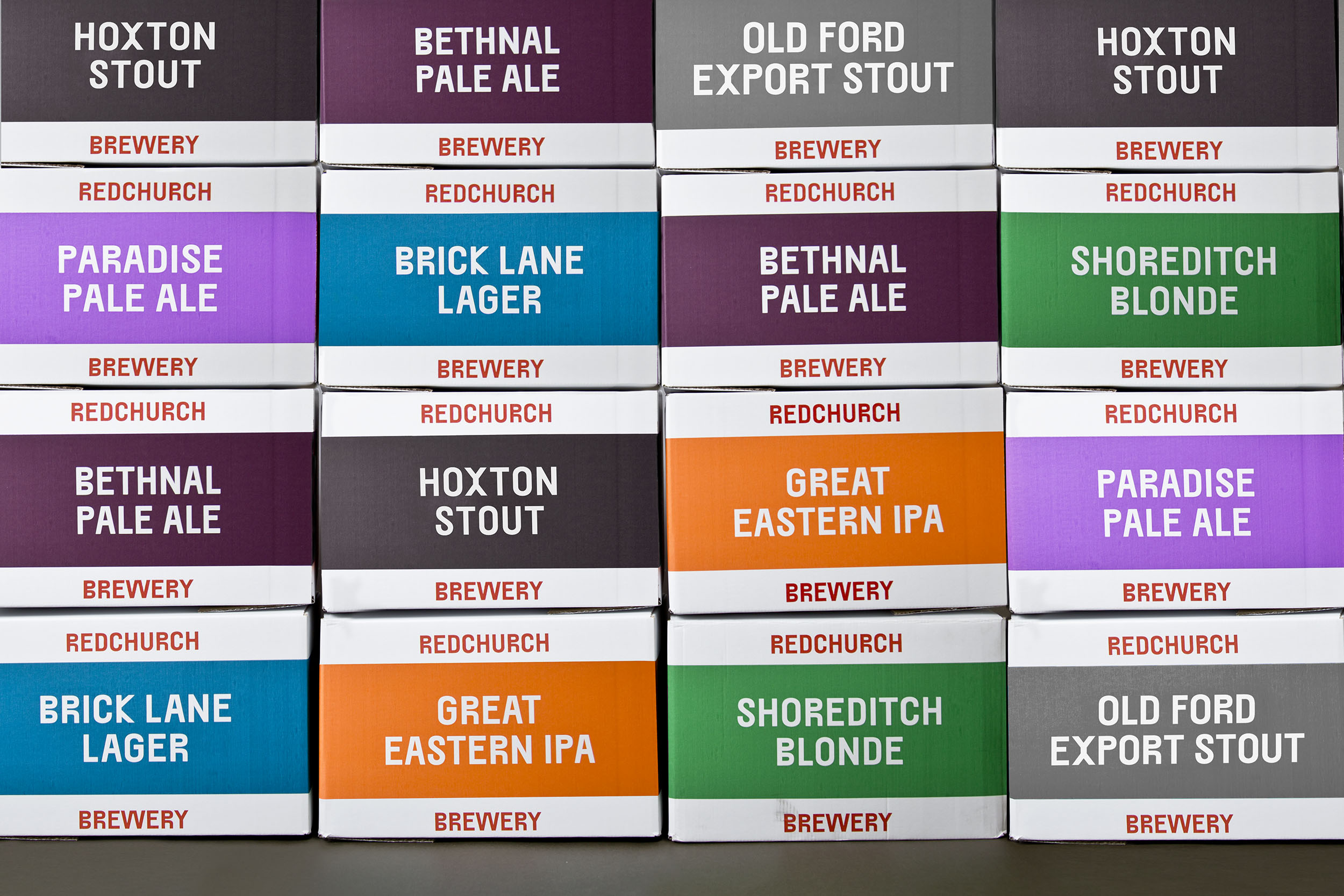
And aside from the space itself, one of the first things that will likely grasp your attention upon introduction to their brand is their uniquely type-driven visual identity, created by fellow Londoners Bibliothèque Design. Their logo is a clean modern typographic approach, with distinctly quirky “R” & “B” letterforms. And their packaging is a fitting carryover of this playful style, utilizing stripped down type plus a playful color palette.
We asked Redchurch & Bibliothèque about their approach to the brewery’s branding.
Redchurch Co-Owner, Tracey Cleland, explained their initial approach to the brewery’s rebrand. “Back in 2011 when we set up the Redchurch Brewery we were inspired by a love for typography, local street names, strong brewing history of East London and how it had become so diverse and creative. As we continued to grow we realized by 2016 it was time to refresh the brand to give us more shelf appeal and stand out from the crowd. We approached Bibliotheque who worked with our design and gave it a more modern, colorful appeal. It also gave us more assets to play with so we could create everything from taproom branding to business cards to bottle caps and t-shirts.”
Designer Mason Wells shared, “Our approach to Redchurch’s branding was deliberately reduced–the visual language of the micro brewery scene is very illustration biased in the UK, so to differentiate we opted for a more utilitarian approach. That said we still wanted the identity to have some idiosyncrasy so we opted to use the typeface ‘Separat’ by the Icelandic (yes, Icelandic!) type foundry ORTYPE–their mantra ‘to challenge typographic convention’ felt spot on. The font was tweaked a bit–we modified the R and the B to make it bespoke to Redchurch. This was applied to a smaller bottle label and bright contrasting color palette to cut through the visual noise of the supermarket aisles and maximize identification of your favorite brew.”


“Back in 2011 when we set up the Redchurch Brewery we were inspired by a love for typography, local street names, strong brewing history of East London and how it had become so diverse and creative. As we continued to grow we realized by 2016 it was time to refresh the brand to give us more shelf appeal and stand out from the crowd. We approached Bibliotheque who worked with our design and gave it a more modern, colorful appeal. It also gave us more assets to play with so we could create everything from taproom branding to business cards to bottle caps and t-shirts.”


“Our approach to Redchurch’s branding was deliberately reduced – the visual language of the microbrewery scene is very illustration biased in the UK. So to differentiate, we opted for a more utilitarian approach. ”


“We opted to use the typeface ‘Separat’ by the Icelandic type foundry ORTYPE – their mantra “to challenge typographic convention” felt spot on. The font was tweaked a bit – we modified the R and the B to make it bespoke to Redchurch. ”


–––
Images provided by Bibliothèque Design.
![]()