Shop
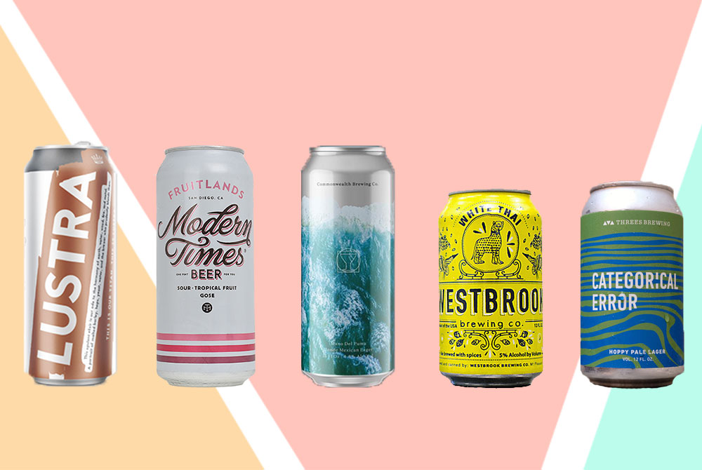
The 5 Most Beautiful Cans to Drink by the Pool This Spring
Colorful cans, drinkable beer, and no glass to shatter.
It’s officially spring. Time to take the party outside. You’re going to drink, you’re going to sarcastically say, “Oh look, the sun,” and you’re going to take pictures. But until you hit peak tan, let your most photogenic friend be your beer.
Seriously, though. The beers on this list don’t come in your run-of-the-mill cans; they’re carefully designed to make you feel something. “From the very beginning, the label is designed to create a response; preferably, for the brewers, that response is buying it,” says Alex Barbiere, designer of the legendary AleSmith packaging for Speedway Stout and the San Diego 394 Pale Ale. “Packaging alone can’t make a bad beer taste great, but it’ll make it last longer [in production].”
The good news is, as more breweries open, we’re starting to see more creative and daring can designs. “The new ones don’t have a tradition to uphold,” explains Alex. “They haven’t been in the game long enough to deviate from any pre-existing branding. These new ones will find their look and stay consistent.” Consistency, he explains, is most important. “It’s a new trend, these show pieces,” he explains of more artistic cans. “But you still have to be able to identify the key design features of the brand: color, artistic technique, contrast, logo.”
The best, according to Alex? Brooklyn-based Grimm and Cincinnati-based Rhinegeist. “They sell to their target audience,” he says. “Grimm is hipster-y, but they’ve mastered the Brooklyn craft-scene; that’s their audience. Everything they do is clean and sleek, like Brooklyn itself. The billboard effect draws buyers in; if customers see a whole wall full of one brand that looks cohesive from package to package, they respond.” And what about Rhinegeist? “They’ve got a cool logo and design format that carries from beer to beer.”
His, and most people’s, favorite labels aren’t always the best-selling. The top sellers are the classics, and although there’s plenty of tradition behind a Guinness or a Miller Lite, the young guns are paving the way, artistically speaking.
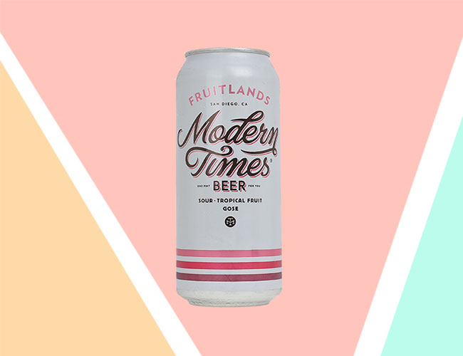
Modern Times, Fruitlands
The can, designed by Helms Workshop, presents a contrasting, cursive logo, different shades of pink, and a simple layout for easy explanation. Fruitlands is a sour, tropical, and fruity gose that is as pinkish and pleasing on the inside as it is on the outside.
Westbrook Brewing, White Thai
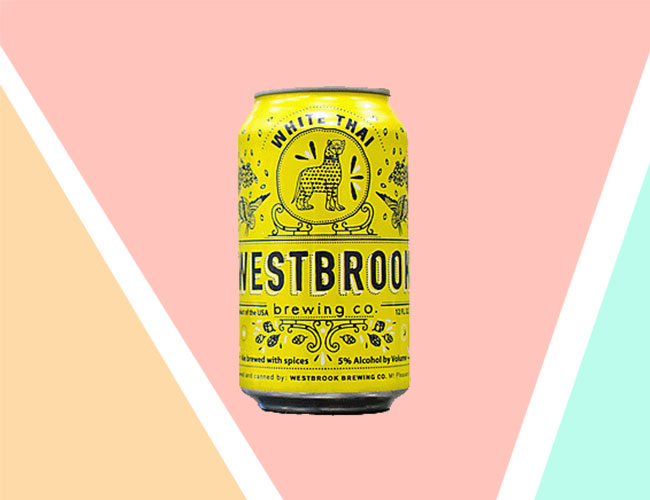
These cans are hard to miss. Designed by Fuzzco, a creative design agency based in Charleston, these bright yellow cans are, according to the brewery, “based on wrought-iron work and the sometimes surprising ingredients you might find in a Westbrook beer.” Packed inside is coriander, orange peel, lemongrass, ginger root, and Sorachi Ace hops.
Commonwealth Brewing, Mano Del Puma Mexican Cerveza
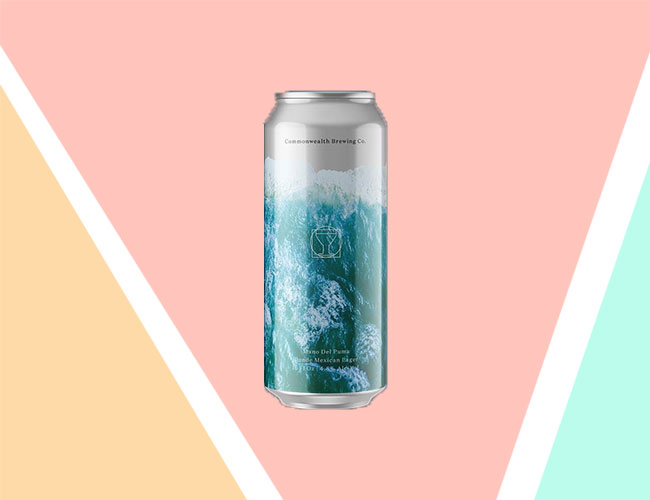
Designed by Glasgow-based Thirst Craft in an ode to to Virginia Beach, these cans feature the crash of waves; fitting, since the Mano Del Puma is Commonwealth’s Mexican cerveza. It’s a smooth, light, and refreshing beer that is as almost as nice as the ocean breeze. Drink two of these and hold them up to your ears and you might be able to hear the ocean.
Threes Brewing, Categorical Error
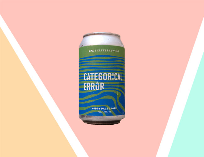
Brewed specifically for Whole Foods’ New York locations, Categorical Error is no error at all. The can, green and blue, rippled like the map of some mysterious island land, is a perfect match for this surprisingly complex American Pale Lager, which tastes of honeydew, lemongrass and white pepper.
Dancing Gnome, Lustra
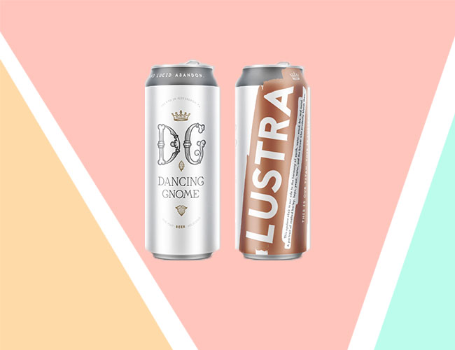
Andrew Witchey knows art as well as he knows beer; the founder of Pittsburgh’s Dancing Gnome helped co-create his own branding with PB+J Design. The Lustra carries a clean, fruity bitterness that pairs well with its toasted, wheaty flavor, and the floral, gold-accented can pairs well with the golden brew.

