Shop
Meanwhile Brewing Teams Up with Dutch Artist for New IPA Series
How art and beer collide on the can.
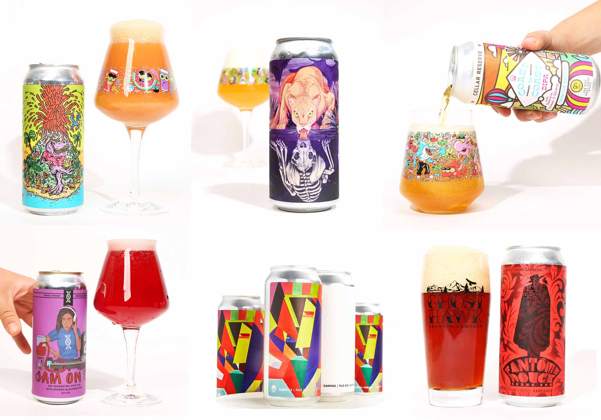
What goes in a beer can matters more than what goes on a beer can. On this, we can all agree. But people drink with their eyes first and their mouths second.
All craft breweries make hay with Instagram for good reason: well-composed and well-timed images of big, hazy beers, hued from gold to peach to chocolate, set off patrons’ salivary glands as they scroll through social media.
Likewise, sharp can designs attract an audience in their own right. Cool can art piques interest in new releases, and canonizes lauded and prestigious beers in public consciousness.
Inhaling a freshly cracked Focal Banger tall boy is almost a spiritual experience, but you might remember the can art’s Droste effect first.
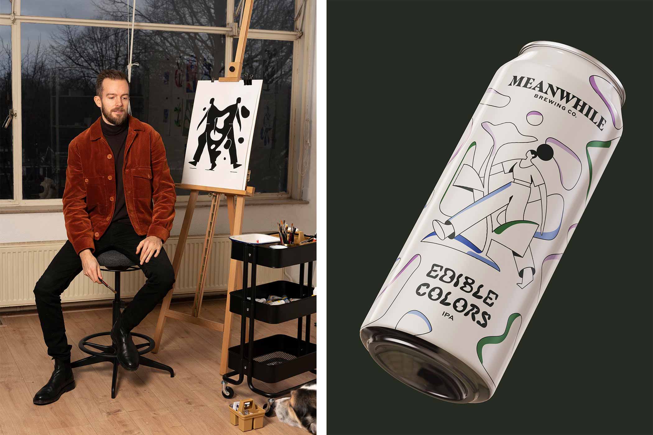
South Austin’s Meanwhile Brewing Co., an outfit founded on chill hangout vibes, takes the relationship between the beer and the can seriously. Starting in March and ending this October, the brewery has released and will continue releasing new IPAs on the first Friday of the month in collaboration with Dutch artist and graphic designer Timo Kuilder.
Each new beer produced for this project comes in cans bearing Kuilder’s unique art and designs and includes accompanying t-shirts and prints of Kuilder’s original pictures for sale.
Think of Kuilder as Meanwhile’s artist in residence for the better part of 2022, putting his stamp on nine new beers and, in doing so, adding to the brewery’s sensibilities with his own.
How a Dutchman Teamed Up with a Bunch of Texans
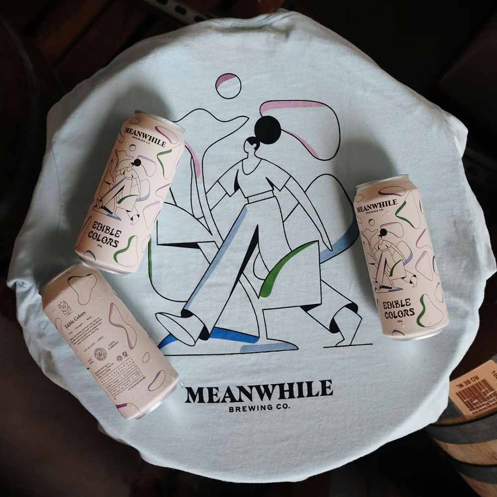
Illustration courtesy of Timo Kuilder | Photography courtesy of Meanwhile Brewing
The tale of how Kuilder and Meanwhile linked up is almost disappointingly plain: Meanwhile needed an artist, they heard about Kuilder. That’s the size of it. “Meanwhile reached out to me and opened the door last year looking for an artist to work with them on a series of cans,” Kuilder explains. “After exploring their brand, I thought my style really fit well with their aesthetic.”
Kuilder’s style, like Meanwhile’s, is laid-back and simple. That’s what drew the brewery to him in the first place. “What we especially love about his work is his knack for storytelling through simplicity,” says William Jaquiss, Meanwhile’s founder and brewmaster. “When you look at his work, you’ll see elegant subjects and mesmerizing landscapes, often in slightly surreal worlds.”
But in art, simplicity isn’t so simple—clean, straightforward linework illustrating austere characters requires meticulous attention to detail and strong vision. Otherwise, lines are just lines. And the stories they’re meant to tell don’t get told at all.
Instead, they get lost.
Even at their most basic, Kuilder’s illustrations succeed in storytelling. He cites classic masters like Henri Matisse and Kazimir Malevich. Along with contemporary artists like Séverin Millet and Bráulio Amado, as influences. Dive into works from each, and their effect on Kuilder’s art becomes clear. He ties them all together to form his own personal artistic identity.
That easygoing quality translates through Meanwhile’s brand and beer, too. For instance, Dream Logic, the first West Coast IPA in this project, is comparatively “simple” next to the more popular hazy IPAs. Piney and clear with a sweetness and balancing bitterness, Dream Logic isn’t complicated. Which is a nice punchline considering the beer’s source of inspiration: “All in the Golden Afternoon,” the preface poem to Alice’s Adventures in Wonderland. (An clever choice considering Lewis Carroll’s writing is nothing if not complicated.)
Given the back-and-forth between simple and complex, The brewers and the artist make an obviously good fit on paper.
Better still, they make an obviously good fit on cans.
Putting Craft Beer On Canvas
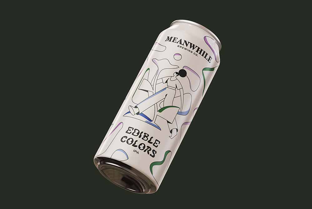
Illustration courtesy of Timo Kuilder | Photography courtesy of Meanwhile Brewing
Strawberry. Apricot. Peach. Marmalade. Pine. Resin. Citrus. Pineapple.
These make up a handful of tasting notes on Meanwhile’s first three releases: Dream Logic, Edible Colors, and Glitter & Gloom.
Communicating those flavors to inquiring customers at the taproom is an easy task. People know them. They have almost certainly eaten an apricot, a peach, or a pineapple, at one point or another in their lives. And if they’ve ever tried an IPA made with Chinook or Rakau hops, among others, then they know what to expect from a resiny, piney beer.
But how does an artist take those notes and express them through drawings?
Meanwhile and Kuilder went beyond the ingredients and under the hood for these can designs. Instead of approaching the task head-on by, say, slapping a rough sketch of a fruit on the label and calling it good, they brought the brewery’s temperament into the conceptualization phase.
Run by self-described “people-people,” Meanwhile wants customers to stay a while, have a beer or two, and maybe make some new friends. The recurring keyword here: “simple.” That’s core to good hospitality.
There’s another recurring keyword in their collaboration, though: “story.”
“We started talking about the flavors for each can as a jumping off point, but we also spoke a lot about the backstory and mission statement of Meanwhile,” explains Kuilder, “That there is beauty to be found in the everyday, sometimes right in front of us if we can take the time to unplug and observe it.”
By working together, Kuilder and Meanwhile make the ordinary, into something extraordinary.
Finding a Story on a Craft Beer Can
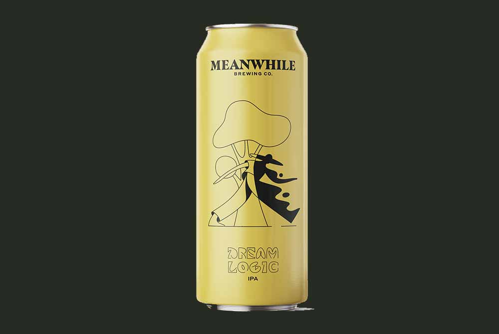
Illustration courtesy of Timo Kuilder | Photography courtesy of Meanwhile Brewing
Dream Logic’s design centers on a figure by a tree wearing a wide brimmed hat. In fact, the person actually appears to be passing through the tree. On the left hand side the figure has no shading while on the right hand side they’re entirely blacked out, as if the tree is a portal to another dimension.
Kuilder’s art helps emphasize what’s so special about the beer, an IPA that harkens back to a time when beer’s werent always opaque. This is an American IPA…through and through.
When it comes to favorites though, Kuilder favors Glitter & Gloom, one of the hazy IPAs in the lineup, in keeping with Jaquiss’ vision for the project: In his words, “to deliver a wide range of both West Coast and Hazy IPAs that demonstrate the diversity of the style in a deliberate, straightforward, and ultimately delicious way.”
For Kuilder, the hazies have, “a bit more sinister feel” compared to the other IPAs, which he feels suits its flavor profile. “It’s about the play of opposites, about being confronted with danger and how that can be exciting,” he points out. “We see a man enjoying his beer, but a wolf is looming over his shoulders.”
Maybe the wolf is about to gobble up the man. Maybe he’s about to partake in a frosty one himself. Casually leaning on its left elbow, the wolf doesn’t exactly appear like a predator before devouring their prey. (Though, if there’s a sure way for the man to avoid ending up in the wolf’s belly, it’s by sharing his beer. After all, wolves can’t pounce when they’re tipsy, right?)
Differentiating Drawings and IPAs
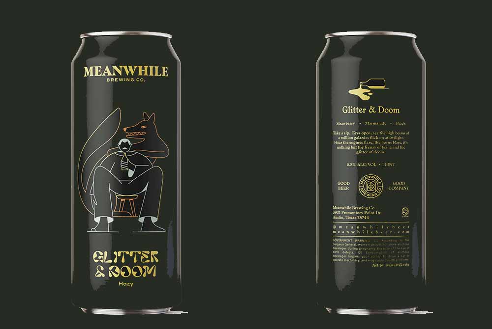
Illustration courtesy of Timo Kuilder | Photography courtesy of Meanwhile Brewing
IPA is a big sandbox for playing with flavors and experimenting with hop combinations, which gives brewers opportunities to avoid repeating those notes from one IPA to the next. Developing individual can designs to match each flavor profile month to month seems, at first, a great deal more challenging.
But Kuilder is aided in his gig with the running themes he and Meanwhile came up with for each IPA sub-style. “The IPAs are all sort of alluding to there being something wondrous right under your nose,” Kuilder says. “While the hazy IPAs are about embracing that chaos and danger.”
This is a boon for Kuilder. Giving distinct structure to these sub-styles means he has a different brief for every design, all revolving around the same essential idea: The marriage of opposites.
At the same time, Kuilder benefitted by Jaquiss’ preference for leaving him ample, broad space to come up with new pieces. “Our favorite part of the process,” Jaquiss explains, “has been just waiting to see what he’ll come up with next.”
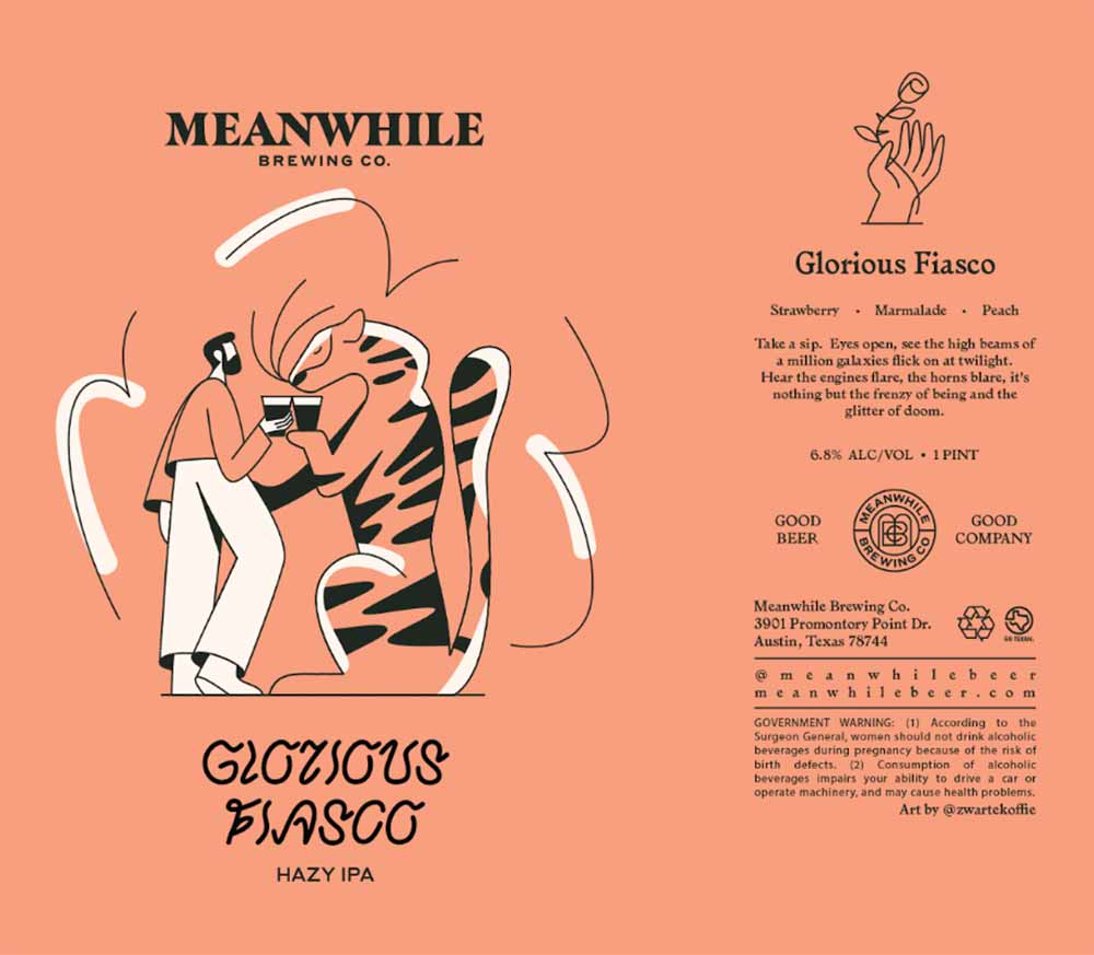
Illustration courtesy of Timo Kuilder
A man and a wolf on Glitter & Gloom.
A woman walking among woman-sized flowers on Edible Colors.
Or a man and a tiger on Glorious Fiasco. Although the tiger, unlike that sneaky wolf, grips a glass in its paw and toasts the man. Nobody’s getting devoured in that drawing. Which perhaps exemplifies Meanwhile: getting people together in a friendly, convivial space to share good beer and good company.
No surprise, then, that Kuilder and his work find themselves in good company with Meanwhile.
About The Author

Andy Crump
Currently Drinking:
Trillium Brewing Double Dry Hopped Sleeper Street
Boston-based culture writer Andy Crump writes about film, television, beer, and music for too many outlets to list. You can follow him on Twitter and find his collected writing at his personal blog. He is composed of roughly 65% craft beer.