Shop
The 25 Best Beer Labels of 2021
The best art inside and outside the can.
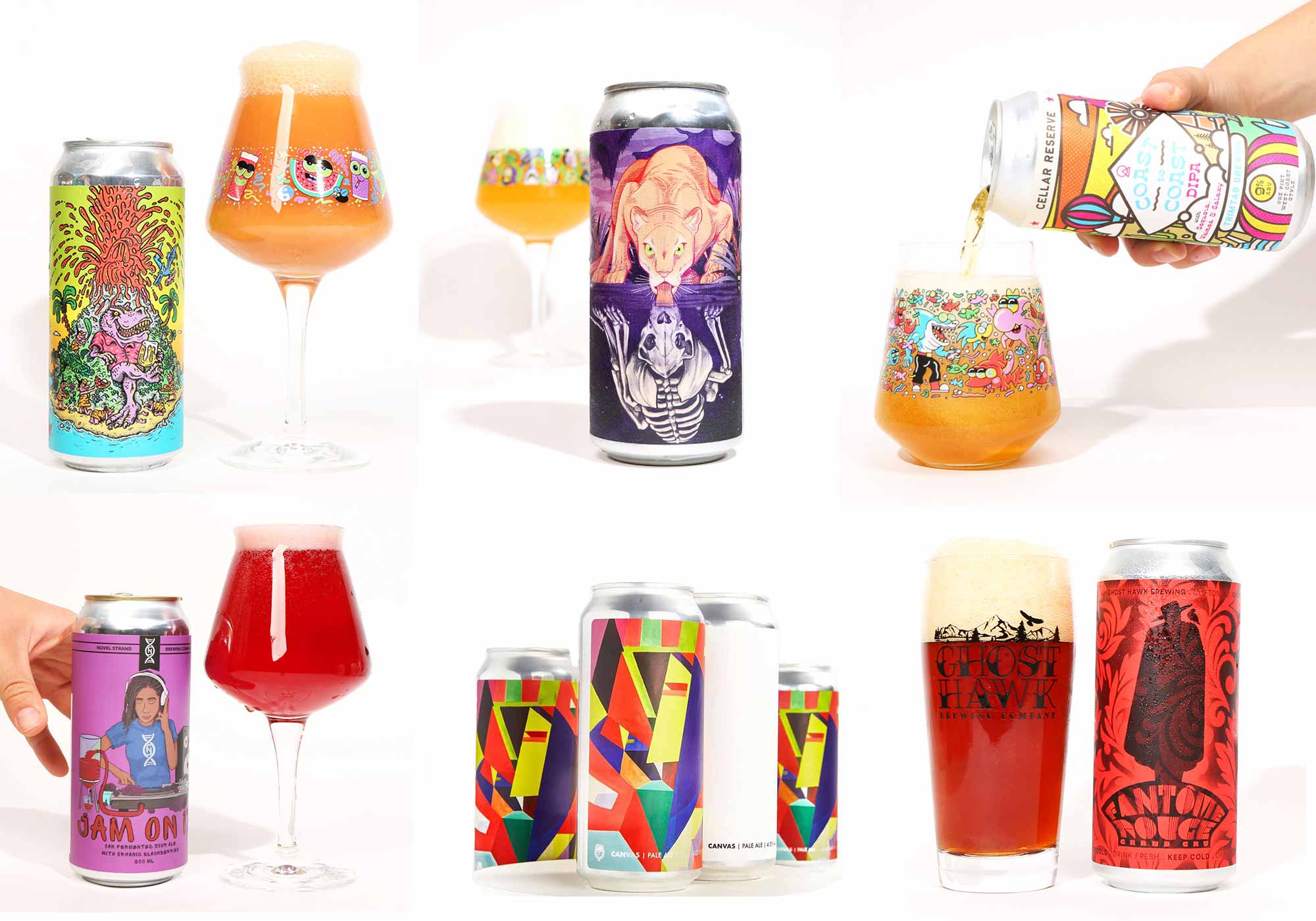
Pops of vibrant color. Witty names. Hints at pop culture. Incredible geometric shapes. Whimsical characters. These are just a few of the elements that we’ve seen pop up on beer labels over the past few years. Today, it takes more than just solid liquid to build a brand. You need eye-catching graphics or beer names to make something stand out on the crowded shelf. For that reason, since 2018 we’ve written about our favorite beer labels of the year.
Frankly, because we’ve seen so much creativity out there. And we want to recognize the craft outside the can as much as what’s inside.
It’s also why we started a new series on Instagram called #radcan where each week we feature some of the raddest labels out in the wild.
We feel we have a pretty good pulse on some of the best beer labels.
But this year we also wanted to ask for advice from the folks who know exactly what it takes to create an award-winning label. We reached out to some of the winners of last year’s Best Beer Labels of 2020 to ask their opinion on their favorite beer label of the year.
This means below you’ll find picks from the folks at DSSLVOR, Good Word Brewing & Public House, Flying Machine, Tripping Animals, Resident Culture, Wiley Roots, Pure Project, Tröegs, Wiley Roots, Brouwerij West, and Humble Sea!
Of course, we’ve thrown in a few of our own for good measure, too.
Prepare to be dazzled. Because as we all know: We drink with our eyes first.
The Best Beer Labels of 2021
Fluff Motif
Two Tides Brewing Company – Savannah, GA
Art by Alexandria Olivia Hall (@AlexandriaOlivia)
Submitted by: Michael Semenc – DSSOLVR, Best Beer Label 2020 Winner for Thank You For Existing
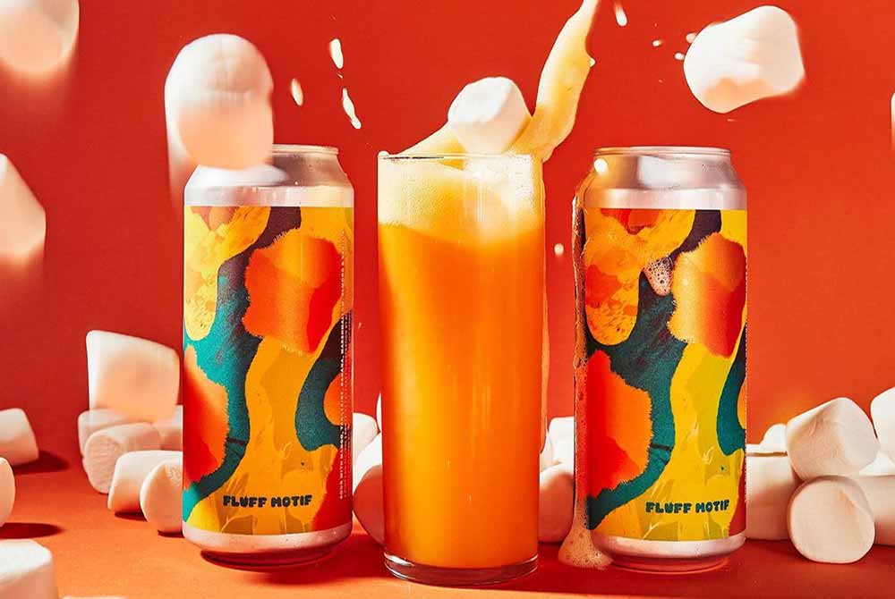
Photography courtesy of Two Tides Brewing Co.
Fluff Motif from the crew at Two Tides is one of our favorite labels of 2021. It has the perfect aesthetic feel for one of our favorite series of Fruited Marshmallow Sours. A combo of abstract ‘mallows with a stream of vibrant metallic colorways adds up for a visually amazing package. If we close our third eye, we can see ourselves floating on one of those cubed-mallows, drifting our way through beautiful downtown Savannah, and then landing at the Two Tides Taproom just in time to help James and Liz pick only the fluffiest of mallows for this year’s Marshmallow Selection, and then they pour us a big ole glass of Fluff Motif just as the sun sets, but guess what? That sun is actually the biggest and fluffiest marshmallow we’ve ever seen and it’s all thanks to TWO TIDES!! DAMN WHAT A TIME TO BE ALIVE!!!
Fate’s Reflection
Tactical Brewing Co. – Orlando, FL
Art by Veronica Steiner aka VSTEINER (@v.steiner) and Schiani (@sleds)
Submitted by: The Hop Culture Team
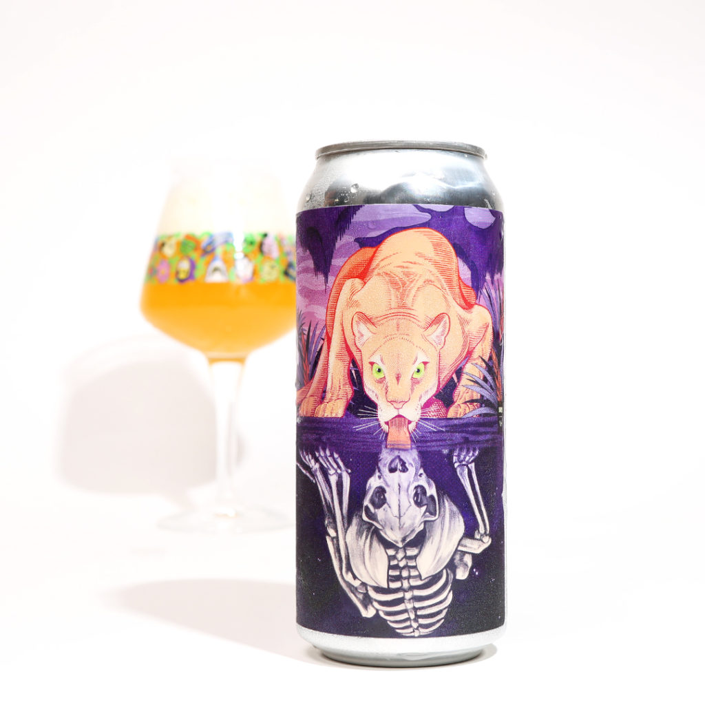
Photography courtesy of John A. Paradiso
Honestly, this beer label blew our minds. Have you seen it!? The artwork sent shivers down our spine. The designs at this Orlando-based brewery are just so point. In fact, Tactical Brewing earned a spot on our Best Beer Labels of 2020 list for Guavango Montoya, an homage to the 1980s cult classic movie The Princess Bride.
Whereas Guavango Montoya illustrated a playful pop culture reference, Fate’s Reflection stopped us in our tracks with a mind-bending rendition of the classic Greek myth of Narcissus.
Brewed in collaboration with Freehand Goods this Florida weisse fruited sour includes grilled pineapples, Florida honey, and oranges. Plus, a portion of the proceeds benefited Back to Nature Wildlife Refuge that rescues, raises, rehabilitates, and releases Florida native species.
Created in tandem by Freehand’s artist and wildlife surrealist Veronica Steiner aka VSTEINER (@v.steiner) and Tactical’s in-house artist Schiani (@sleds), Fate’s Reflection replaces Narcissus with a Florida Panther.
A nod to the fact that the Florida Panther population is dwindling, Fate’s Reflection reflects the Orlando-based brewery’s terroir in everything from the label to the beer.
Gift of Arrakis
Our Mutual Friend Brewing – Denver, CO
Art by Sam Taylor
Submitted by: The Hop Culture Team
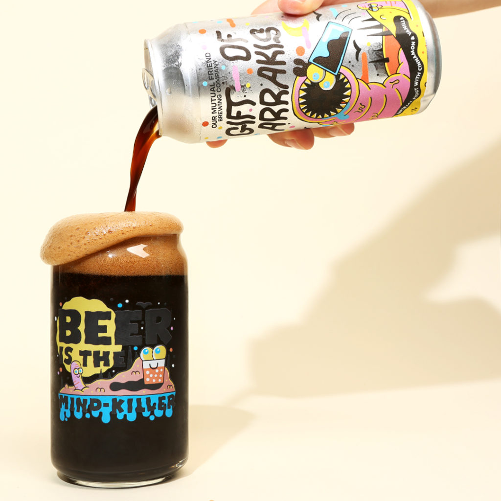
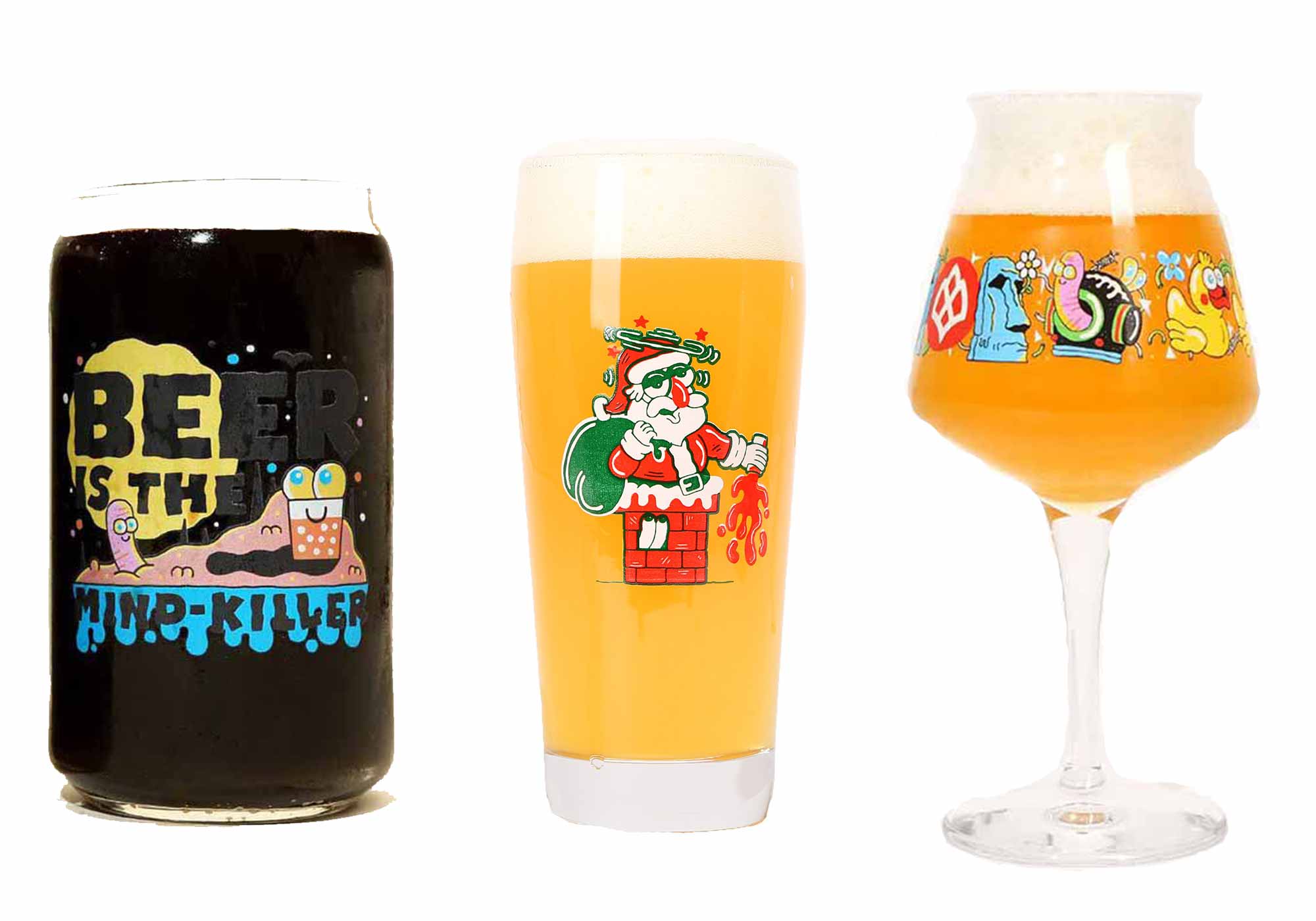
Photography courtesy of John A. Paradiso
I must not fear. Fear is the mind-killer. Fear is the little death that brings total obliteration. I will face my fear. I will permit it to pass over me and through me. And when it has gone past, I will turn the inner eye to see its path. Where the fear has gone there will be nothing. Only I will remain. – Lady Jessica from Dune by Frank Herbert
This is a deep cut for those who are science fiction fans. Back in October during the Great American Beer Festival we released a beer with Our Mutual Friend called Gift of Arrakis. Graphics designed by our friend and British confidant Sam Taylor, mimic the infamous human-eating worms that plague the planet of Arrakis.
Taylor once again nailed it with his quirky yet terrifying take on this seminal tome that we transformed into a beer.
Big Atlanta Energy
Wild Heaven Beer – Avondale Estates, GA + Switchyards Neighborhood Work Clubs – Various Locations, GA
Art by Alvin Diec and Family Bros.
Submitted by: Rachel Eleanor – Artist for Good Word Brewing & Public House, Best Beer Label 2020 Winner for We Are America
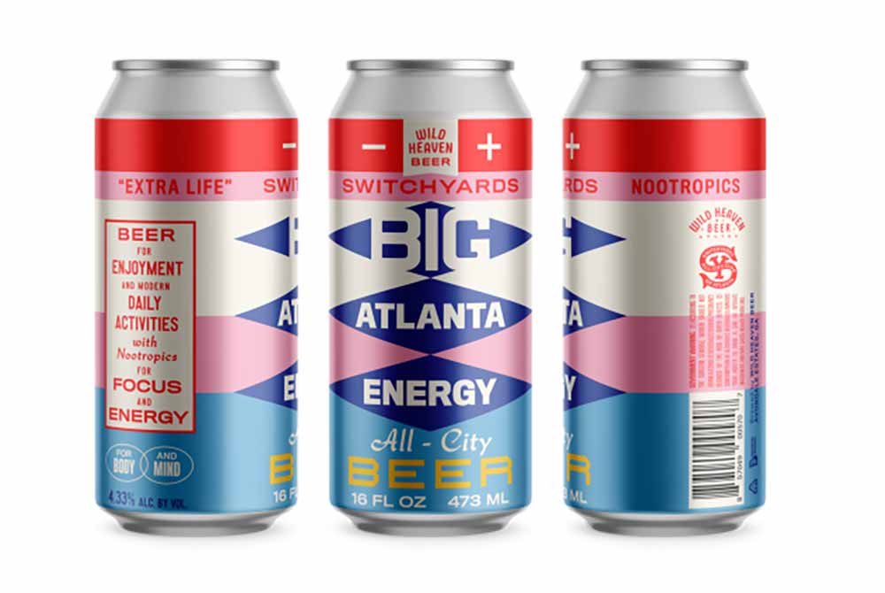
Photography courtesy of Wild Heaven Beer
My pick is Big Atlanta Energy, a collab between Wild Heaven Beer and Switchyards, a neighborhood work club with various locations around Georgia. I work out of Switchyards and stopped in my tracks when I saw this collab can.
As an illustrator who tends to get pretty detailed, textural and swirly-twirly with my own work, I always admire sleek, graphic and type-forward designs. So not my specialty, and therefore so very attractive to me. Punchy colors and bold, nostalgic typography make this can my pick for favorite beer label design of the year.
UNA FRÍA
Novel Strand Brewing Company – Denver, CO
Art by Paul Vismara
Submitted by: The Hop Culture Team
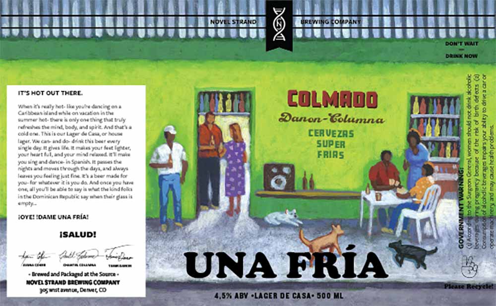
Illustration by Paul Vismara
BIPOC-owned Novel Strand Brewing Company, one of our 20 most underrated breweries of 2020, brewed this house lager for the first time in 2021. Made with German malt, Bierstadt Lagerhaus lager yeast, and Riwaka hops from New Zealand, UNA FRÍA is super crushable, “with just a tiny bit of magic,” writes Tamir Danon, co-founder of Novel Strand, in an email to Hop Culture.
Co-Founder Chantel Columna’s nephew in the Dominican Republic (DR) inspired the beer. As Danon tells it when Columna’s nephew first started to talk he kept muttering what sounded like ‘una fria’ or ‘cold one’ in Spanish. In the DR using that phrase is how you ask for a beer. “It was adorable and we knew right away the name of the beer,” writes Danon.
Novel Strand’s current artist Paul Vismara drew this vibrant illustration of characters enjoying a beer. “He did wonderful work capturing the energy of a Dominican bodega, or colmado, which sell anything from fruit to food to household items, and of course, cold beer,” writes Danon. “We believe great beer crosses cultural boundaries with ease, and UNA FRÍA does that by combining elements of traditional German lager, new age NZ (sic) hops, and a little Caribbean flare.”
Indikator
Schilling Beer Company – Littleton, NH
Art by Franny Cozzens
Submitted by: Matthew Wiley – Artist for Flying Machine, Best Beer Label 2020 Winner for Lagerish
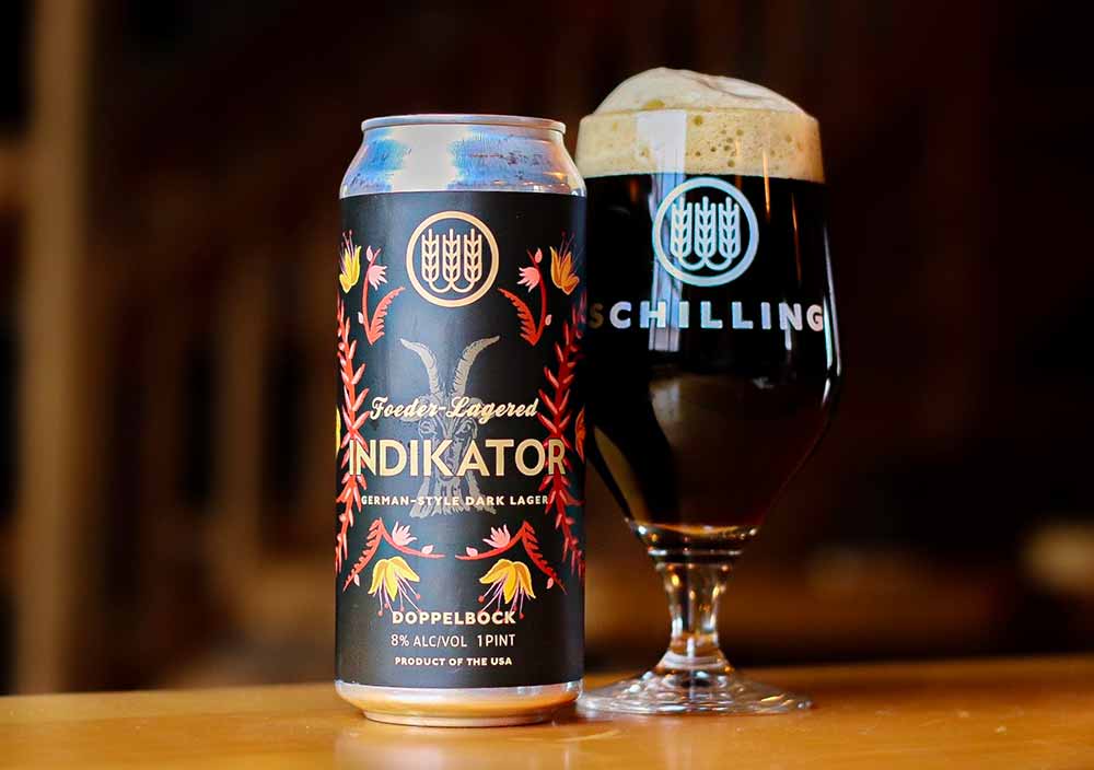
Photography courtesy of Schilling Beer Co.
According to Schilling’s Head of Sales and Marketing, Zac Porter, Indikator is extremely meaningful to the brewery because the owner’s daughter Franny Cozzens hand drew all of the artwork for this label.
“Indikator does a wonderful job of balancing its rustic elements of traditional bock imagery, soft color palette and hand drawn lines with its striking contemporary mirrored composition and bold sans serif font,” writes Matthew Wiley, an artist whose work at Flying Machine nabbed them a spot on our Best Beer Label list last year for Lagerish, in an email to Hop Culture. “I suppose I admire Indikator for a lot of the same reasons I admire Schilling as a whole. Their harmonious blend of old world tradition and sleek modern appeal lovingly encapsulated in Indikator’s hand crafted design.”
Sumac Gose
Back Home Beer – Brooklyn, NY
Art by a Female Iranian Artist
Submitted by: The Hop Culture Team
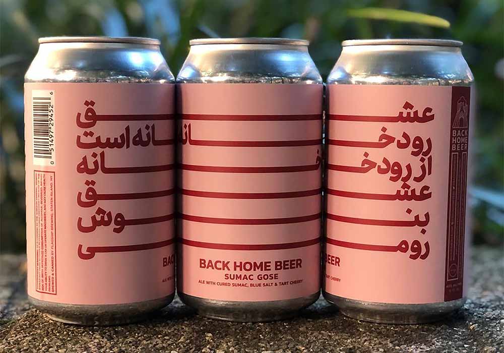
Photography courtesy of Back Home Beer
The label on Sumac Gose represents the first beer commercially sold by this Iranian and women-owned brewery. Founded by Zahra Tabatabai, Back Home Beer focuses on flavors and art from Iran and the Middle East.
The daughter of Iranian immigrants whose grandfather homebrewed in Iran in the 1950s and ‘60s, Tabatabai started Back Home Beer to share the rich history of brewing in Iran.
With that in mind, Tabatabai brews with Iranian ingredients like sour cherries, sumac, and more. She also features artwork from a young female Iranian graphic designer.
According to Tabatabai it’s tough because the artist is a bit afraid to advertise her work while she still lives in Tehran, Iran. Currently, women in Iran still suffer from systemic oppression and inequality. Making it even more incredibly important for Tabatabai to illustrate her heritage and empower women both inside and outside the can.
One of actually three labels in the “poetry series” this artwork stands out for being simple yet incredibly bold and beautiful.
Noble Friend
Unseen Creatures Brewing & Blending – Miami, FL x Civil Society Brewing Co. – Jupiter, FL
Art by @probokosyi
Submitted by: Ignacio Montenegro – Tripping Animals, Best Beer Label 2020 Winner for Steamin’ Key Lime
Photography courtesy of Unseen Creatures
“Lately, one of the label art executions that I have been enjoying the most is from a brewery called “Unseen Creatures.” Among all their labels, I will choose their “Noble Friend” , a collaboration beer they did with Civil Society,” says Ignacio Montenegro, Co-Founder of Tripping Animals, who won Best Beer Label 2020 Winner for Steamin’ Key Lime.
Made to celebrate friendship, Noble Friend combines Unseen Creatures’ characteristic animals with Civil Society’s penchant for friends, family, making memories, and a love of hops. “The guys at Civil Society are some of our best friends and they have been so gracious with their time and helpful to us during COVID,” writes Marco Leyte-Vidal, co-owner of Unseen Creatures, in an email to Hop Culture. “This label was drawn up to be a symbol of strength of our friendship and to memorialize our brewery’s appreciation for and love of those guys.”
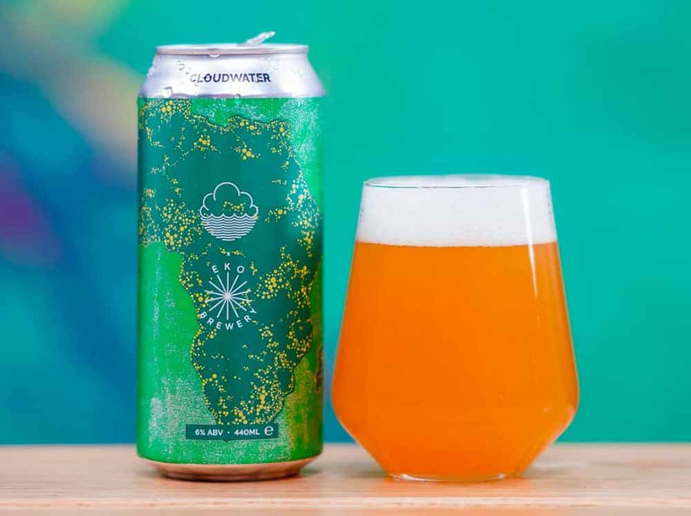
Embracing Otherness
Eko Brewery – London, England x Cloudwater Brew Co. – Manchester, England
Art by @textbookstudio
Submitted by: The Hop Culture Team
Photography courtesy of Eko Brewery
The Co-Founders of Eko Brewery Helena and Anthony Adedipe started the London-based brewery to highlight traditional African brewing techniques and ingredients.
This collab with Cloudwater Brew Co. called Embracing Otherness invites folks to embrace something outside of their comfort zone.
Whether that’s a BIPOC-owned brewery, a queer-owned brewery, a women-owned brewery, a veteran-owned brewery, an Indigenous-owned brewery, or really anything that pushes the boundaries of the craft beer industry.
The beer was part of a bigger initiative called Beer With Big Ideas Collaborative Pack that featured four beers aimed to be a platform to deliver needed changes to both the industry and wider society
Helena and Anthony hope showcasing their own African culture through their beer and artwork will bring new conversations to the table.
Embracing Otherness’ label elegantly illustrates the continent of Africa, a theme you’ll find throughout pretty much all of Eko Brewery’s artwork. “I got the inspiration from looking at a NASA image of Africa at night,” writes Anthony in an email to Hop Culture. “What you can see on the label is an exaggerated representation of the light pollution at night.”
Again, this is a simple, yet powerful way of sending a message.
Drawn & Quartered
Nightmare Brewing Company – Bay Shore, NY
Art by Alexandros Pyromallis
Submitted by: Maryssa Pickett – Artist at Resident Culture Brewing Company, Best Beer Label 2020 Winner for Out to Pasture
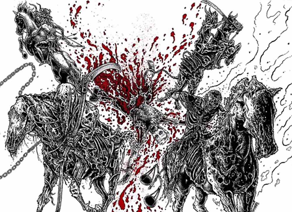
Illustration courtesy of Alexandros Pyromallis
Torn limbs, reapers, chains, and decaying flesh – this piece has it all. I was really excited and honestly inspired when I saw the absolutely gnarly ink work on this label. It’s intricate, it’s grotesque, and YEAH, it makes me want to drink this beer in a graveyard (DUH). There is a certain life that hand drawn lines have that you cannot replicate fully through a single program out there, this label is PROOF, and if you disagree you’re lying to yourself! And if you think that’s something an old person would say, well guess what – I’M NOT OLD YET!
Sunshine Felt Like Rain
Divine Barrel Brewing – Charlotte, NC
Art By: Dave Kaminsky
Submitted by: The Hop Culture Team
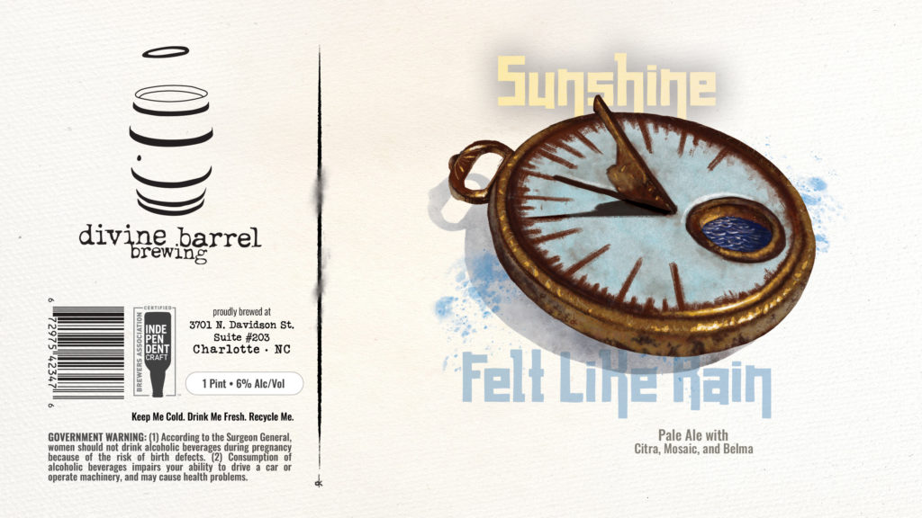
Divine Barrel’s artist and designer Dave Kaminsky has drank and drawn his way around Charlotte, designing labels for Salud Cerveceria and Heist Brewery along with Divine Barrel. His labels have a sense of almost dry, playful wit balanced with nostalgia. Take Sunshine Felt Like Rain. This Hazy Pale Ale brewed and double dry-hopped with Citra, Mosaic, & Belma is meant to mimic notes of orange creamsicles, pink Starbursts, and juicy mango, but the label forgoes the easy route of illustrating these flavor notes and instead features what appears to be a sundial in a puddle after its rain. Makes us question what it means for sunshine to feel like rain. So it’s no surprise that this label won first place in the category of “Pale Ales” in the North Carolina Brewer’s Guild Label Insanity Label Art Competition. It’s one that we’ve been discussing a long time after we finished the beer.
Industrial Devolution Triple IPA
Vitamin Sea Brewing – Weymouth, MA
Art by Dean McKeever
Submitted by: Rebekah Smith – Wiley Roots, Best Beer Label 2020 Winner for Imperial Somethin’ Got Played In The Mail
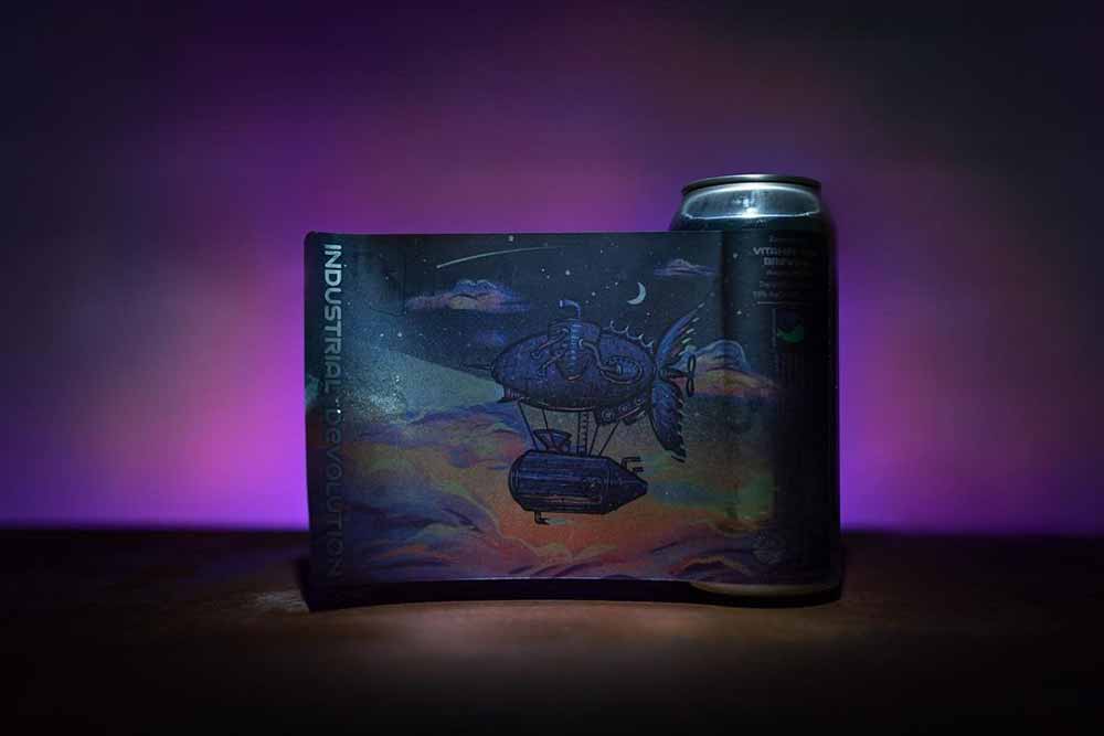
Photography courtesy of Vitamin Sea Brewing
It’s no surprise that Rebekah Smith from Wiley Roots, who won a Best Beer Label award last year, picked the illustration on Vitamin Sea’s Industrial Devolution Triple IPA.
Founder Dino Funari and his team work with Dean McKeever, whose epic illustrations have made their way onto labels at major Massachusetts breweries such as Vitamin Sea and Tree House.
“We really like how whimsical the design is and the artist’s use of color and shading,” writes Smith in an email to Hop Culture. “It looks like a true art piece, rather than just a beer can label.”
Canvas
Foam Brewers – Burlington, VT
Art by Monroe Cromis aka @monroepaints
Submitted by: The Hop Culture Team
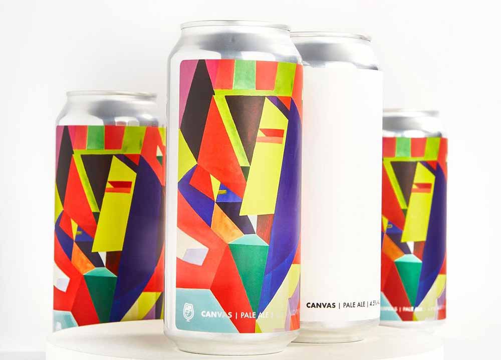
Photography courtesy of Foam Brewers
Every four months the team at Foam Brewers pores over art submissions, choosing one to become the new face of their series called Canvas.
Most recently, Monroe Cromis (@monroepaints) won the 2021 Summer Canvas Contest. According to an Instagram post from Foam, “Monroe Cromis is from Bristol, VT where she started drawing in her Mom’s back seat. She has been creating ever since, determined to offer an additional lens to see the world, through color and shape.”⠀
Cromis composed a stunning composition of both colors and shapes across this can. What could have been a jumbled jargon somehow all fits together.
This illustration almost perfectly encapsulates what Foam is going for here. As Hop Culture freelancer Andy Krump wrote recently in a piece on the 10 Beers We Were Most Thankful for this Year, “Canvas demonstrates community as a living, breathing organism, something that we all invest in to make every visit to the brewery one worth remembering.”
This is a can we’ll be remembering for a long time. Or at least for the next four months until Foam releases the design from the next feature artist!
Pepper
The Eighth State Brewing Company – Greenville, SC
Art by Hannah Hunt
Submitted by: Makenna Barris – Pure Project, Best Beer Label 2020 Winner for #ISO
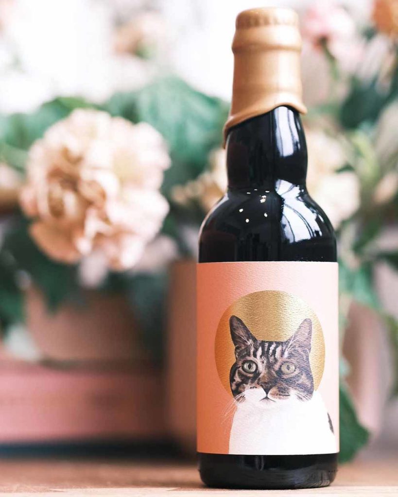
Photography courtesy of The Eighth State Brewing Co.
“Obviously amazing, an homage to the brewer’s angelic pet cat,” writes Director of Marketing of Pure Project Makenna Barris in an email to Hop Culture. Last year we named Pure Project’s #ISO one of the Best Beer Labels of 2020 because it’s Matrix-like realness spoke to us.
Just like The Eighth State’s Pepper spoke to Barris. The 13.8% ABV barleywine is dedicated to Head Brewer and Co-Owner Cameron Owen’s four-legged feline friend, Pepper.
“When thinking about these labels, I wanted to come up with a way to pay tribute to the animals that inhabit my life,” writes Owen in an email to Hop Culture. Owen and his fiancé actually have seven furbabies including six cats and one dog.
So he created a series especially for all his four-legged friends in the order they joined the family. “I try to create a beer that revolves around the idea of what the animal would be in beverage form,” writes Owen. In Pepper’s case a barleywine blend of sixty percent apple brandy barleywine with forty percent double barrel-aged barleywine. Plus an infusion of Pompona vanilla beans.
You know how much we love animals at Hop Culture. We’ve given love to all animals from dogs (Hop Culture Managing Editor has a beloved pup of her own) and cats (Hop Culture Founder Kenny Gould has two of his own named after Cinderlands beers) to fishes and everything in between. So this exquisite rendition of Pepper earned a spot on our list of best beer labels of the year.
Sfizio
Fort Point Beer Co. – San Francisco, CA
Art by Dina Dobkin and Manual
Submitted by: The Hop Culture Team
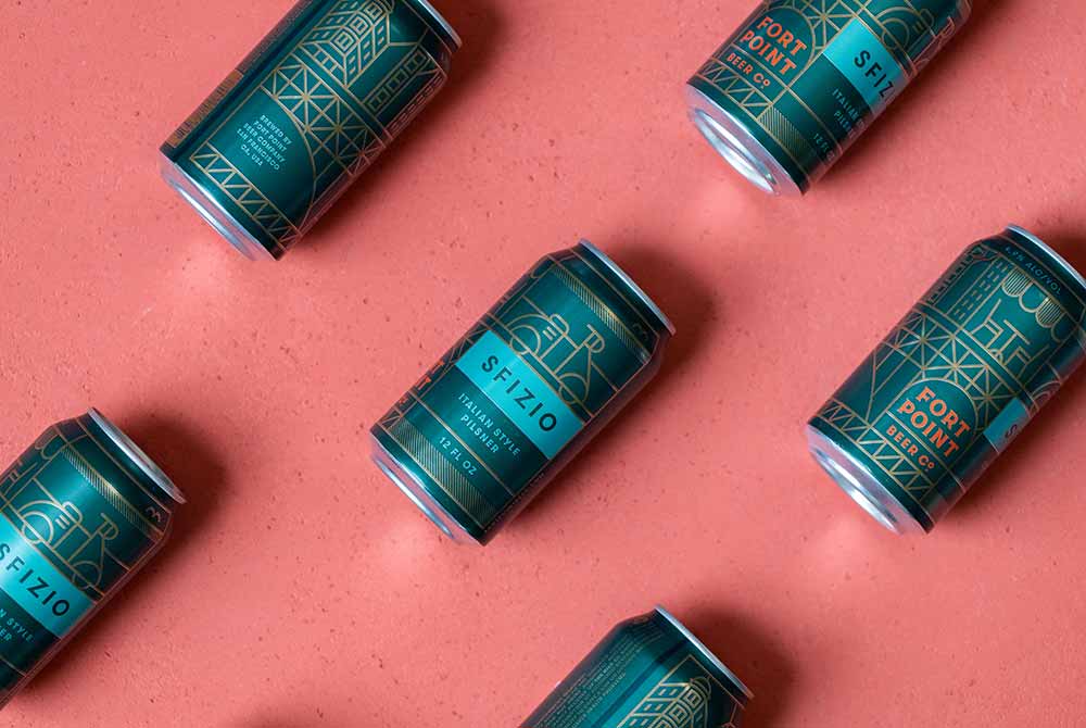
Photography courtesy of Fort Point Beer Co.
Architectural design at its highest (see what we did there). Fort Point Beer Co. has always impressed us with the brand’s clean lines and bold colors. We first tried Sfizio for a piece we wrote on Italian pilsners. We loved the liquid, but were captivated by the alluring deep pine green of the can.
Reeling us in for a closer look, the sea of cyprus cleverly parted to reveal subtle gold lines constructing nods to the beer’s Italian heritage. According to Dina Dobkin, chief brand officer and co-founder of Fort Point Beer Co., the team wanted to recognize San Francisco’s “Little Italy” neighborhood of North Beach.
They traveled to iconic North Beach spot, Vesuvio Cafe, for a brainstorming session. There, the team came up with the name Sfizio, an Italian word for “indulgence” or “something you might not need, but you still want”.
Additionally, Dobkin picked out landmarks she wanted to feature including The Sentinel Building (aka Columbus Tower), “a beautiful copper-clad building that really marks that transition from downtown to North Beach,” writes Dobkin in an email to Hop Culture.
Look even harder and you’ll notice an archetypal Italian scooter. Manual, a San Francisco-based branding and design studio Fort Point often works with on projects, came up with that idea.
“The final can shows a triptych that tells a story of a day in North Beach,” writes Dobkin. “You’re walking through the skyscrapers downtown and get pulled into North Beach when you see the Sentinel building, run into a friend and grab an Italian pilsner at an outdoor cafe, and then…you get whisked away by a friend on a scooter.”
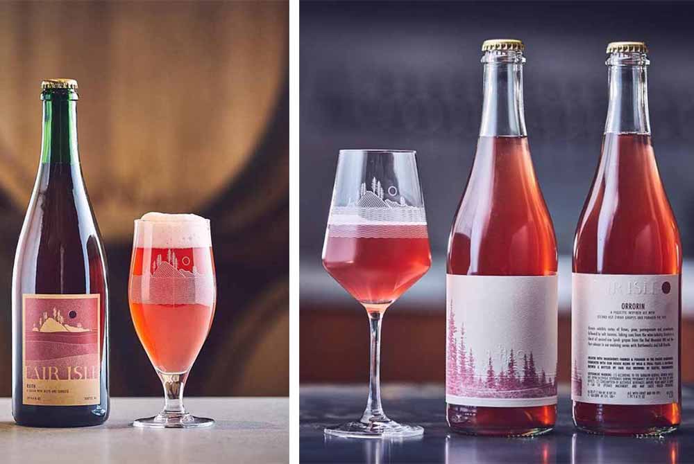
Orrorin and Reith
Fair Isle Brewing – Seattle, WA
Art by Andrew Pogue inspired by Joshua Cockrell
Submitted by: Makenna Barris – Pure Project, Best Beer Label 2020 Winner for #ISO
Photography courtesy of Fair Isle Brewing Co.
“Fair Isle Brewing anything… Orrorin or Reith. They’re classy, elegant, and love the nod to their Pacific Northwest home,” says Barris.
Fair Isle worked with Joshua Cockrell, the artist behind many of Jester King’s labels, to launch the brewery’s initial logo and branding. Since then Owner Andrew Pogue has iterated on that foundation, exploring new colorways for beers like Reith and new label families like Orrorin. “Like our beer, we explore layering, textures, and subtle but intentional uses of colors,” says Pogue. “Orrorin uses an emboss of our logo, layered with a digital press of a photo from the day of foraging fir tips that we used in the beer.”
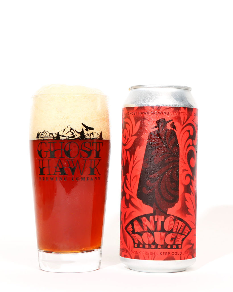
Fantôme Rouge Grand Cru
Ghost Hawk Brewing Company – Clifton, NJ
Art by Steve Bauer
Submitted by: The Hop Culture Team
Photography courtesy of John A. Paradiso
Do you feel a haunting tingle at the back of your neck? There’s something mysterious going on with this label, pulling us in.
Ghost Hawk Co-Founder Steve Bauer does all of the artwork himself.
Once Brewmaster Chris Sheehan named this beer Fantôme Rouge (“Red Ghost” in French) as a nod to the Pinot Noir barrels he used to partly age the Flemish sour red ale, Bauer went to work. “I automatically thought of some kind of spectre or mysterious character in the shadows. Like something out of an old James Bond flick” writes Bauer in an email to Hop Culture.
Bauer also took inspiration from the old Sandeman logo, a brand of Port and Sherry wines founded in 1790. For final touches he added a French wallpaper pattern along with a bird on the figure’s shoulder.
Birds, but specifically hawks play an especially important role at Ghost Hawk, one of our top breweries to visit in New Jersey.
The brewery is dedicated to Bauer’s brother Danny, who loved Red-Tailed Hawks. It was an appreciation carried over from lessons their dad taught them on deep-woods hiking and camping trips as kids. Danny passed away in 2016. On that day Steve visited a place where his dad used to take him and his brother fishing. While he stood there a Red-Tailed Hawk circled overhead.
Since opening the brewery doors in 2019 Steve writes on Ghost Hawk’s website that, “I have been seeing that “ghost hawk” in the strangest and oddly significant times and places.” To this day a hawk regularly visits and circles the brewery.
It’s a story that gives us goosebumps. Much like this label.
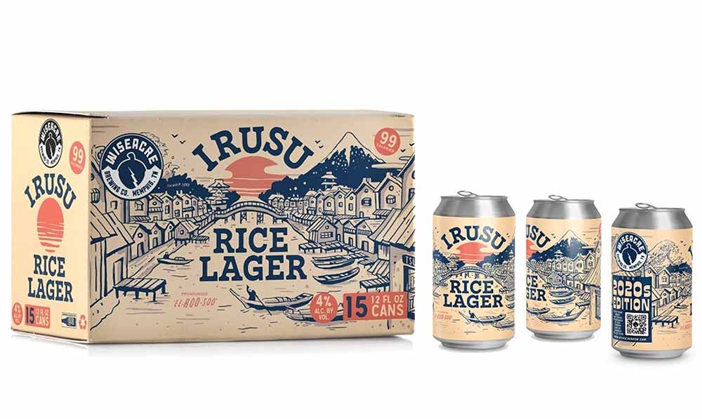
Irusu
WISEACRE Brewing Company – Memphis, TN
Art by Rachel Briggs
Submitted by: Jen Adams – Tröegs Independent Brewing, Best Beer Label 2020 Winner for Haze Charmer
Photography courtesy of WISEACRE Brewing Co.
My pick for best 2021 beer label design is by Rachel Briggs. Her design for Irusu a rice lager brewed by WISEACRE Brewing in Memphis is super-awesome.
The beer was inspired by Wiseacre brewmaster/founder’s magical trip to visit a friend in Japan where he fell further in love with the country and was inspired by the Japanese tradition of dry rice lagers.
I love a beer with an inspired storyline and art that brings the story to life. Rachel did a great job making sure the beer name and style are really bold and sure to standout (crucial within today’s crowded virtual and physical beer shelves) while perfectly complementing the beautiful landscape illustration inspired by ukiyo-e woodblock art.
Nods to the calories, ABV and pronunciation are subtle yet effective. The color palette is also really fresh and lovely. Memphis is on my road trip wishlist and now I’ll be sure to also check out Wiseacre for a pint of Irusu!
Schmoojee MangoRex
Imprint Beer Co. – Hatfield, PA x Flying Facility – Weymouth, MA
Art by Luiz Berger (@luizberger)
Submitted by: The Hop Culture Team
Photography courtesy of John A. Paradiso
Schmoojee, Schmoojee, Schmoojee. Try saying that three times fast. We’ll keep trying because what an amazing word. A collab between Imprint Beer Co. and Flying Facility (a contract brand that evolved into its own brewery called Juicy Brewing soon to open in Northern Virginia), Schmoojee MangoRex is a heavily fruited sour ale brewed with mango, dragonfruit, and coconut.
“The name of the beer is a T-rex kind of creature that loves consuming mangos,” says Anton Sagan, co-founder of Flying Facility / Juicy Brewing. “And in general that kind of fruit combo – mango, coco, and dragonfruit – is what you want to drink at an island inspired vacation.”
We equally enjoyed the label as much as we enjoyed saying the name. This artwork from Brazilian artist Luiz Berger, much like the beer, is just an explosion of crazy colors and characters.
And at the center of it all? A badass T-Rex. Just chillin’ as mayhem erupts around him. Having the time of his life as the world appears to be heading for an apocalypse. That might not be the true story of how dinosaurs went extinct but it’s pretty boss.
Surfbird
Gunwhale Ales – Costa Mesa, CA
Art by Bobby Fitzgerald
Submitted by: Brian Mercer – Brouwerij West, Best Beer Label 2020 Winner for Hollywood Acid
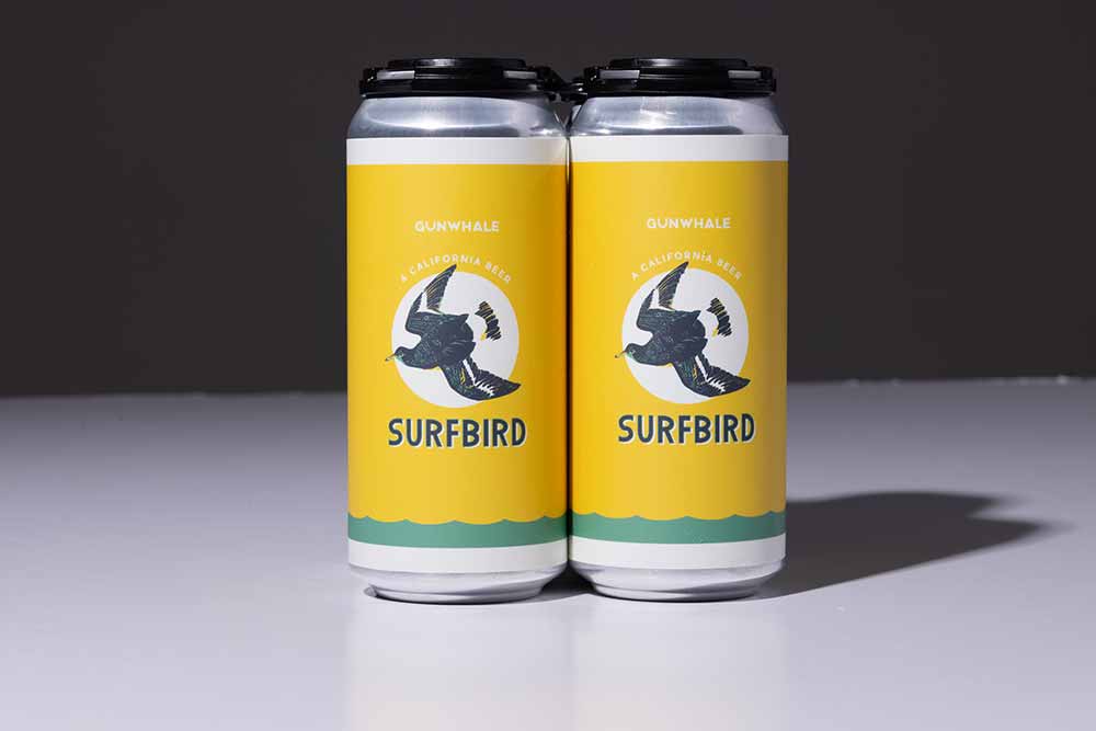
Photography courtesy of Gunwhale Ales
It sure was hard to pick a favorite label. There are so many wonderful labels out there these days, but ultimately we did find one we really couldn’t seem to get enough of. The beer is awesome too!
May we suggest Surfbird from Gunwhale Ales in Costa Mesa, CA.
We love that Gunwhale’s label art is designed in-house by co-owner Bobby Fitzgerald, who is a video game designer by trade. The Surfbird label art evokes a warm mid-century California/The Endless Summer vibe from the sunny background, the detailed etchings on the namesake bird, and the hand-drawn “store-front” retro font. The wash of sea green modernizes the label and complements the theme nicely.
Save the Robots
Radiant Pig Craft Beers – New York, NY
Art by Rob Pihl
Submitted by: The Hop Culture Team
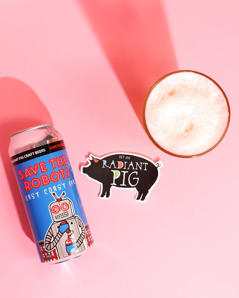
Photography courtesy of John A. Paradiso
Brewing may be a technical profession but any brewer worth his or her salt will describe it as a blend of art and science. And Radiant Pig, a brewery started by a former art student in his tiny Brooklyn apartment, seems to have found the perfect words to describe this mashup: liquid art.
As liquid artists, Radiant Pig respects art across all its mediums, from labels inspired by New York street art to the delicious beer itself.
Balancing art and science is not a tricky task, but rather a labor of two loves for Rob Pihl, Creative Director and Founder of Radiant Pig. And Radiant Pig is a shining example of what happens when art and science come together as one.
“We look at everything as a form of artwork from the inside out,” says Pihl. “The liquid, the labels, we like to think of what we do as creating little 16oz works of art.”
Vibrant and cheeky, Radiant Pig’s designs include a bit of a graffiti-street-art edge. For example, their flagship Save the Robots features a bright blue background with a robot pouring himself a beer from a tap handle in his chest. It’s a quirky commentary on the future of craft beer. Honestly, how far away are we from robot servers pouring beer directly from their chests!?
Art is as much a part of the beer that runs through Radiant Pig’s veins as the beer itself. And that’s why we love this label.
Outraged Daughters
Wise Man Brewing – Winston Salem, NC
Art by Fredo Felix
Submitted by: The Hop Culture Team
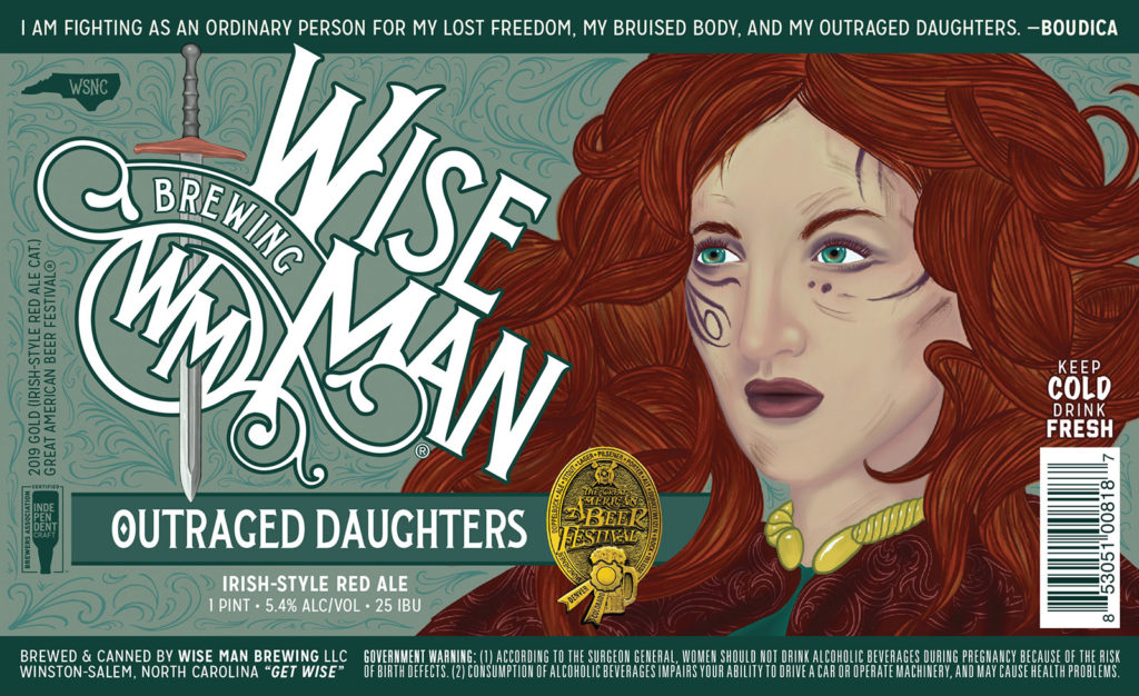
While we love beautifully designed and illustrated labels, we respect breweries that take space on their can to deliver a message. Art has the power to change the world and beer has become a platform to reach thousands with powerful points.
Take the label from Wise Man Brewing’s Outraged Daughters, an Irish-Style Red Ale. While you may originally just see the face of a woman, read the quote, and dig a little deeper here.
The label features a likeness and words from Boudica, an ancient British queen who in 60 CE single-handedly led a revolt against Roman rule. Boudica is often immortalized as a courageous warrior who fought for freedom from oppression. “I am fighting as an ordinary person for my freedom, my bruised body, and my outraged daughters,” said Boudica. We couldn’t have said it better ourselves and applaud Wise Man for devoting a beer to this unsung hero.
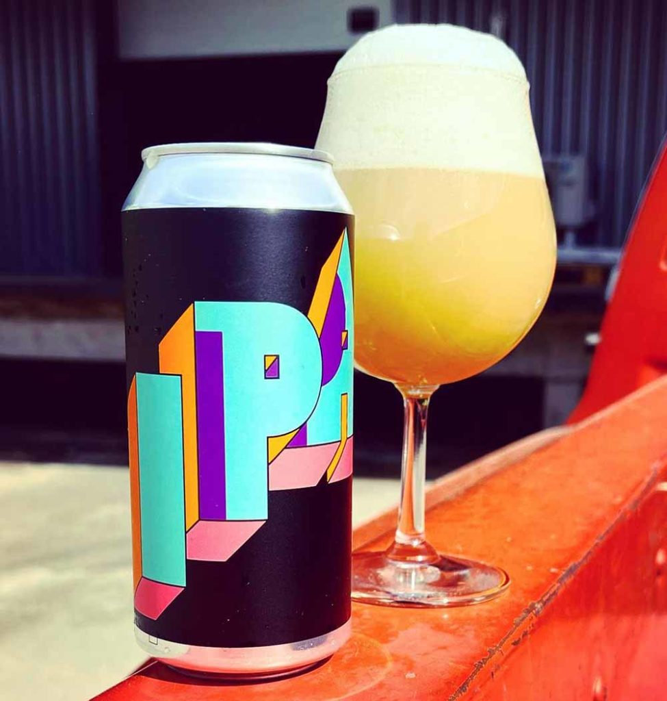
Lorpan IPA
Omnipollo – Stockholm, Sweden
Art by Karl Grandin
Submitted by: Lee DeGraw – Humble Sea, Best Beer Label 2020 Winner for Gnarcholas Cage
Photography courtesy of Omnipollo
“Omnipollo consistently blows my dome off with their designs,” writes Lee DeGraw, head of marketing at Humble Sea Brewing Co, winner of Best Beer Label 2020 for Gnarcholas Cage.
We couldn’t agree more, Lee! Omnipollo’s seemingly simple designs (like a smiley face, feather, or piece of cake) get boosted with incredible kaleidoscopes of color.
In this case just the letters I-P-A exploded off the jet black can (a bit of a signature for this Swedish brewery) in bright blue, orange, purple, and pink off a jet black can.
And we thought breweries were reaching the limits of innovating with IPAs. Not today Satan, not today.
Coast to Coast
TrimTab Brewing Co. – Birmingham, AL
Art by Brad Reed
Submitted by: The Hop Culture Team
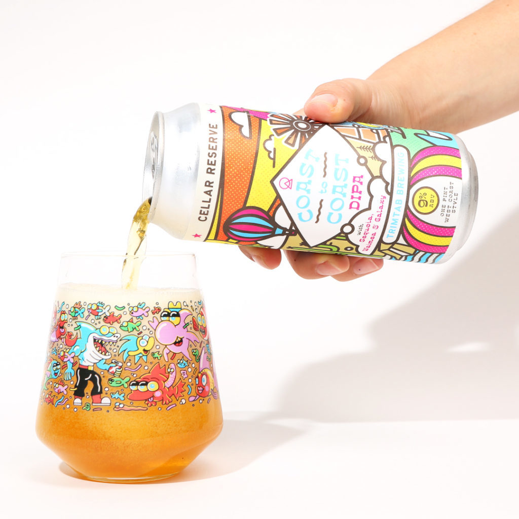
Photography courtesy of John A. Paradiso
Here’s what we love about this TrimTab beer: It celebrates a love of IPAs from ::cough:: coast-to-coast ::cough::.
Do West Coast IPAs or East Coast IPAs reign supreme? We’re sure everyone has their own opinion, but at least while you’re drinking this beer we’re meeting in the middle. TrimTab describes this Cellar Reserve DIPA as having the pillowy mouthfeel of a West Coast IPA combined with a punch of East Coast citrus.
Likewise the label seems to just invite travel. Or as the label says, “Create A World You Love”.
And in a year where we admit we couldn’t get (off our couch much less) out the door and on a plane as much as we used to, this label took us to new heights. From the hot air balloons, waves, and cactuses of the west to the pine trees, lighthouses, and boardwalks of the east, Coast to Coast took us on a ride. One we never wanted to get off.
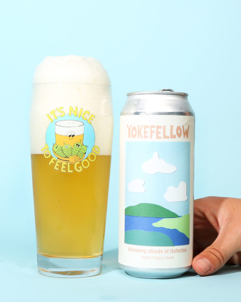
Billowing Clouds of Hallertau
Yokefellow – Johnson City, TX
Art by Garrett Crowell
Submitted by: The Hop Culture Team
Photography courtesy of John A. Paradiso
Remember that third grade drawing you took home to your parents? The one they proudly taped on the fridge because they truly believed you were the next Monet? That’s Yokefellow’s Billowing Clouds of Hallertau. And we mean that in the best way possible!
The simple landscape of green mountains, blue rivers, and white fluffy clouds is one we want to jump into and live in. It’s hard not to fall in love with this idyllic, peaceful, and pastoral illustration from Yokefellow Head Brewer and Founder Garrett Crowell. It’s a breezy design for a breezy beer.
You’ll find these clean, bucolic cutouts across all of Yokefellow’s artwork. “I used paper paint swatches, cut them out with an x-acto knife, and glued them up on a piece of base paper, scanned it, added a bit of digital text and sent it off to print. ” writes Crowell in an email to Hop Culture. “Nothing real fancy or complicated. The image is just a simple effort to conjure a scene I’d typically like to find myself in, especially if I’m drinking a beer like billowing clouds.”
This was the first label and beer Crowell designed for Yokefellow, setting the tone for the brewery’s idea of “easy drinking beers of companionship”. Yokefellow harkens back to simpler times. Here’s to hoping 2022 will bring brighter vibes.
Oh and, Crowell stitched this design onto an awesome dad hat too.