Shop
Are These the Most Beautiful Beer Cans in Massachusetts?
When being superficial about beer looks great.
A Pint with Natalie Cilurzo
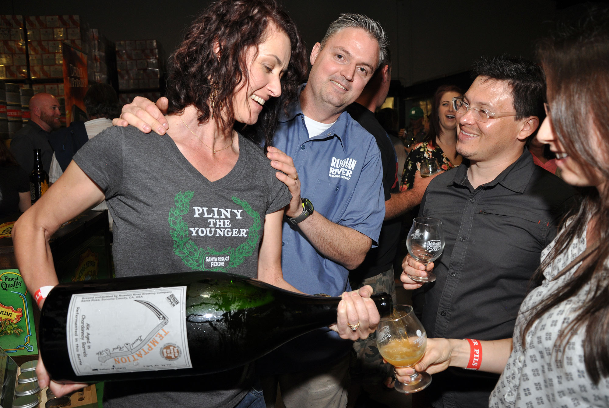
The co-founder of Russian River Brewing talks about naming the world’s greatest beer.
Making beer is one of the purest and tastiest forms of art many of us encounter on a regular basis. There’s the mental act of conceiving of a new recipe and the physical balance of strength and finesse involved in actually brewing a beer. And of course, there are the labels — actual, tangible, consumable pieces of mass-produced art.
Knowing all the labor — physical, mental, and otherwise — that goes into getting a beer into a tap lineup or onto a store shelf, it can be trite to say that the label matters. But of course, in a world as social media obsessed as ours, oftentimes the label is the only thing that truly does.
In a world as social media obsessed as ours, oftentimes the label is the only thing that truly does.
Which is totally fair. Consumers are presented with a dizzying array of options when seeking that next beer to drink. Many of them don’t have the time, understanding, or vocabulary at their disposal to ask all the questions needed to find the perfect fit. So we do what we always do: We rifle through a barrage of pictures and pick the one we like best. Online we “like” it. At the beer store, we buy it and drink it.
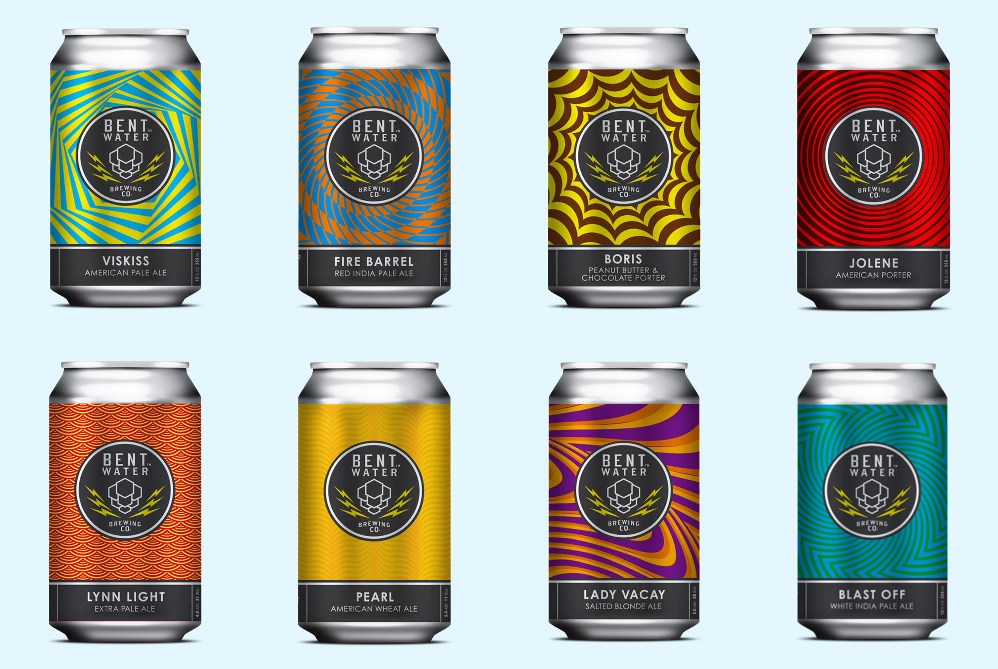
Interestingly, in the hundreds of conversations I’ve had with people here in Massachusetts about what beer they’re digging right now, one brand seems to pop up time and again. It’s a relatively new outfit in Lynn, about 30 minutes north of Boston, called Bent Water Brewing Co.
“Our motto is, ‘All for beer. Beer for all.’ and this extends to our labels,” one of the founders, Aarom Reames, told me. “Geometric shapes and bright colors are inviting to people of all walks of life and all ages. The mathematical patterns are simple yet sophisticated, while making a connection to our science and technical roots. We hope the labels are fresh, scream fun, and that there is a design that speaks to everyone.”
Not to be hyperbolic, but I think they might be the most visually appealing beer cans in the entire state.
Their motif is a variation on a common theme: The logo in a black circle in the middle of the can, surrounded by a brightly colored geometric pattern wrapping all the way around that hints at the liquid within — orange for a wheat beer, red for a red IPA, etc. — designated at the bottom in bold white writing on a black background.
“The concept is the brain child of our close friend and partner Mike Shaughnessy, an artist, partner and close friend who works in the advertising industry,” Reames added. “Our children have grown up together and all of the founders spent countless hours together brewing in my garage. The current label concept was not the first iteration, however, we knew it was one that fit all of our personalities.”
They are as pleasing to the eye as they are jarring, at once simple and complex. And they seem to be working.