Shop
Our 17 Favorite Beer Labels of 2023
Liquid art.

Looking for More of the Best?
Puzzles, pops of color, and people. Shapes, seminal movies, and songs. In 2023, beer labels wowed us almost as much as the liquid in the can. Since we celebrated Beer Can Appreciation Day last week, we have been thinking: What were our best beer labels of 2023?
Because, yes, we do drink a lot of beer. And yes, we build shrines for the brewers who make what goes in the can (too much?). But we also appreciate the artists, graphic designers, illustrators, media agencies, and breweries themselves that design the labels on the outside.
With the shelf so crowded (almost 10,000 breweries operating in the country, each making [insert number here] beers…you do the math), catching our eye is even more eye-popping.
To get a representative list again this year, we called on folks across the Next Glass team from different backgrounds and geographies to share their picks with us.
Below, we’ve listed our top choices for the best beer labels of 2023, presented in no particular order.
Hop Culture’s Best Beer Labels of 2023
Wordplay
Lamplighter Brewing Co. — Cambridge, MA
Submitted by: Grace Lee-Weitz, Senior Content Editor, Hop Culture
Art by Lainey Fink and Ben Scott at Bluerock Design and Crossword by Ross Trudeau
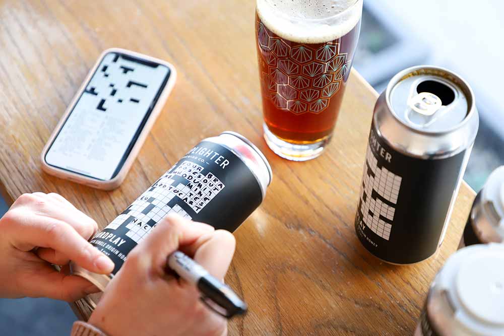
Photography courtesy of Lamplighter Brewing Co.
Hey, I’m a writer, so I love a little wordplay. Lowkey, I used to try to complete a Minnesota Star Tribune crossword puzzle every morning during my senior year of high school. You know, because all the cool nerds were doing it.
I can’t say that I’ve ever seen an interactive beer can like Lamplighter’s Wordplay, which has an actual crossword puzzle you can solve!
Fun tip: Lamplighter’s Director of Marketing and Events Emma Arnold told us in an email that the puzzle changes with each new batch of Wordplay. And you can find all the past puzzles here.
Lamplighter’s good friend Ross Trudeau (@rosstrudeau) designs the crosswords while Lainey Fink and Ben Scott at Bluerock Design actually make the labels.
The Boston-based brewery calls this “the beer equivalent of doing the puzzles on the back of your cereal box when you were a kid.”
I just call it genius.
Beezlejus
Old Irving Brewing Co. x Alarmist Brewing — Chicago, IL
Submitted by: Aaron Keefner, Sales Solutions Consultant, Next Glass
Art by Timothy Broyles
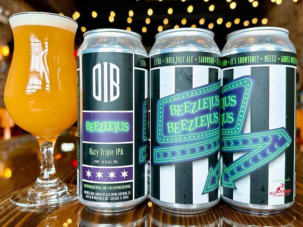
Photography courteys of @oldirvingbrewing
Even more so than the best beer label, Beezlejus is just the best beer name I came across in 2023. As a play on both breweries’ flagship IPAs, “Beezer” from Old Irving and “Le Jus” from Alarmist, this beer was just teed up to be released around the Halloween season. The design behind the “Betelgeuse” sign in the movie, mixed with Michael Keaton’s infamous black and white striped suit, just makes for an extremely fun beer collab based on GABF gold medal-winning beers from both breweries in the hazy IPA category.
Seavo Pils
Humble Sea Brewing Company (Santa Rosa, CA) x Firestone Walker Brewing Company (Paso Robles, CA)
Submitted by: Dustin Jeffers, Director of Brewery Implementation, Next Glass
Art by Juan Llorens from Good Knife Studio
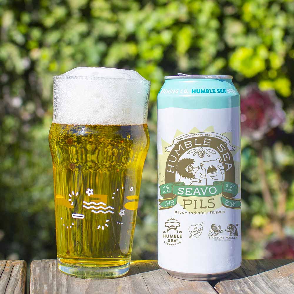
Photography courtesy of Humble Sea Brewing Company | Label Artwork by Juan Llorens, Good Knife Studio
Humble Seas makes some of my favorite beers and consistently my favorite artwork and branding. As someone who has always embraced the beach lifestyle, their punny beer names and labels and “Foggy IPAs” never fail to capture my attention. A standout for me this year was Seavo Pils, when Humble Sea collaborated with Firestone Walker, seamlessly merging their distinctive branding with the iconic Firestone Walker logo. The substitution of the Firestone Walker Bear with Humble Sea’s Shark left no doubt that this was a collaboration worth noting. Plus, who can resist anything inspired by the fantastic Pivo Pils!?
Miami Pop!
Tripping Animals Brewing Co. (Doral, FL) x Grimm Artisanal Ales (Brooklyn, NY)
Submitted by: Magic Muncie, Social Media Manager, Hop Culture and Untappd
Art by Gretta Johnson (@gretta_j)
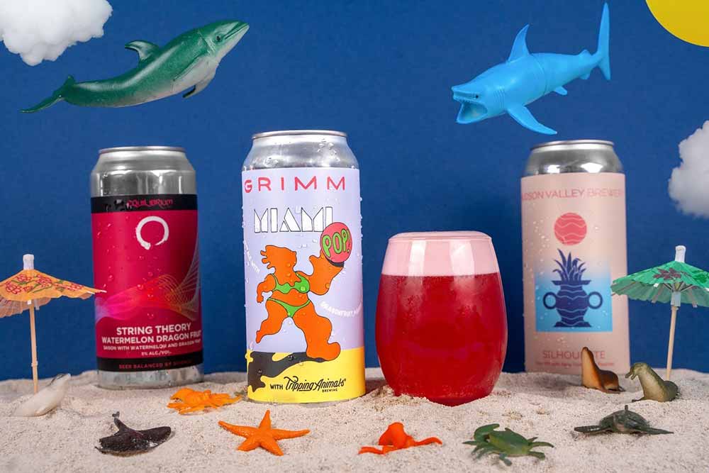
Photography courtesy of Magic Muncie | Hop Culture and Untappd
Fun and playful, the label for Miami Pop! captures the fusion of two beautiful (yet also fun and playful) breweries—Grimm and Tripping Animals. It feels like this label could be on display at Art Basel, Miami’s most famous art festival.
A part of the Pop! series, this label is inspired by a pop sensibility, according to designer Gretta Johnson. “This one is fairly minimal as far as these labels go, but I really let the blobby figure drive the composition,” she wrote us in an email. “There is always a lot of movement in my work, and this one feels particularly impactful with the character sort of distorted to imply the strike of the ball. The font I came up with felt very Miami to me, sort of an Art Deco look.”
Grimple Stix
Other Brother Beer Co. — Seaside, CA
Submitted by: Kyle Roderick, Chief Product Officer, Next Glass
Art by Lou Barberio (aka Helhound)
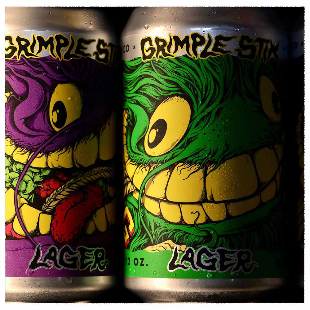
Art by Lou Barberio (aka Helhound)
Okay, look. I stopped skateboarding after I sprained my ankle in high school and had to walk on crutches for a few weeks. But this label’s whole vibe is making me want to kickflip over to Other Brother and nab every single one of these Grimple Stix cans. Featuring artwork by Lou Barberio (aka Helhound), these 12oz cans each sport a different color “Grimple,” a surrealist catfish-like creature with a mouthful of teeth. There’s just something about the small size and the faces on these cans with the most intense eyes that I just can’t look away from.
Basmati Rice Lager
Rupee Beer — Boston, MA
Submitted by: Grace Lee-Weitz, Senior Content Editor, Hop Culture
Conceptualized by Van and Sumit Sharma with help from multiple designers across South Asia
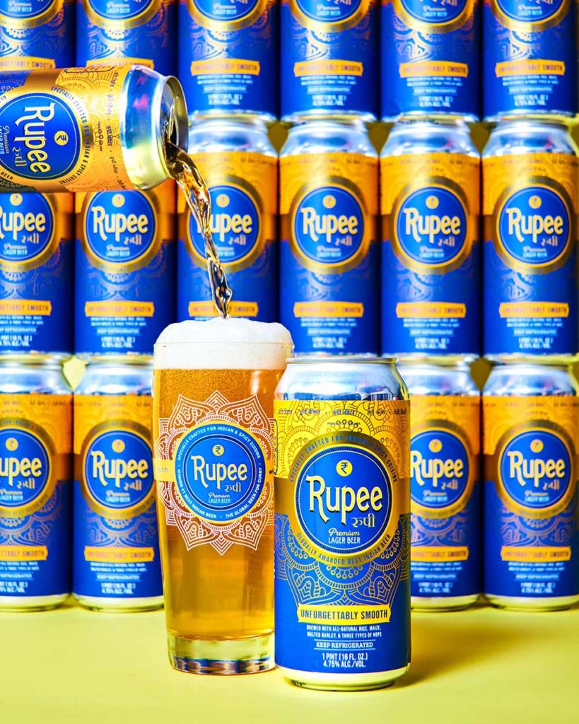
Photography courtesy of Rupee Beer
We challenge you to find another craft beer brand out there available in America with a design like Rupee Beer. Van and Sumit Sharma, a part of a fifth-generation family of Indian restaurateurs, started Rupee Beer as a currency that could be handed down for generations—just like their family’s restaurants.
Named after the iconic currency of India and seven other countries, Rupee Beer pays homage to the Sharma family’s and many others’ struggle to build a business despite the barriers of a predominantly white community in a predominantly white industry.
The brewery’s iconic Basmati Rice Lager
represents a beer built to be the “global beer for curry.” The elegant blue and gold colors may seem simple—just like the rice lager inside—but they belie a deeper meaning. Peer close and you’ll notice the word Rupee written in Hindi.
According to Van, they chose to transliterate Rupee Beer into 11 of the most commonly spoken languages across South Asia, which includes Punjabi, his mother tongue.
“Each can is meant to have a piece of Indian history, always relating back to the origins of that style of beer and the Rupee founder, Sultan Sher Shah Suri,” Van told us in an email.
In the most unassuming way, Rupee Beer challenges you to rethink mindless drinking and instead embrace mindful thinking…while you’re drinking.
Infinite Hotel
Wayfinder Beer — Portland, OR
Submitted by: Magic Muncie, Social Media Manager, Hop Culture and Untappd
Art by Orion Landau
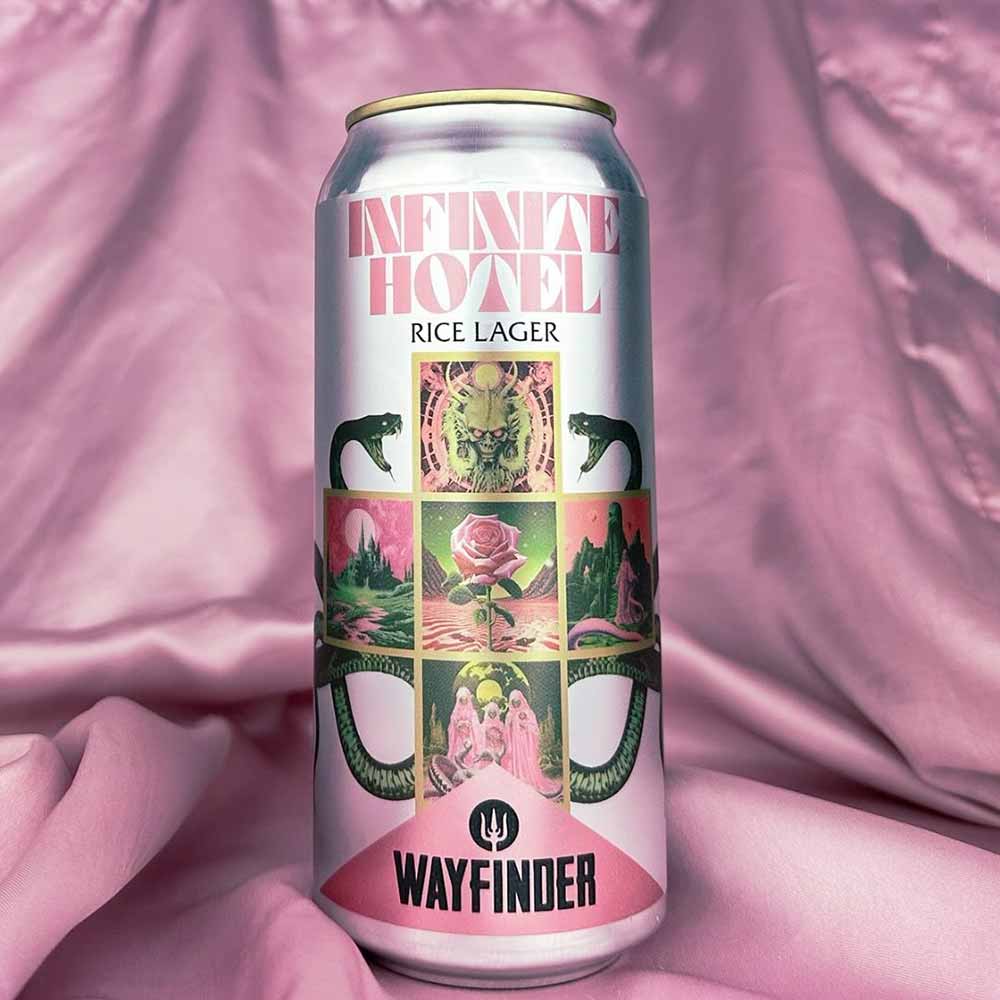
Photography courtesy of @wayfinderbeer
Frankly, I like all of Wayfinder’s labels, so I asked myself which stood out from the crowd.
Infinite Hotel did.
It reminds me of this mix of vivid rock ’n roll, but at the same time, it has a much softer side with pops of pastel pink. It’s kind of in a vein of metal meets magnificence.
According to Wayfinder’s Art Director, Orion Landau, who designed the artwork, the label takes inspiration from Hilbert’s paradox of the Grand Hotel. The thought experiment states that a fully occupied hotel with an infinite number of rooms can always accommodate new guests, creating a sort of Penrose Stairs loop that never ends.
“We loved the concept and were trying to illustrate multiple spaces going on at the same time, so I just created all these little worlds,” Landau wrote to us in an email.
Yup, safe to say, this label, and it’s explanation, blew our minds.????
Laser Strings Nitro
Dream State Brewing — Ft. Lauderdale, FL
Submitted by: Dustin Jeffers, Director of Brewery Implementation, Next Glass
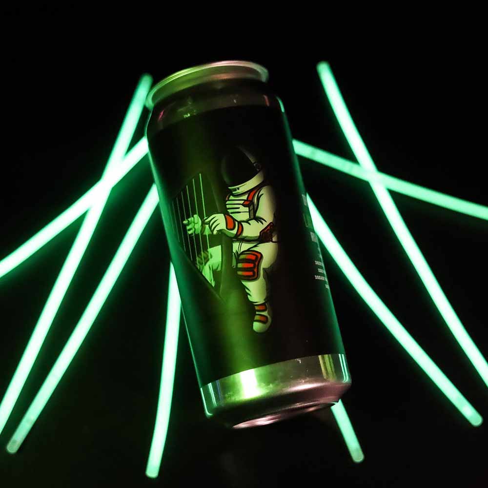
Photography courtesy of @dreamstatebrewing
Dream State Brewing, a newcomer on the scene, brewed a nitro stout this year with one of my favorite labels. It is not always easy to find a traditional Irish-style dry stout down in Florida, so I was already excited when Laser Strings Nitro came out. The label on the can put this beer over the edge. The dark background with the bright neon green was eye-catching when sitting on the shelf, and the harp, added as a nod to the iconic nitro stout, was a great touch.
Editor’s Note: Hop Culture reached out to Dream State to find out the name of the artist who designed this label but did not receive a response by the time of publication. If you recognize someone’s work here please DM us (@hopculturemag) or shoot us an email [email protected] to let us know!
Mantis Shrimp
More Brewing Company — Huntley, IL
Submitted by: Aaron Keefner, Sales Solutions Consultant, Next Glass
Art by Bo Russell (@boknowsphotos_)
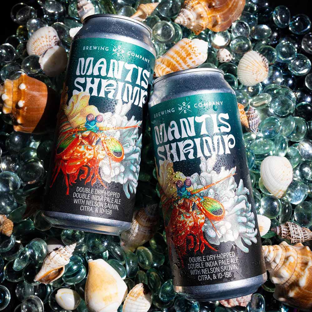
Artwork courtesy of Bo Russell | Photography courtesy of @morebrewing
Bo Russell, former Creative Manager for More Brewing, now with Revolution Brewing, was the design mind behind this Mantis Shrimp label, a new variant of hazy Double IPA from More.
The creativity and, quite frankly, oddness of this label caught my attention right away when I saw it. The color usage in the design and blending of coral imagery brings everything together beautifully while looking like a fine piece of modern artwork.
Luckily, the liquid inside the can matches this masterpiece. A silky mouthfeel makes way for an onslaught of citrus, passionfruit, and light bitterness thanks to dry hop additions of Nelson Sauvin, Citra, and experimental hop ID-158.
Don’t worry; there is no shellfish in this beer…only delicious and pillowy hazy DIPA.
Built to Spill
Foam Brewers — Burlington, VT
Submitted by: Grace Lee-Weitz, Senior Content Editor, Hop Culture
Art by Jackson Tupper
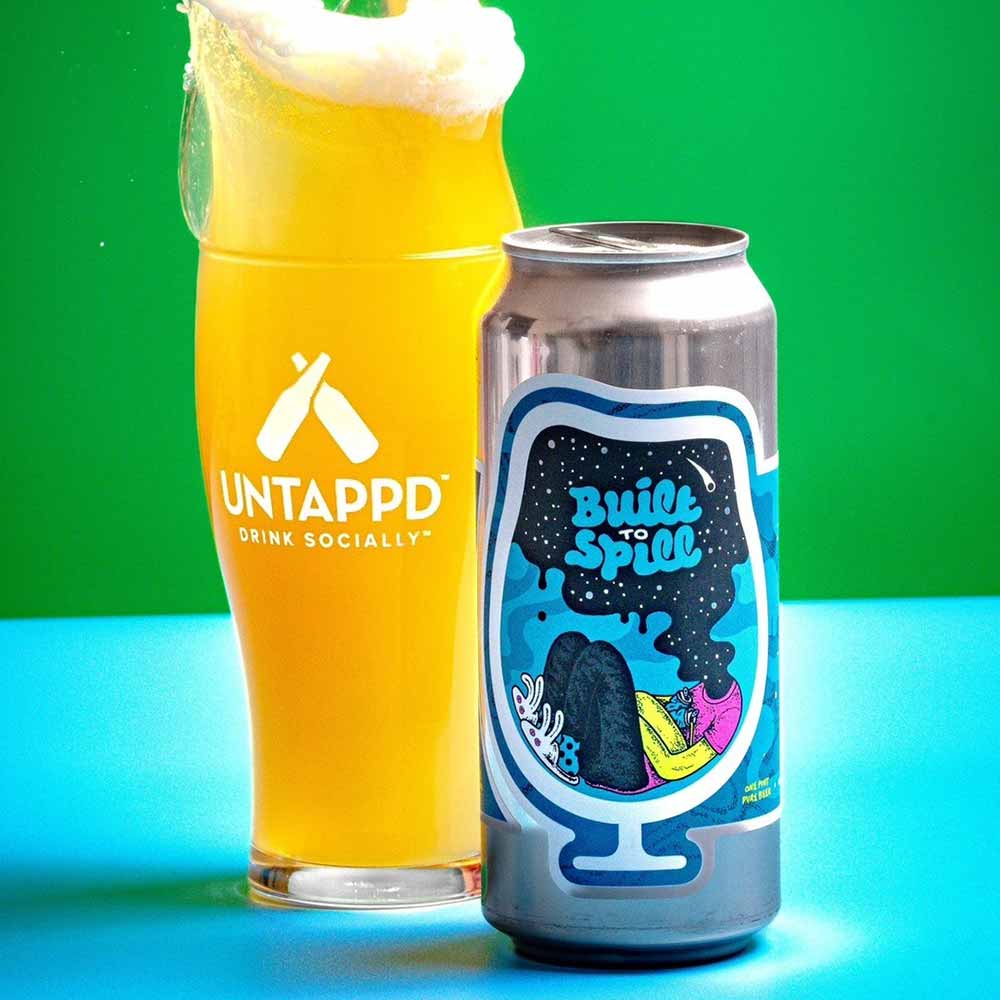
Label art courtesy of Jackson Tupper | Photography courtesy of Magic Muncie
Here’s a crazy story. I first noticed this can when our friends at Untappd added Foam’s Built to Spill into its IPA Beer Box. I immediately earmarked it as one to consider for the best beer labels of the year.
Come time to write this piece, I did a little digging and discovered that a former co-worker actually nominated this same label back in 2018. At that point, I thought I’d search elsewhere, but considering we both came to the same conclusion independently over six years apart, I thought I’d give second props where props are due.
Artist Jackson Tupper used influence from a song called “Big Dipper” by the rock band Built to Spill to design this label.
Foam always kills it with the artwork. This DIPA’s design has those ethereal, meta vibes that almost make us want to think really hard. And then we open the can and drink the dankness within and just admire how pretty it is and how bangin’ it tastes.
Scissor Run
Brouwerij West — San Pedro, CA
Submitted by: Kyle Roderick, Chief Product Officer, Next Glass
Art by Matt Taylor
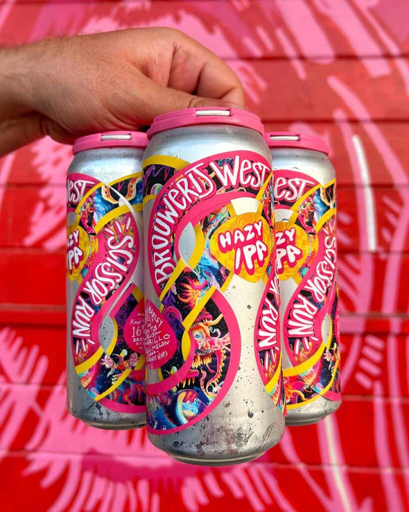
Label art courtesy of Matt Taylor | Photography courtesy of @brouwerijwest
The die-cut devils are at it again with some of the most outrageous, rule-bending, can label applications in the business. I’ve always loved Brouwerij West’s unique take on the art of the can label, from Jaws Rice Lager to the original circular Pop Fuji labels. Artist Matt Taylor (aka Varnish) has been pushing the boundaries of West’s can art for years, and this one quickly became my favorite when I saw this incredible 3D explosion rendering by Daniel Crane.
It’s like a Lisa Frank, rainbow road, shoots and ladders, Trapper Keeper binder cover for one of LA’s best breweries.
Scissor Run is a hazy IPA with Amarillo, Huell Melon, Ekuanot, and oats clocking in at 6.2% ABV that, if you’re looking for it on shelves, you’re absolutely going to spot.
Gasoline Dreams
Monday Night Brewing Company — Atlanta, GA
Submitted by: Grace Lee-Weitz, Senior Content Editor, Hop Culture
Art by Kelsey Watson
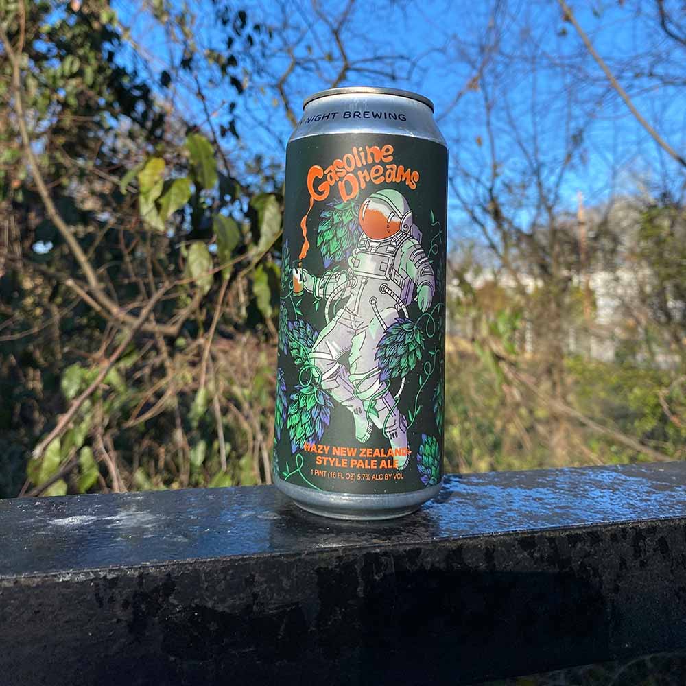
Photography courtesy of Monday Night Brewing
For this collab with NZ Hops and YCH for the 2023 Craft Brewers Conference, Monday Night explored another stratosphere of hops.
“These hops in particular tend to have a distinct diesel-like aroma (which is actually really appealing and does not translate in its taste),” says Monday Night Brewmaster Peter Kiley. “As ATLients ourselves, we wanted to give a nod to Atlanta rap duo OutKast with the name of this beer—so “Gasoline Dreams” just made perfect sense.”
Inspired by OutKast’s hit 2000s song, graphic designer Kelsey Watson says, ” I wanted to capture the feel of the music – if not necessarily the lyrics. So, what’s the Gasoline Dream of a craft beer lover? Enter “Hopstronaut,” a pale ale-consumed space explorer floating through a swirling hop galaxy. In my imagination, maybe somewhere out there there’s a beer-centric star system where an astronaut can drift along enjoying a gravity-free pint.”
For a beer that straddles continents, worlds, and launches us beyond what we thought hops could do, Gasoline Dreams’ ethereal illustration propels us into a different state of mind.
Mouth Wooed
Resident Culture Brewing Company — Charlotte, NC
Submitted by: Grace Lee-Weitz, Senior Content Editor, Hop Culture
Art by Maryssa Pickett
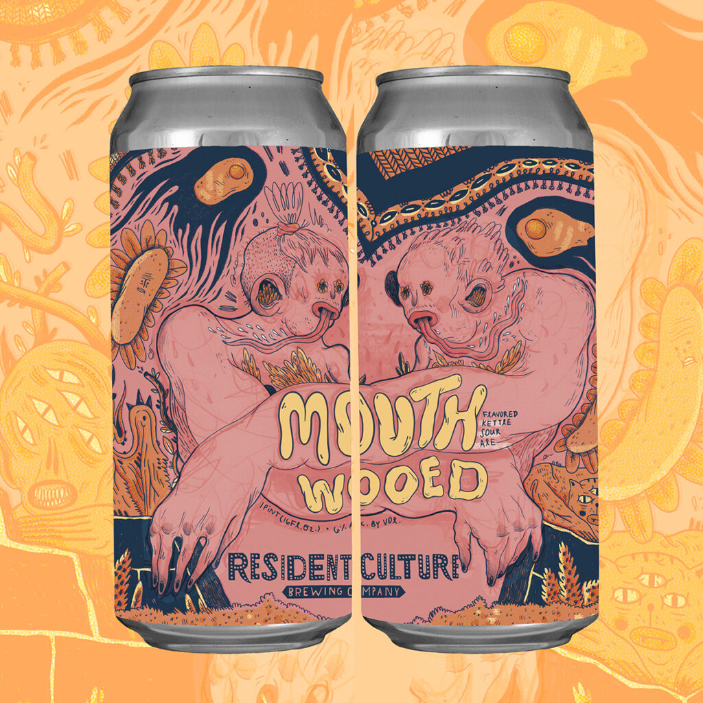
Illustration courtesy of Resident Culture Illustrator Maryssa Pickett and mockup courtesy of Resident Culture Graphic Designer Chelsi Architzel
We’ve been fans of Resident Culture Illustrator Maryssa Pickett for years. But for the first time, in 2023, we had a chance to sit down with her and find out what inspires her quirky, hand-drawn, sometimes a little dark, and always a little bit funny label designs.
You will always recognize Pickett’s style on the shelf, making her a shoo-in for what could have been a whole bunch of our best labels of the year.
While Pickett calls Riding for the Feeling and Radical Empathy two of her favorites, we chose Mouth Wooed because it’s an epic kind of a tongue twister (or eye twister?).
Resident Culture Graphic Designer Chelsi Architzel told us this was the first Resident Culture label she had ever seen. “I vividly remember being blown away by the amount of detail and intricacy,” she said. “The beer was a delicious sour already, but the can art makes you wonder why you’d ever pour any Resident Culture beer into a glass when you’re drinking literal artwork.”
Well said.
Tier Zero Part Deux
Horus Aged Ales — Oceanside, CA
Submitted by: Magic Muncie, Social Media Manager, Hop Culture and Untappd
Art by Spring Whitaker (@springwhitaker)
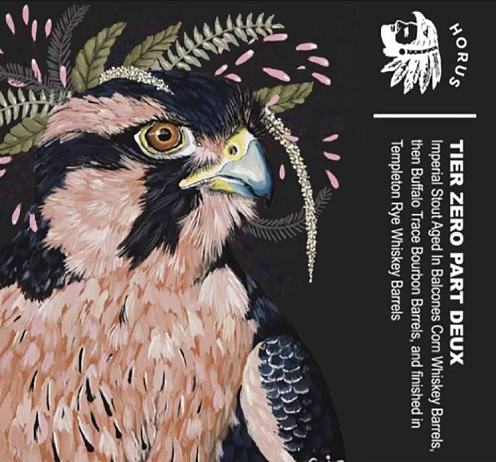
Artwork by Spring Whitaker
Spring Whitaker is the artist who does all of the work for Horus Aged Ales’ labels, and she is amazing. I really like all her work in general—it’s very unique—but Tier Zero Part Deux is one of my favorites. It’s really beautiful and gorgeous with a lot of vivid colors. The artwork is very majestic, matching the beer. Because this is an unadulterated stout with no adjuncts and just all barrel and all complexity, the label matches the beer beautifully.
Maybe It’s a New Beginning
Burial Beer Co. — Asheville, NC
Submitted by: Grace Lee-Weitz, Senior Content Editor, Hop Culture
Art by David Paul Seymour (@davidpaulseymour)
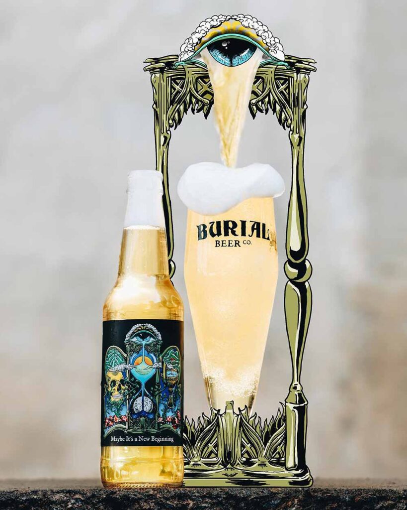
Photography courtesy of Burial Beer Co. | Label Artwork courtesy of David Paul Seymour
Usually, it’s Burial’s beer names that speak to me. This time, it was David Paul Seymour’s standout artwork for Maybe It’s a New Beginning.
According to Burial Head of Marketing Phil Cassella, Paul Seymour has illustrated for Burial for over a decade, creating nearly all of the brewery’s label artwork.
I can see why.
Out of all the beers Burial so kindly sent me for their tenth anniversary, this one struck me for its fascinating interplay between light and dark, shining through with a duality between the sun and the moon. Which pops even more thanks to the black label on a clear bottle with crystal clear gold German pilsner inside.
Paul Seymour’s illustrations reach out to you viscerally, grabbing your attention and sucking you in like a black hole.
From the words to the art to the liquid inside, Burial just continues to impress us.
Everyone
Everywhere — Orange, CA
Submitted by: Grace Lee-Weitz, Senior Content Editor, Hop Culture
Label Illustration by Priscilla Moreno (@preemoreno) and Packaging Design by Daniel Muñoz
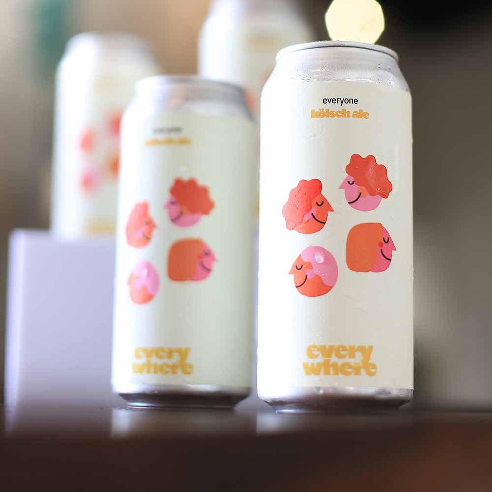
Photography courtesy of Everywhere Co-Founder Daniel Muñoz | Label art courtesy of Priscilla Moreno
Elegant and simple, Everywhere’s Everyone includes the sort-of-surreal artwork of Priscilla Morean. I love the variety of faces with tones of gender neutrality. I don’t know if this beer necessarily set out to make a statement, but to me, it does. After all, a beer called Everyone should be for everyone regardless of gender, race, or sexual identity. I appreciate the message the label sends to me as a drinker.
Tiny Beekeeper
Spaceway Brewing Company — Rocky Mount, NC
Submitted by: Grace Lee-Weitz, Senior Content Editor, Hop Culture
Art by @leximalp
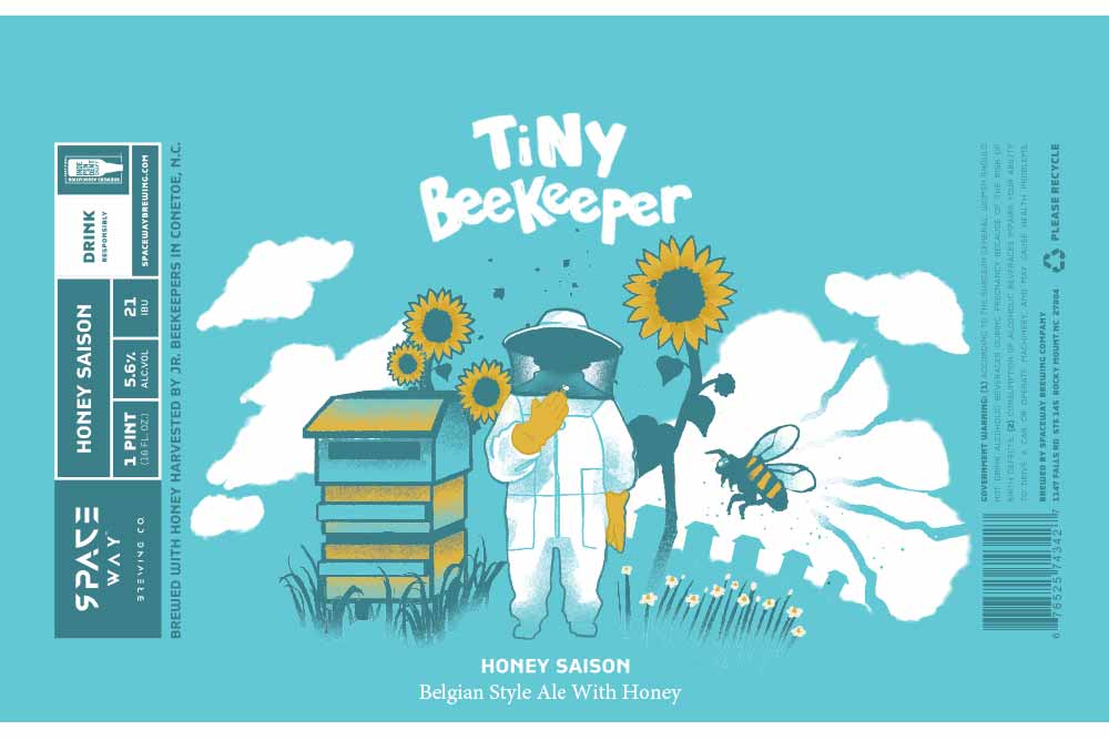
Art courtesy of @leximalp
Last year, Spaceway picked up a win in the North Carolina Craft Brewers Guild’s Label Insanity Competition for its Don Dada label.
They repeated this year with Tiny Beekeeper.
These two could not be more different. Where Don Dada looks like Daft Punk on a beer label, Tiny Beekeeper could be an updated version of Goodnight Moon.
And these two beers are very different. Don Dada, a cardamom stout, and Tiny Beekeeper, a Belgian-style ale with honey harvested by junior beekeepers in Conetoe, NC.
Which shows the breadth of the BIPOC-owned Spaceway Brewing in both artistry and brewing.
With Tiny Beekeeper, @leximalp’s design depicts a field of sunflowers with bees lazily buzzing around, transporting us not only to another place but also to a different time.