Shop
Inside the Minds of Resident Culture’s Art Duo: Where Your Weird Is Welcome
A little kooky, a lot funny, and never too sad.
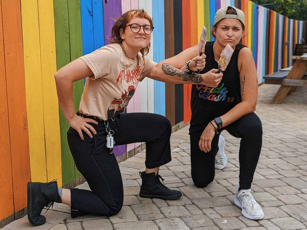
Resident Culture Illustrator Maryssa Pickett (on the left) and Graphic Designer Chelsi Architzel (on the right) | Photography courtesy of Resident Culture Brewing Company
Other Stories You Might Like:
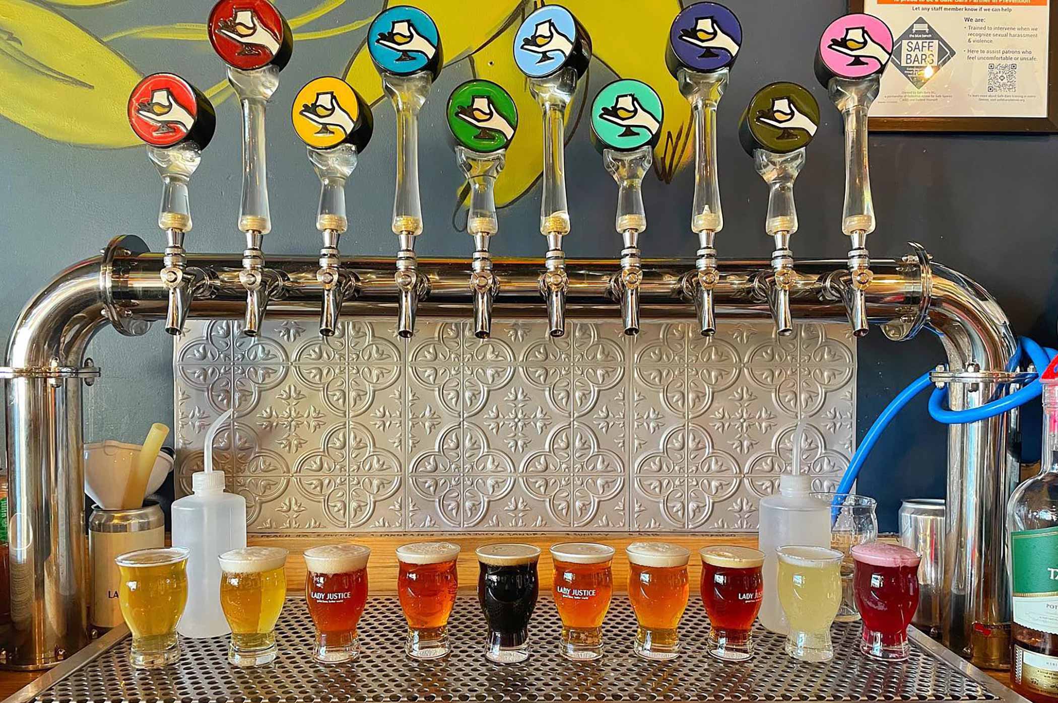
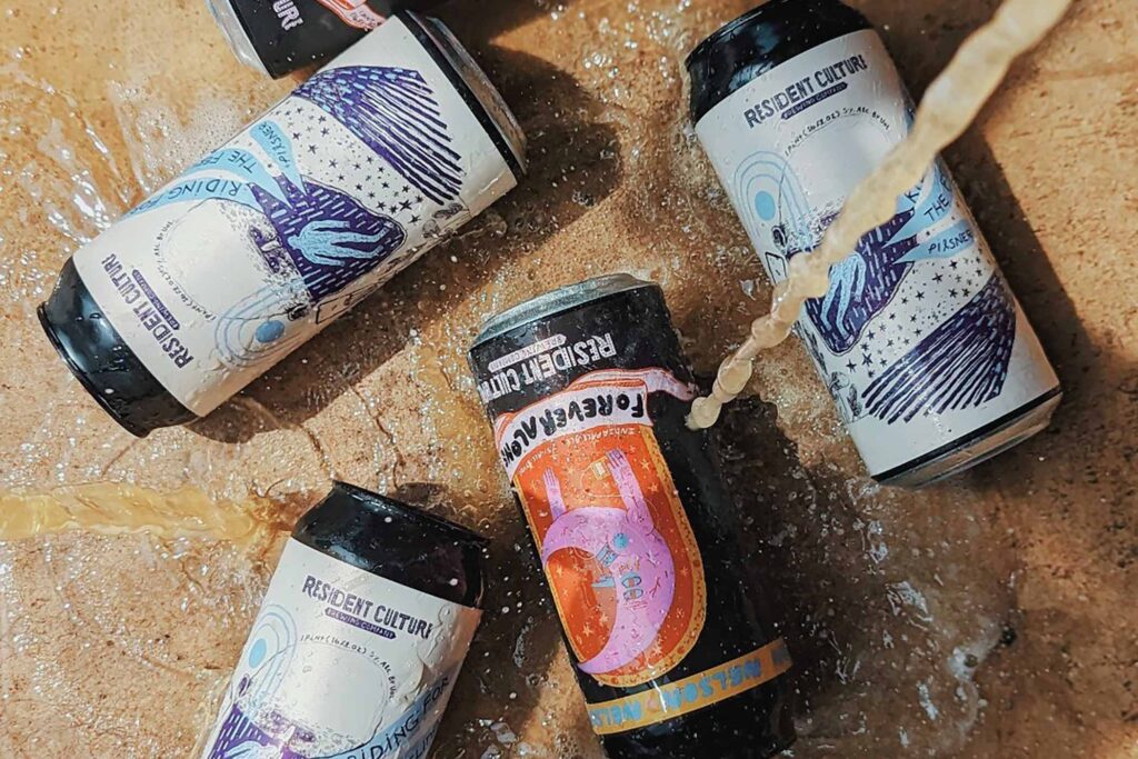
You can’t mention Charlotte, NC, and craft beer in the same sentence without writing Resident Culture. The brewery originally opened in the Plaza Midwood neighborhood in 2018, quickly becoming a go-to destination, gaining recognition nationwide for its explosive IPAs, sours, stouts, balanced pilsners, and exquisite farmhouse ales. But the brand blossomed beyond just the beer, sporting cans with some of the best label art in the business.
Quirky, hand-drawn, sometimes a little dark, and always a bit funny, Resident Culture’s designs are unmistakable. We certainly noticed them, naming their Out to Pasture label one of our favorite designs of 2020. When you see a Resident Culture can on a shelf, you know it’s them.
But do you know the people, the hands, the minds behind those illustrations?
Turns out Resident Culture Graphic Designer Chelsi Architzel didn’t even go to school for art, and Illustrator Maryssa Pickett had never even set foot inside a brewery.
From Senior Portfolio to Brewery Illustrator, From Bartender to Graphic Designer
Photography courtesy of Resident Culture Brewing Company
A senior in college at Savannah College of Art and Design in Georgia, Pickett says a former member of Resident Culture “hit me up because they saw a sticker I made on someone’s laptop.”
The sticker that Resident Culture noticed had just the chicken head in this picture with Pickett’s website | Illustration courtesy of Maryssa Pickett
The brewery wanted Pickett to paint a mural for the taproom.
Pickett ended up designing a series of labels for the brewery. “I used it as a pitch so they could see that and decide if they wanted to use my art,” she says. “They were down.”
After graduating in 2017, Pickett joined the brewery and painted that mural for them.
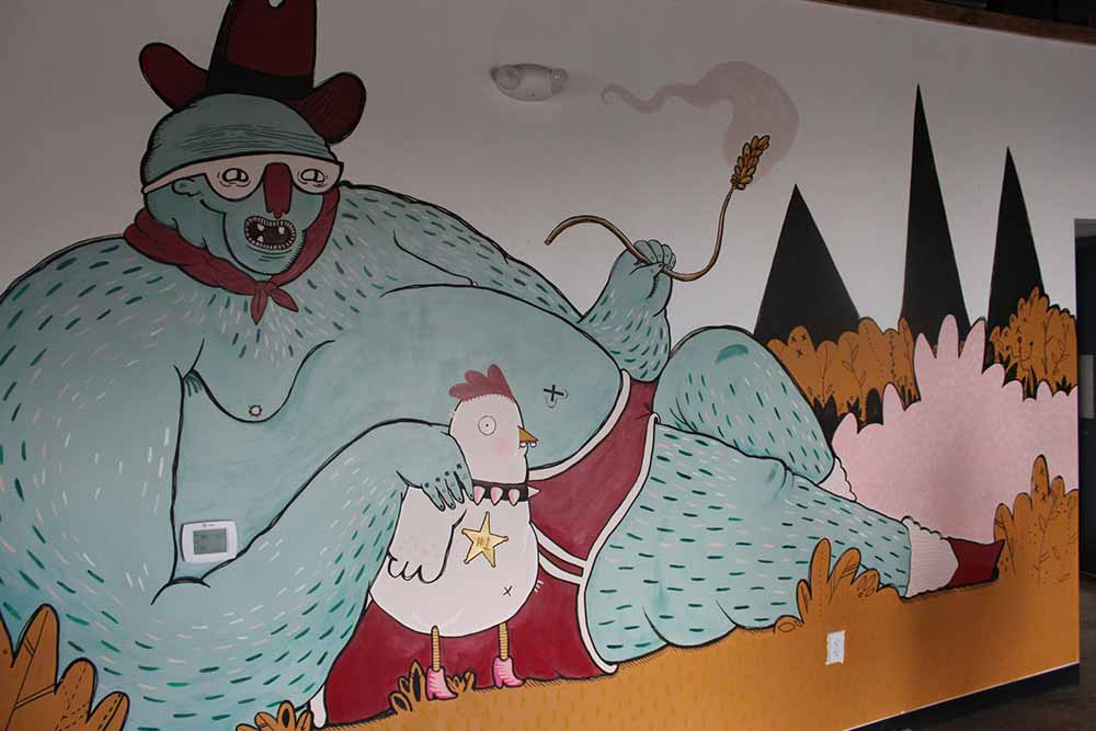
One of the murals Pickett painted for Resident Culture | Illustration courtesy of Maryssa Pickett
“Here I am in beer unexpectedly,” she laughs.
By her side for the last two years in a graphic designer role, Chelsi Architzel makes up the two-person team now illustrating and executing all of Resident Culture’s label designs.
Pickett creates the original drawings while Architzel manipulates them for print.
“I took one graphic design class [in college] and dropped out the first day,” laughs Pickett. “Chelsi coming on board has made my life so much better and helped shape Resident Culture into a polished brand; it’s the skill set I don’t have and could never offer.”
Originally from Richmond, VA, Architzel worked at Triple Crossing before moving to Charlotte. Working in restaurant jobs for a bit, she says she missed beer before becoming a bartender at Resident Culture.
Two years in, Pickett needed help finishing her labels and creating signs for the taproom. “It was easier for me to do it,” says Architzel. “I don’t have a degree, but I’ve always been interested in art.”
For the past two years, the two have worked side by side “all day, every day,” says Architzel, breathing life into Resident Culture’s quirky, kooky, sometimes spooky brand.
Resident Culture’s Brand Identity: A Lot Funny, A Little Dark, But Never Too Sad
Photography courtesy of @residentculture
It’s a little hard to bottle up Pickett’s art definitively. Her works are a bit ethereal, almost like she’s creating characters for a specific realm or new dimension.
“Crafting this Resident Culture world is weird and surreal,” Pickett says when asked to describe her style. “Low-brow but round and dark and a little funny. We’ve created our own world over time; that’s why it stands out.”
Pickett says over the years, she designed north of 250 unique labels. She tallies up the amount she’s done annually, and “every year the number doubles itself,” she says.
Meaning staying creative with it all can be challenging. But at this point, Pickett and Architzel have a pretty good process nailed down.
Tapped into every new beer coming down the line from Resident Culture, Pickett uses the name, beer details, and style as a jumping-off point. “Luckily, I can riff off a name because our team does a good job of having interesting names,” she says. From there, a week or so before she’ll start sketching the concept.
Finding it easier to compartmentalize stylistically with different approaches to beer styles, Pickett says, “IPAs I keep more freaky, psychedelic, and colorful [while] pilsners and lagers, I’ll do a muted situation.”
She says this creates built-in design paths for her to help illustrate something more than just a style and name.
Overall, the Resident Culture gives Pickett complete creative freedom—partly why she’s stuck around for this long.
Pickett has had to redo only one label in almost six years with the brewery. “One was too sad,” she laughs. “That’s fair. Who wants to sit, drink beer, and look at this sad, sad label!?”
Once approved, the label heads to Architzel’s desk, where she translates it to a digital format and creates social media graphics.
“I take Maryssa’s art, which is very sketchy and paper-forward, and manipulate things … to make it easier for print,” she says.
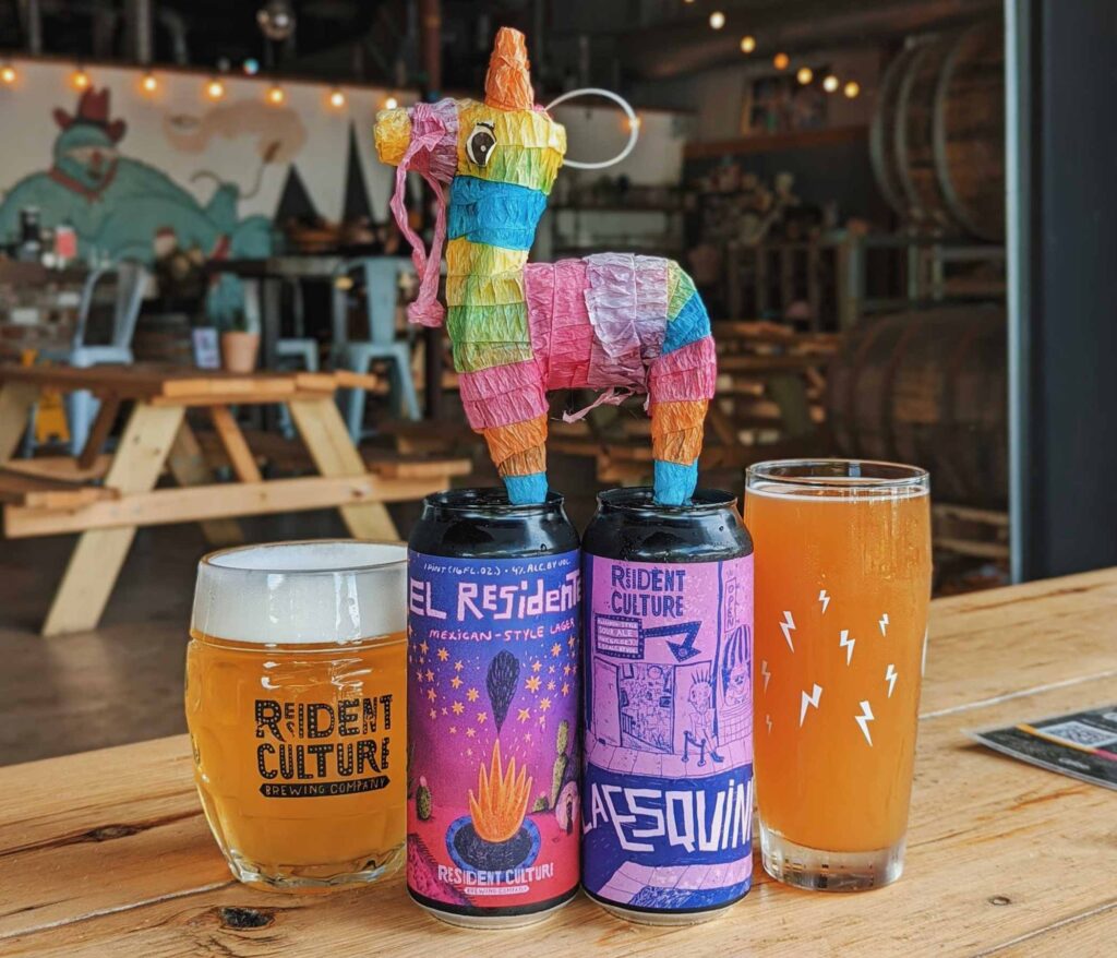
Now working together smoother than Resident Culture’s Lightning Drops hazy, the two have built a pretty strong bond during their time at the brewery.
Resident Culture: Where Your Weird Is Welcome
Photography courtesy of @residentculture
Spend some time talking with Pickett and Architzel, and you’ll see how close they’ve become. That probably comes with the territory of working side by side every day for the last two years. But also because they’re some of the only people identifying as Queer in the organization.
“When I first started working at Resident Culture, I didn’t know Maryssa because she was always in the back,” says Architzel. “But I specifically remember being the only Queer person, which was new for me, especially since I worked in restaurants.”
Architzel says that, for her, Resident Culture has always had what she calls a “safe vibe.”
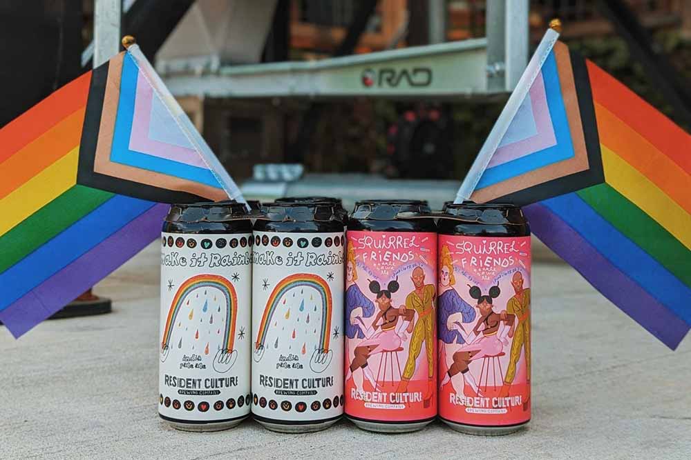
The brewery recently adopted a new slogan: Where Your Weird Is Welcome.
“To me, our slogan … is an invitation for anybody and everybody to make what they wish of our beer, our taprooms, and our brand as a whole and find a place that feels comfortable to them,” says Architzel. “We have always had somewhat of a reputation of being the brewery that makes odd and ‘weird’ choices, but I think that’s really what makes us special and tells our story. By creating atmospheres that invite people to show up as their fully authentic selves, we are able to create a safe space and a feeling of community, ultimately erasing the negative feelings that might come from being described as weird because here, it’s encouraged.”
An approach Architzel says Resident Culture proved in spades when opening their second location in South End, an area of Charlotte catering more to a straight crowd.
“As a Queer person, I go out a lot to mainly Queer-friendly places, and South End wasn’t always somewhere I felt comfortable,” says Architzel.
Pickett chimes in, too, saying, “I always avoided this part of town; I used to never come here.”
But from the get-go, Archizel says the brewery wanted to make sure they were doing lots of things that invited the Queer community to the South End, such as events like drag brunches, Pride Prom, and Figure Drag-ing (where folks drink and draw drag performers); beers with names like Squirrel Friends (a nod to the popular Queer reality show RuPaul’s Drag Race) and Make A Rainbow; and one big colossal statement that’s hard to miss.
Photography courtesy of @residentculture.southend
“We have a big branded rainbow flag with our logo on it that’s the first thing you see when you walk up to the bar,” says Architzel.
Throughout the years, the brewery hosted various events to support organizations such as Time Out Youth and Transcend Charlotte, which support the trans and gender-expansive community in Charlotte.
“Year-round, we try to do events that are either creating something fun for the community or that raise money for local non-profits,” says Pickett.
Including participating in Hop Culture’s 2023 Queer Beer Box!
The new (and OG) taproom has impacted not only the Queer community but also the entire neighborhood.
“I’m most excited that this new location brings that [Queer] community into the area, giving them a space, making it visible, and changing the neighborhood a little,” says Pickett. “This spot feels welcoming compared to everything else. It’s nice to open that up to the community, [bringing] more spaces like this into [these] neighborhoods.”
Encouraging a Queer perspective in a historically straight area of town could be considered a bold move. But not to the boundary-defying Resident Culture. After all, how else can we ever expect to change people’s minds if we continue to segment and separate communities?
“It’s nice for some finance bros to have to look at drag queens every now and then,” laughs Pickett.
But Architzel emphasizes that the South End location is for everyone. “Even if you don’t identify as Queer, just come here and be Queer,” she says. “Just be yourself.”
Which is precisely what Pickett and Architzel’s labels seem to do at Resident Culture, building the brand one sketch at a time.
With over 250 designs coming from her fingertips, Pickett and Architzel have plenty in their portfolio to showcase.
But the ones they’re most proud of?
Pickett and Architzel’s Favorite Resident Culture Labels
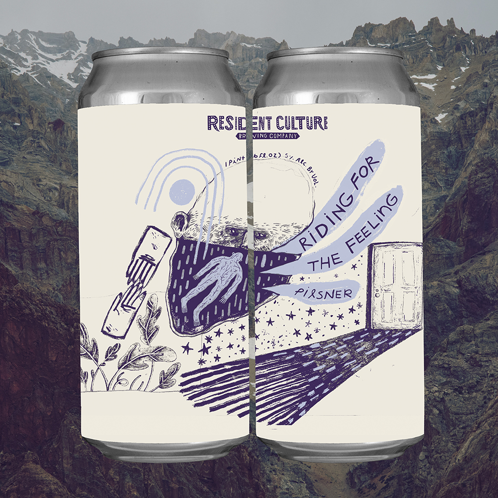
Illustration courtesy of Resident Culture Illustrator Maryssa Pickett and mockup courtesy of Resident Culture Graphic Designer Chelsi Architzel
Riding For The Feeling
What has become a bit of what we might call a flagship for Resident Culture, Riding For The Feeling gorgeously encapsulates what we feel like when we drink a pilsner—that feeling of pure bliss. While we won’t go so far as to try and interpret everything in this label, we’ll just tell you that Pickett told us she loves this label, and that’s good enough for us.
Confidently Incorrect
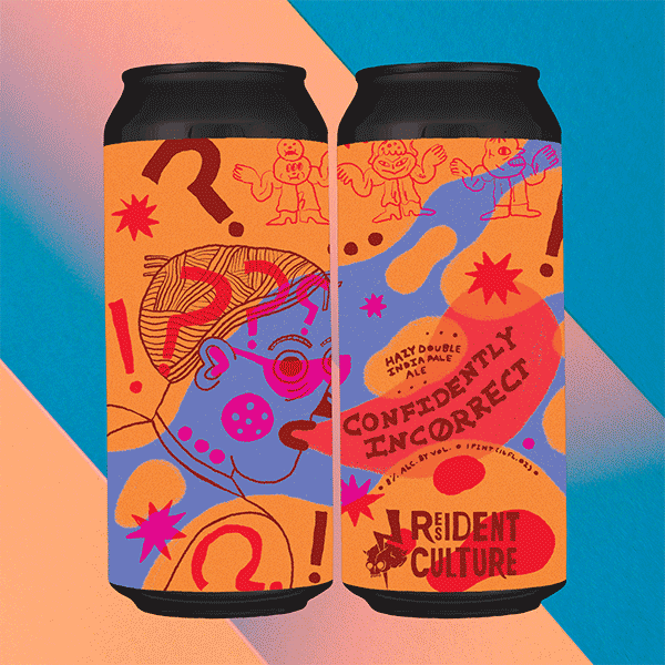
Illustration courtesy of Resident Culture Illustrator Maryssa Pickett and mockup courtesy of Resident Culture Graphic Designer Chelsi Architzel
“The color palette and the contrast of the neons, especially the neon pink against the blue, scratches an itch in my brain!” says Architzel.
Radical Empathy
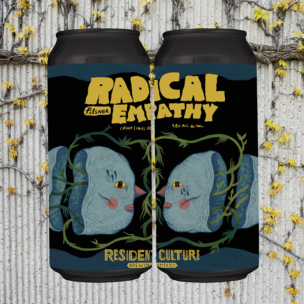
Illustration courtesy of Resident Culture Illustrator Maryssa Pickett and mockup courtesy of Resident Culture Graphic Designer Chelsi Architzel
We love Radical Empathy, the beer, because there is nothing quite like an expertly made pilsner. And there’s nothing quite like an expertly made label to pair with it. Pilsners are a simple style that needs a deft hand to balance its delicate characteristics. Similarly, this label may seem simple, but look closer, and you’ll see the intricacy of Pickett’s designs. One of her favorites as well, Radical Empathy, represents an intensely flavorful beer and beautifully illustrated label.
Island Time
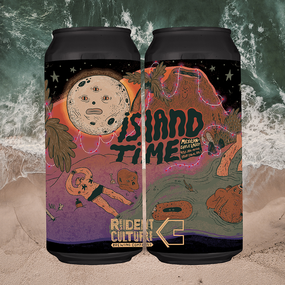
Illustration courtesy of Resident Culture Illustrator Maryssa Pickett and mockup courtesy of Resident Culture Graphic Designer Chelsi Architzel
One of Pickett’s favorite labels, Island Time, shows this cool yet creepy interpretation of an island vacation. We love the color palette on this one. Whereas most sunny vacation vibes might have you thinking cool oranges and blues, Pickett’s version uses these deep purple, mauve, pink, and forest greens for a slightly darker take.
Mouth Wooed
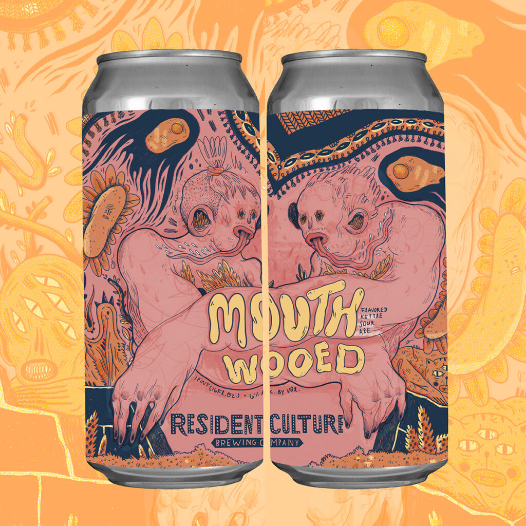
Illustration courtesy of Resident Culture Illustrator Maryssa Pickett and mockup courtesy of Resident Culture Graphic Designer Chelsi Architzel
One of the first labels Architzel says she saw at Resident Culture, she says, “I vividly remember being blown away by the amount of detail and intricacy. The beer was a delicious sour already, but the can art makes you wonder why you’d ever pour any Resident Culture beer into a glass when you’re drinking literal artwork.”
Over Soul
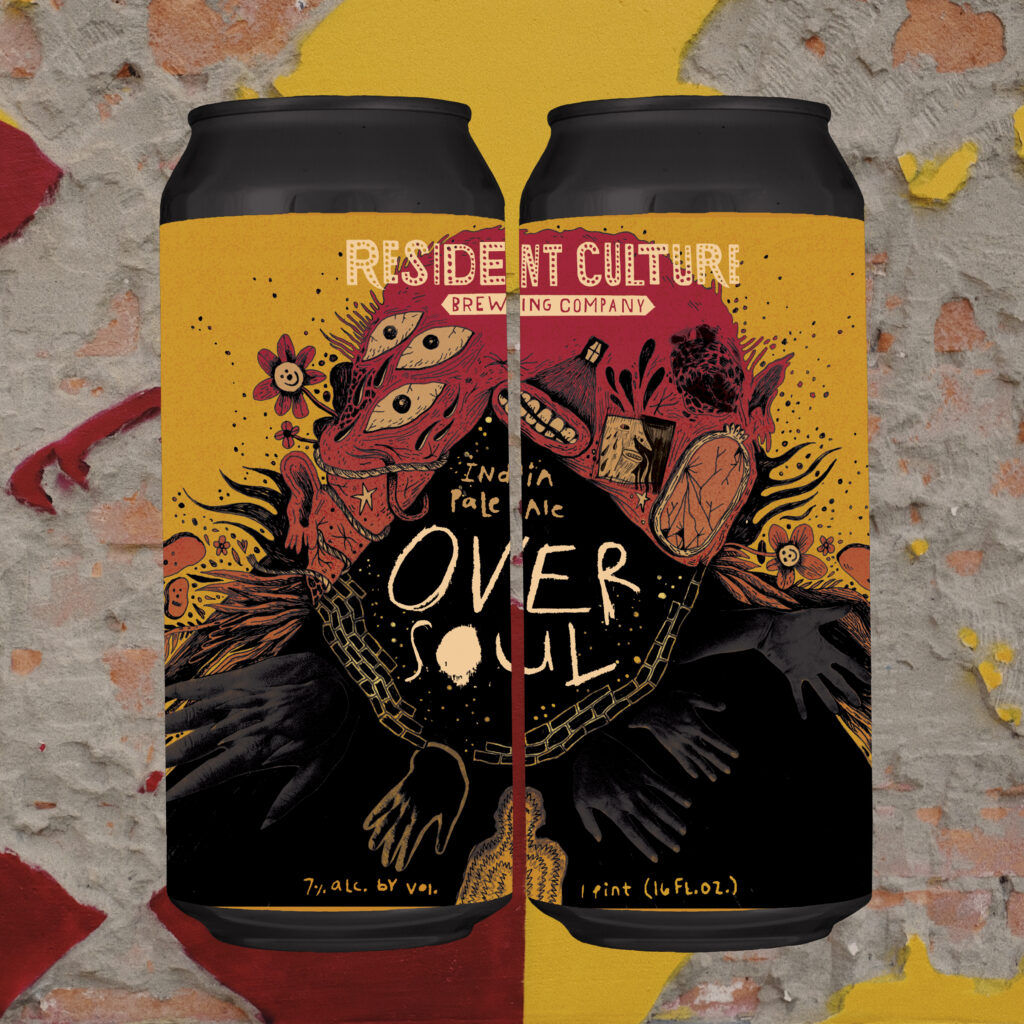
Illustration courtesy of Resident Culture Illustrator Maryssa Pickett and mockup courtesy of Resident Culture Graphic Designer Chelsi Architzel
Straying into some of the scarier sides of Resident Culture’s labels (and we mean that in the best way. We used to throw a Spooky Brews festival, for gosh sake), Over Soul definitely starts conversations. In a beer category that absolutely dominates the shelves, Over Soul stands out simply based on Pickett’s illustration.
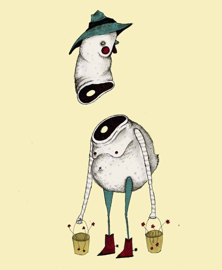
Odd Culture
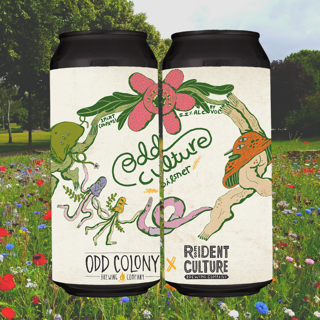
Illustration courtesy of Resident Culture Illustrator Maryssa Pickett and mockup courtesy of Resident Culture Graphic Designer Chelsi Architzel
“I love the mushroom creature,” says Architzel. “I am a big, big fan of when Maryssa gives her label characters buttcheeks and the clean nature vibe.”
About The Author
Grace Lee-Weitz
Currently Drinking:
Fort Point Beer Co. KSA
Grace is the Senior Content Editor for Hop Culture and Untappd. She also organizes and produces the largest weeklong women, femme-identifying, and non-binary folx in craft beer festival in the country, Beers With(out) Beards, and the first-ever festival celebrating the colorful, vibrant voices in the queer community in craft beer, Queer Beer. An avid craft beer nerd Grace always found a way to work with beer. After graduating with a journalism degree from Northwestern University, she attended culinary school before working in restaurant management. She moonlighted as a brand ambassador at 3 Sheeps Brewing Co. on the weekends before moving into the beer industry full-time as an account coordinator at 5 Rabbit Cerveceria. Grace holds her Masters degree in the Food Studies program at NYU.