Shop
The Top 16 Craft Beer Labels from North Carolina Breweries
Bracketology, beer style.
March tends to send us into a certain kind of madness. We can taste spring not only in the air, but also in the variety of seasonal releases that we see from breweries across the country. Plus, a certain college basketball tournament deliriously descends on the Hop Culture team, forcing us to constantly check a certain big-name sports network to see which No. 15 seed has upset a No. 2 seed (**cough** Oral Roberts).
But, we’re beer lovers at heart and so when we got wind of a unique beer label competition that follows the insanity of this month we jumped at the chance to participate.
The North Carolina Craft Brewers Guild’s Label Insanity Label Art Competition presented by Hop Culture, Wright Creative Branding & Labels, and SeaThirst Creative showcases the creativity of can label designs from breweries all across North Carolina.
What Is the Label Insanity Label Art Competition?
The two-part competition began with a panel of 12 judges (including Hop Culture’s very own founder, Kenny Gould), narrowing down a field of 346 entries from 64 NC breweries.
Now, the Guild is handing the voting reigns over to the people! Each 1st place winner from 16 different beer style categories has been entered into the People’s Choice Label Insanity Bracket Tournament in a head-to-head single elimination that will play out in rounds until a final winner is chosen. You can cast your vote daily for your favorite.
Plus, the breweries aren’t the only ones who have a chance to win in this competition. Just by voting each day you’ll be entered to win some great #NCBeer swag.
How can you participate? It’s easy. To cast your vote, just download the #NCBeer Bracket and choose your favorite label designs. Upload your completed bracket by Sunday, March 28th and submit it for the chance to win. Starting Monday, March 29th, vote daily for your favorite designs at @ncbrewersguild. Or, check out everything you need to know here.
We’re huge fans of celebrating both art & beer, rounding up our favorite can label designs since the magazine’s very first year in 2017 and subsequently in 2018, 2019, and 2020. So, to help celebrate we’re taking a look at the Sweet Sixteen 1st Place Finalists and telling you why we love them so much.
From there, it’s up to you to decide which is your favorite. Read on and cast your vote!
Light Lagers & Blonde Ales
Winner: La Surfeza Mexican Lager
Salty Turtle Beer Company – Surf City, NC
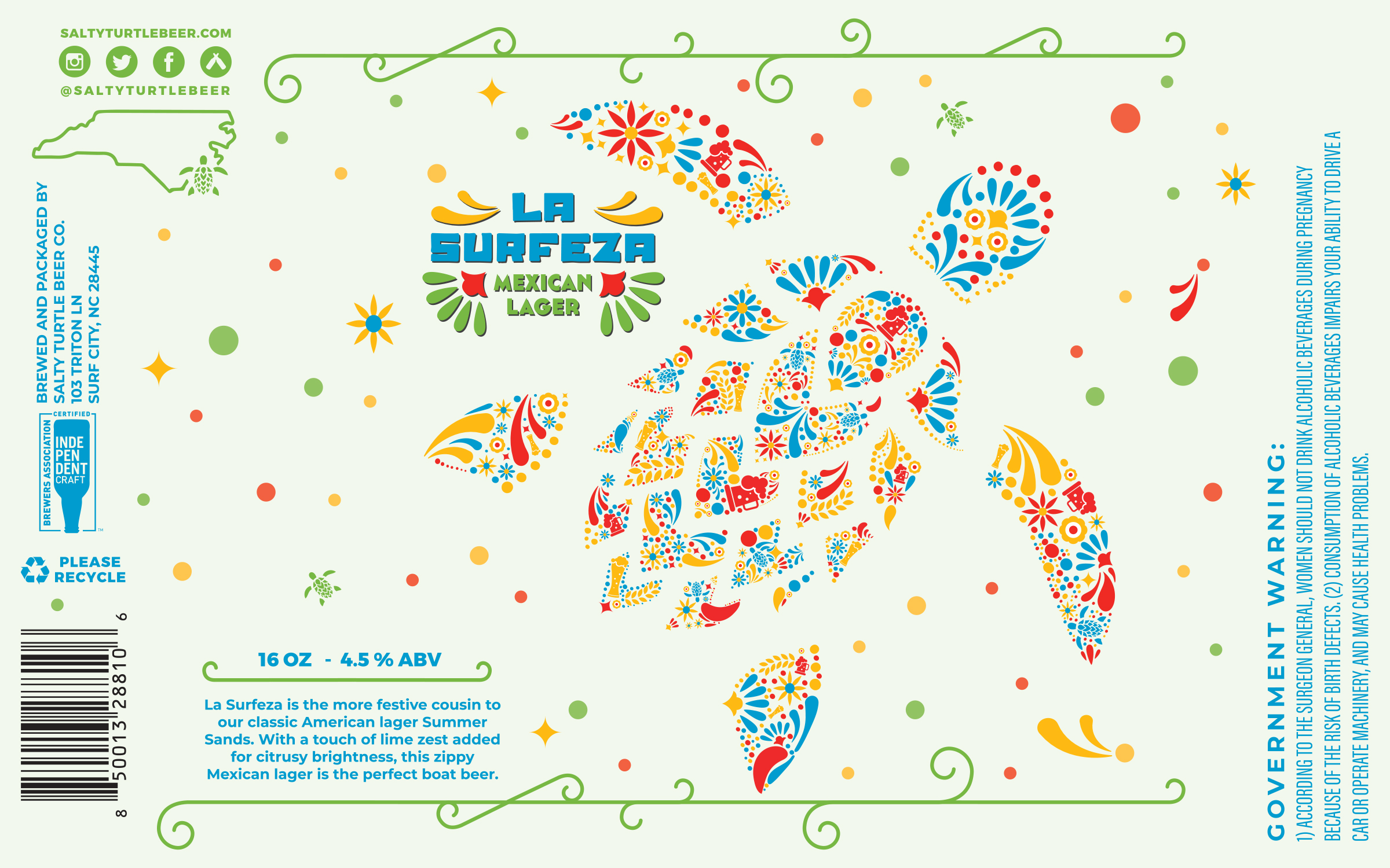
Art By: Ashley Dimick
Designed to be the perfect boat beer that adds a twist of lime to Salty Turtle Beer Co.’s classic American Lager, Surfeza Mexican Lager truly captures the essence of a day at the beach. Similarly, the dazzling, colorful label from Ashley Dimick, who designed this veteran-owned brewery iconic’s sea turtle logo along with its labels, invokes daydreams of the sand and surf. Featuring festive splashes of red, blue, yellow, and green in the shape of that iconic sea turtle, a mascot for the Surf City brewery that represents its dedication to donating a portion of sales to the Karen Beasley Sea Turtle Hospital, this label has us feeling like taking a Friday off to hit the sand and surf.
Malty, Amber, & Dark Lagers
Winner: Luchador Mexican Lager
The Mason Jar Lager Company – Fuquay-Varina, NC
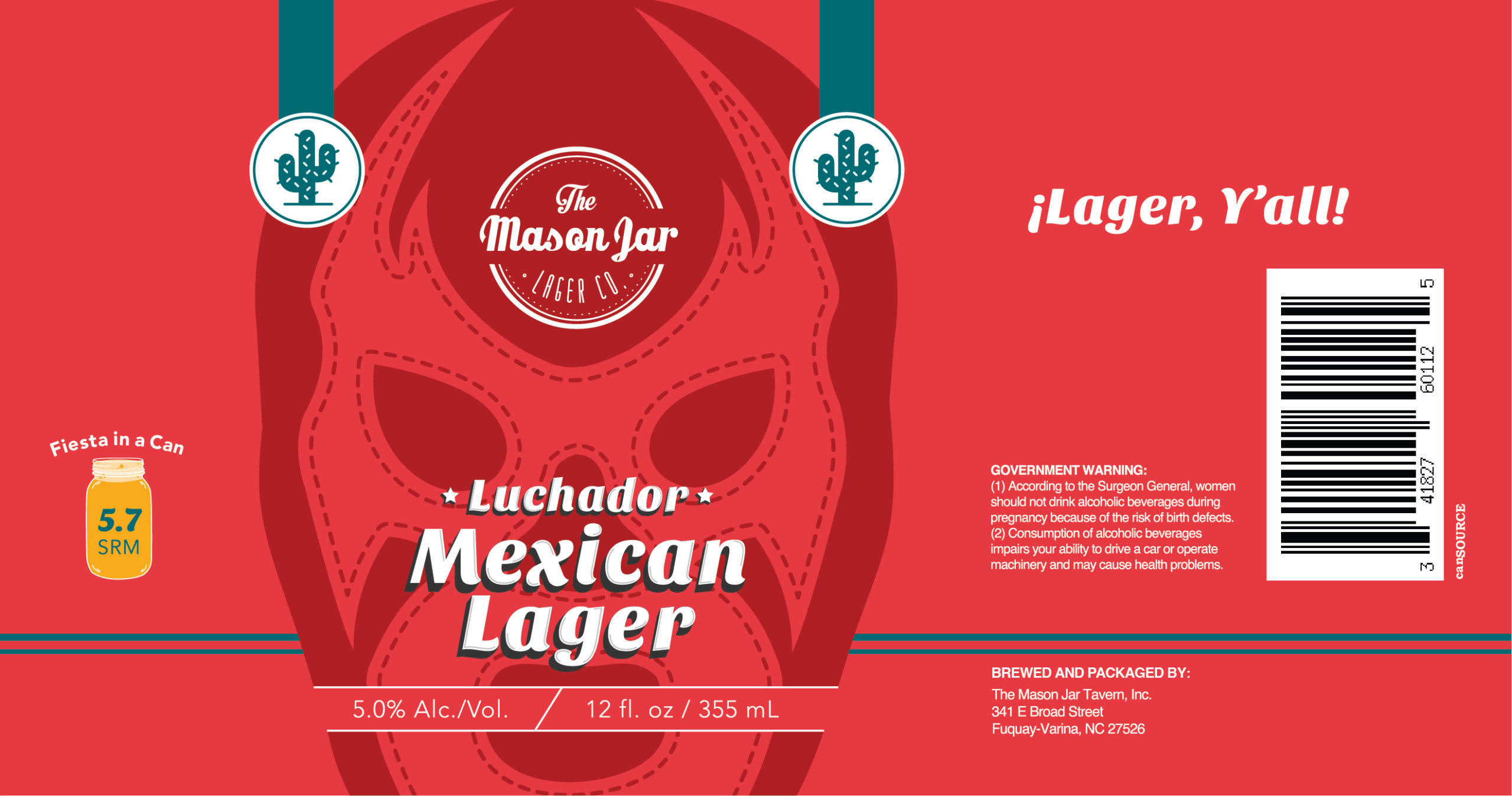
Art By: Laut Design
Much like Luchadors – professional Mexican wrestlers – are known for their famous masks and colorful costumes, The Mason Jar Lager Company in Fuquay-Varina, NC is equally well-known for its “Lager Y’all”. Its Luchador Mexican Lager pays homage to not only this style of beer, but also the celebrated sport south of the border. With a stark representation of the iconic face disguises Luchadors wear in the ring splashed across the can, this label from Raleigh-based product and design firm, Laut Design, subtly screams at us to drink this lager while watching our favorite sports.
Wheat Beers
Winner: Tropical Shirts
Wise Man Brewing – Winston-Salem, NC
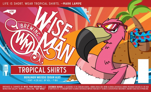
Art By: Jeff Beck
Nothing says tropical like a bright pink flamingo in sunglasses hanging out in an inner tube. Jeff Beck’s whimsical design highlights the playfulness of this Berliner Weisse packed with blackberries and raspberries. This label has us rifling through our closet to get to the stack of Hawaiian shirts and board shorts in the back. Soon summer will be here, the sun will be shining, and we’ll be sucking down one of these beauties on the beach. (Little drink umbrellas sold separately).
Amber & Red Ales
Winner: Outraged Daughters
Wise Man Brewing – Winston-Salem, NC
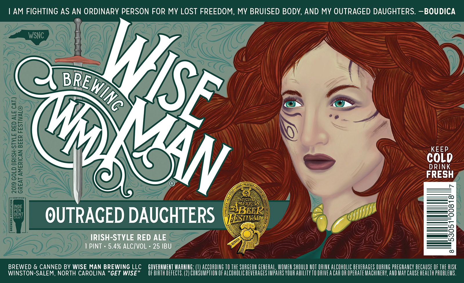
Art By: Fredo Felix
While we love beautifully-designed and illustrated labels we respect breweries that take space on their can to deliver a message. Art has the power to change the world and beer has become a platform to reach thousands with powerful points. Take the label from Wise Man Brewing’s Outraged Daughters, an Irish-Style Red Ale. While you may originally just see the face of a woman, read the quote, and dig a little deeper here. The label features a likeness and words from Boudica, an ancient British queen who in 60 CE single-handedly led a revolt against Roman rule. Boudica is often immortalized as a courageous warrior who fought for freedom from oppression. “I am fighting as an ordinary person for my freedom, my bruised body, and my outraged daughters,” said Boudica. We couldn’t have said it better ourselves and applaud Wise Man for devoting a beer to this unsung hero.
Porters & Brown Ales
Winner: #4TheGraham, Graham Cracker Porter
Gizmo Brew Works – Raleigh, NC
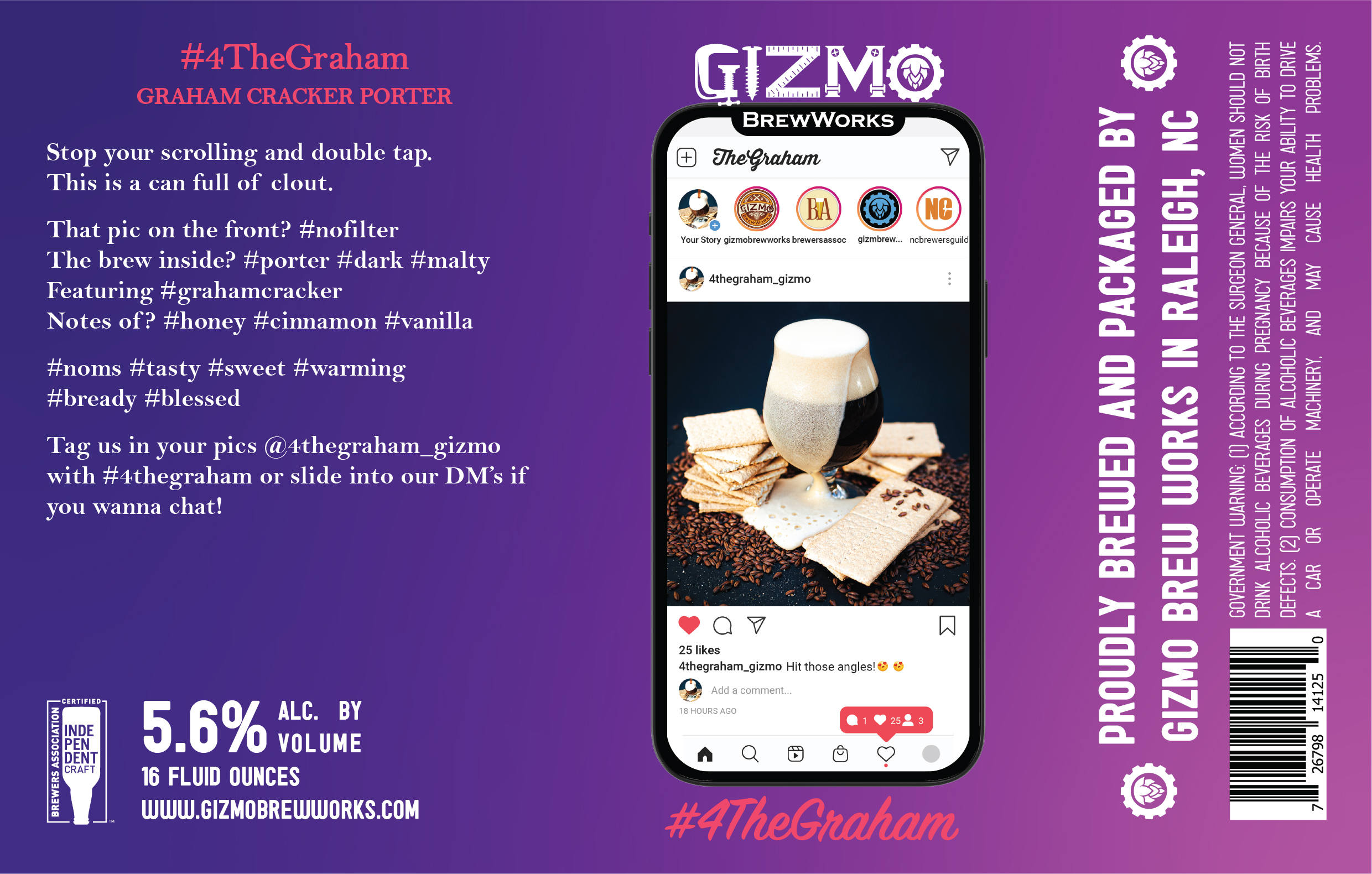
Art By: Jennifer Gorsuch Wood
It’s no secret that, with the number of breweries in the country closing in on 9,000, shelf space has become pretty coveted. A brewery’s can label can often set it apart from the pack, acting almost as a billboard for a brewery’s brand. Gizmo Brew Works in Raleigh went a step further, developing an actual beer around a hashtag. #4TheGraham Graham Cracker Porter encourages drinkers to “stop scrolling and double tap.” The label literally asks you to tag pics of the beer @4thegraham_gizmo. Such a smart branding idea from one of North Carolina’s strongest and feistiest breweries.
Stouts & Imperial Stouts
Winner: Strenna
Fullsteam Brewery – Durham, NC
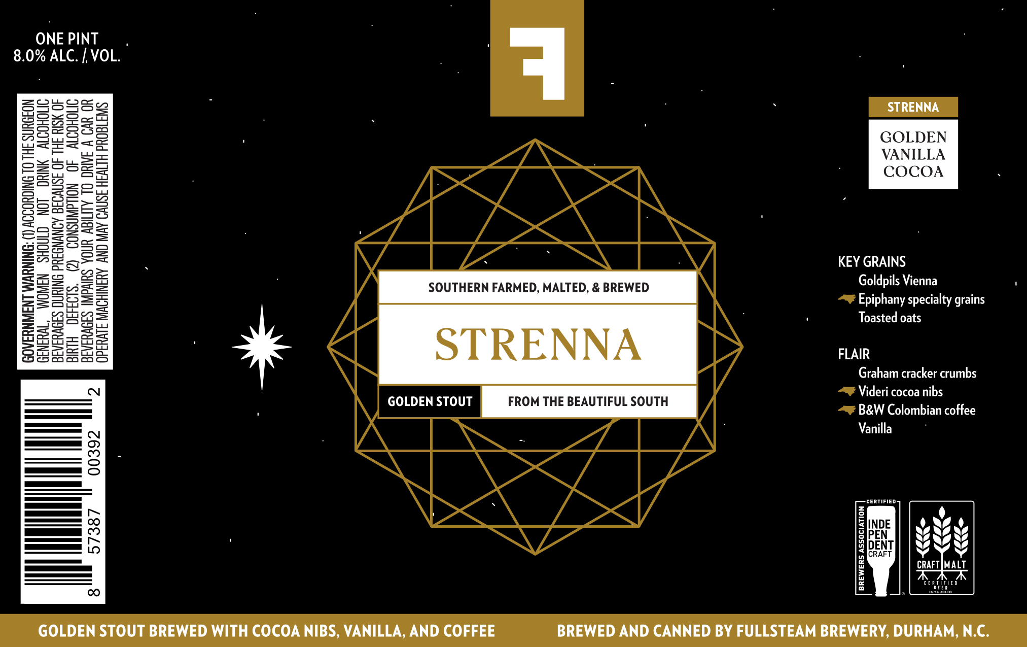
Art By: Chelsea Amato
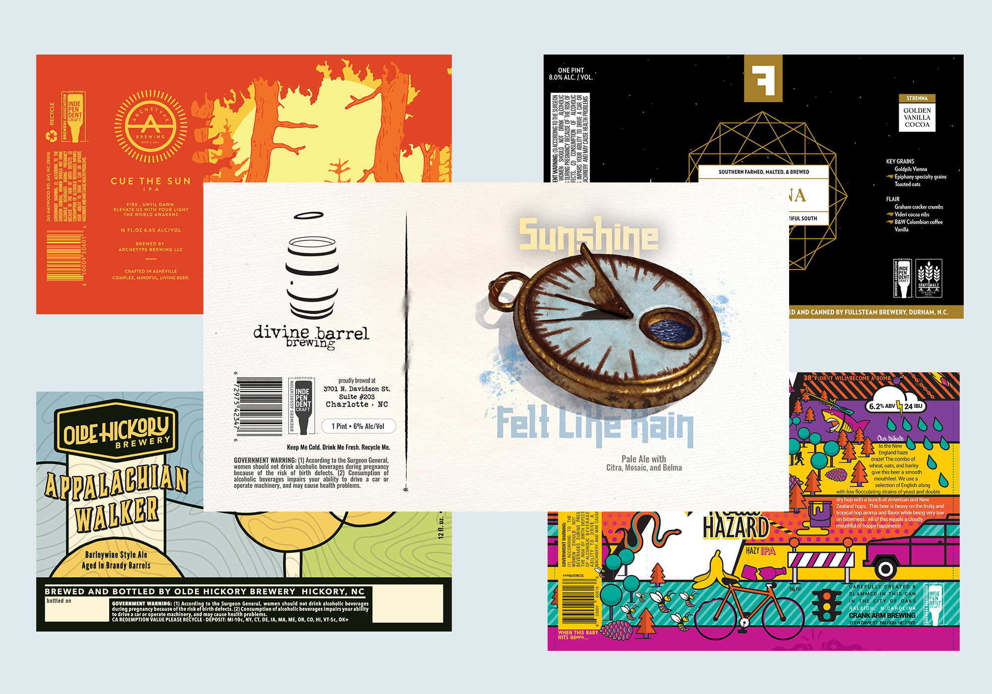
Fullsteam Brewery’s Brand Manager Chelsea Amato’s beer label designs seem to riff off of different scientific and natural elements. Her style is so clean, precise, and riveting that her designs were chosen not once, not twice, but three times on this list! For Strenna, a golden stout with roasted oats and additions of Videri Chocolate Factory cocoa nibs and Black & White Roasters coffee, Amato combines a pitch-black background with a striking gold design. It almost seems that she’s playing off the idea that this beer may be dark and rich in flavor, but pop up open the can and you’ll find a stout stunningly light and golden in color.
Strong Ales & Imperial (Double/Triple) IPAs
Winner: Churro Churro
Fullsteam Brewery – Durham, NC
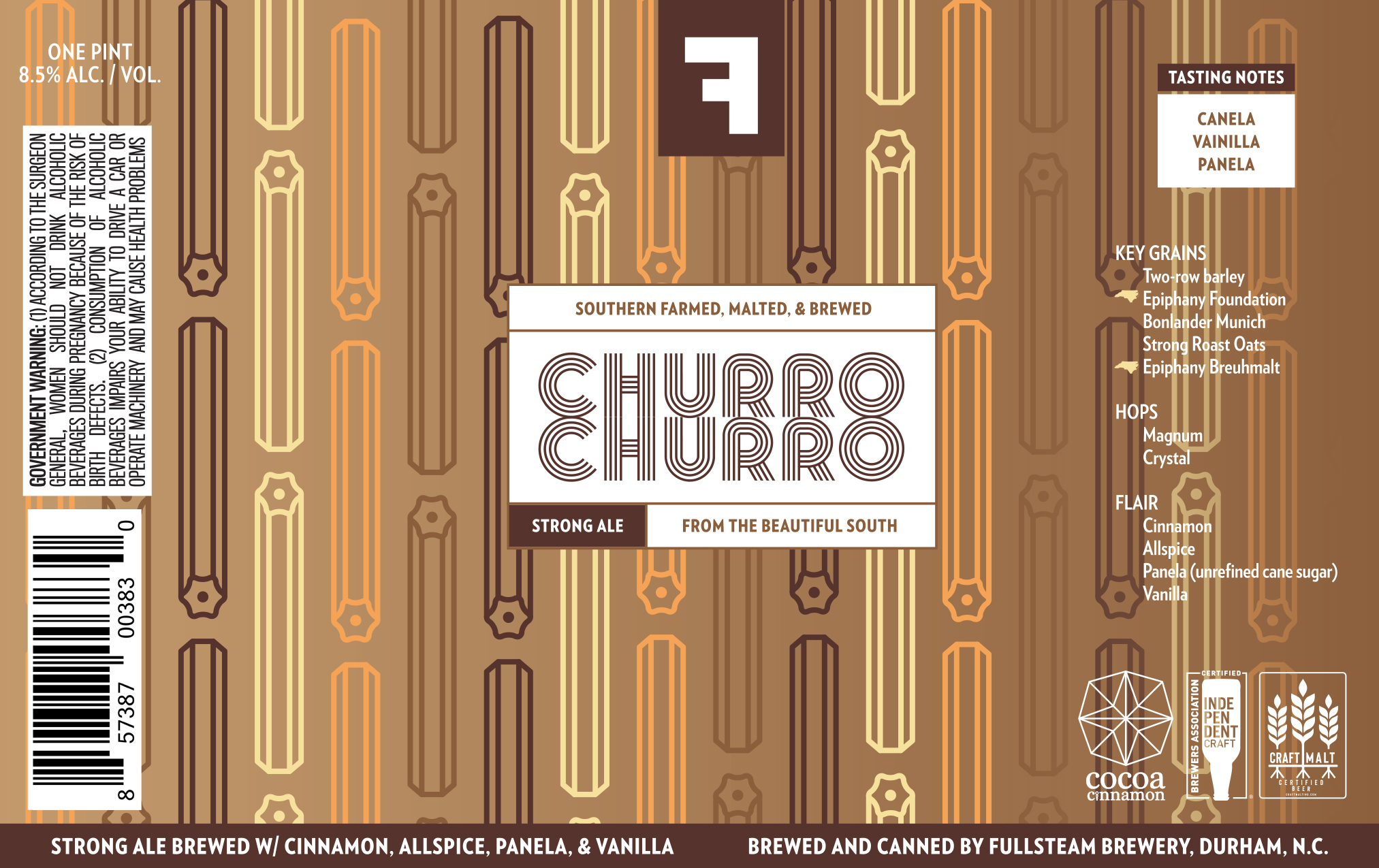
Art By: Chelsea Amato
Here we again find Amato’s stark lines and meticulous illustrations, but inflected with a touch of whimsy. Brewed with churro-inspired ingredients like cinnamon, allspice, panela (a traditional raw sugar used throughout Latin American), and vanilla, Churro Churro mimics the classic Latin American fried treat. Similarly, the label features drawings of the churro in a variety of brown hues, hinting at the flavors of the sugar-coated dessert inside. We found ourselves immediately craving something sweet to drink alongside this beer.
Session IPAs
Winner: One-y 100 Calorie Hazy IPA
Oskar Blues Brewery – Brevard, NC
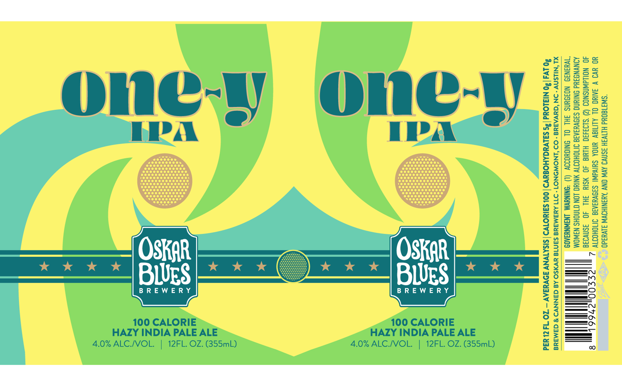
Art By: Matt Lowber
Last year Oskar Blues Associate Creative Director, Matt Lowber, was tasked with rebranding the entire brewery, updating the look and feel of the brand. One-Y 100 Calorie Hazy IPA feels like a great representation of this evolution. Bright green and yellow swirls are a refreshing drop in the bucket for a brewery more known for the classic colors found on its Dale’s Pale Ale or Old Chub cans (though, it should be noted that both these beers received their own design facelifts). The bright color palette hints at the big notes of orange peel, tangerine, and lemon zest delivered by Oskar Blues’ own interpretation of a full-flavored low-calorie hazy IPA.
Pale Ales
Winner: Sunshine Felt Like Rain
Divine Barrel Brewing – Charlotte, NC
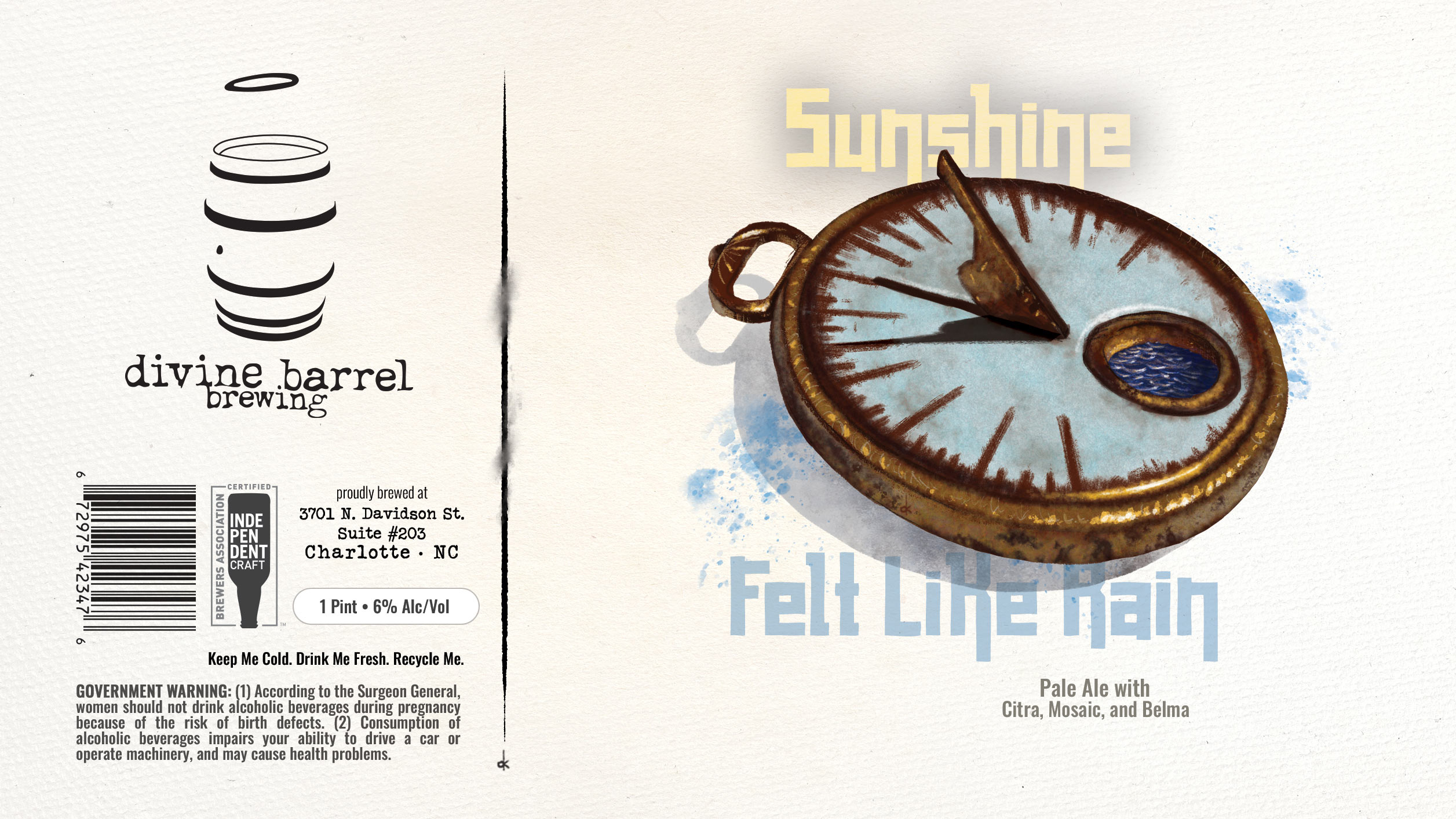
Art By: Dave Kaminsky
Divine Barrel’s artist and designer Dave Kaminsky has drank and drawn his way around Charlotte, designing labels for Salud Cerveceria and Heist Brewery along with Divine Barrel. His labels have a sense of almost dry, playful wit balanced with nostalgia. Take Sunshine Felt Like Rain. This Hazy Pale Ale brewed and double dry-hopped with Citra, Mosaic, & Belma is meant to mimic notes of orange creamsicles, pink Starbursts, and juicy mango, but the label forgoes the easy route of illustrating these flavor notes and instead features what appears to be a sundial in a puddle after its rain. Makes us question what it means for sunshine to feel like rain. This is a label that we’ve been discussing a long time after we finished the beer.
IPAs
Winner: Cue The Sun
Archetype Brewing – Asheville, NC
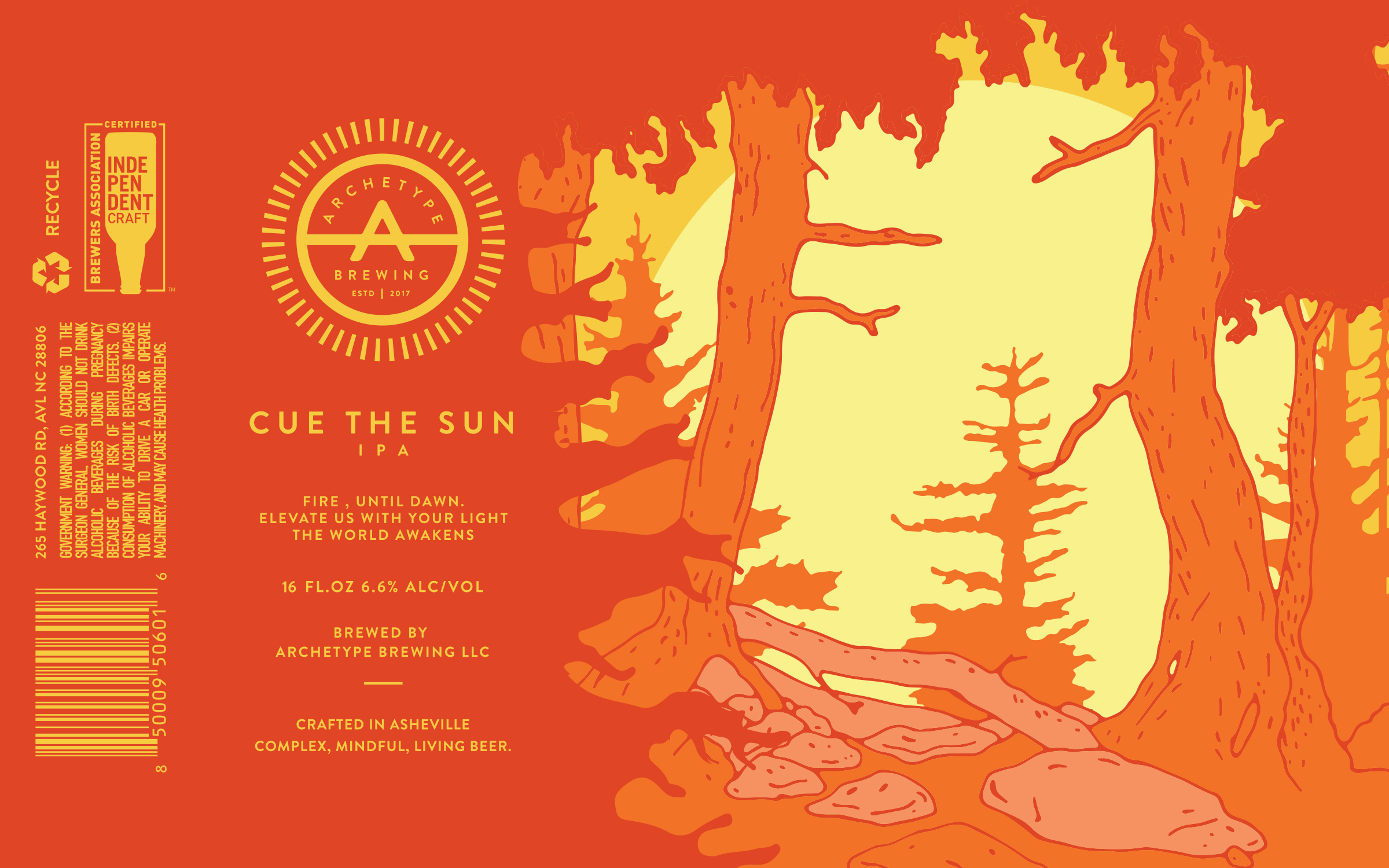
Art By: Sean Jones / HUMID DAZE
Inspired by Carl Gustav Jung’ principles of analytical psychology, Archetype Brewing in Asheville, NC describes itself as a conceptual brewery specializing in “complex, mindful, living beer.” This theoretical theme carries over into the brewery’s labels designed by Sean Jones, founder of his own design agency, Humid Daze. Archetype characterizes Cue The Sun as, “a fresh hoppy IPA with notes of bold citrus, delicious juicy apricot, and classic west coast grapefruit and pine.” We’d say this label is restrainedly bold and bad-ass. Simplicity reigns here with what seems to be just a few strokes of color. Archetype has this magical ability to give us a peek into these magical worlds. We almost feel like Alice falling down the looking glass and we can’t wait to pop the tab and walk into wonderland.
Specialty IPA (black, rye, fruited, brut, etc…)
Winner: The Explorer
Archetype Brewing – Asheville, NC
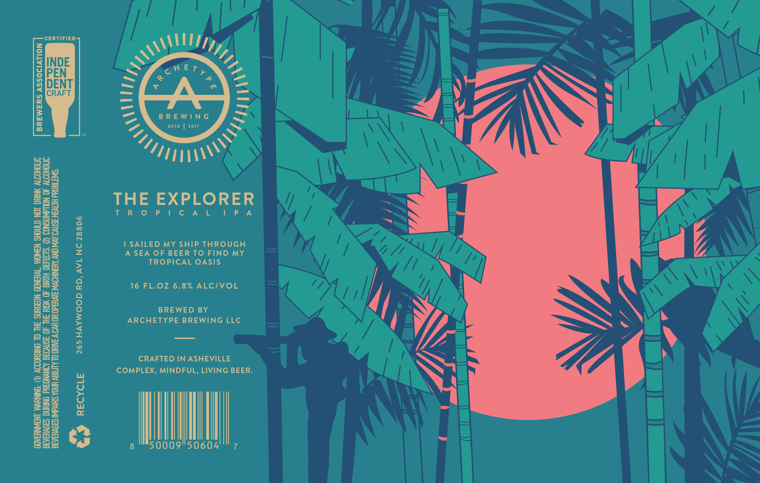
Art By: Sean Jones / HUMID DAZE
Archetype and Sean Jones have done it again, needing only four colors to paint the perfect tropical scene. Peeking through a series of tropical trees at a setting salmon pink sun, The Explorer label leaves us with a feeling of intrigue and mystery. Search a bit farther and the silhouette of someone looking through their own eyeglass will appear, drawing us even further into this mystical illusion. Described as boasting huge notes of pineapple, mango, and other fruits, Archetype’s Explorer calls out to us to explore the world. This tropical IPA has been one of the best ways we escaped our couch in the last couple of weeks.
New England & Hazy IPAs
Winner: Road Hazard Hazy IPA
Crank Arm Brewing Company – Raleigh, NC
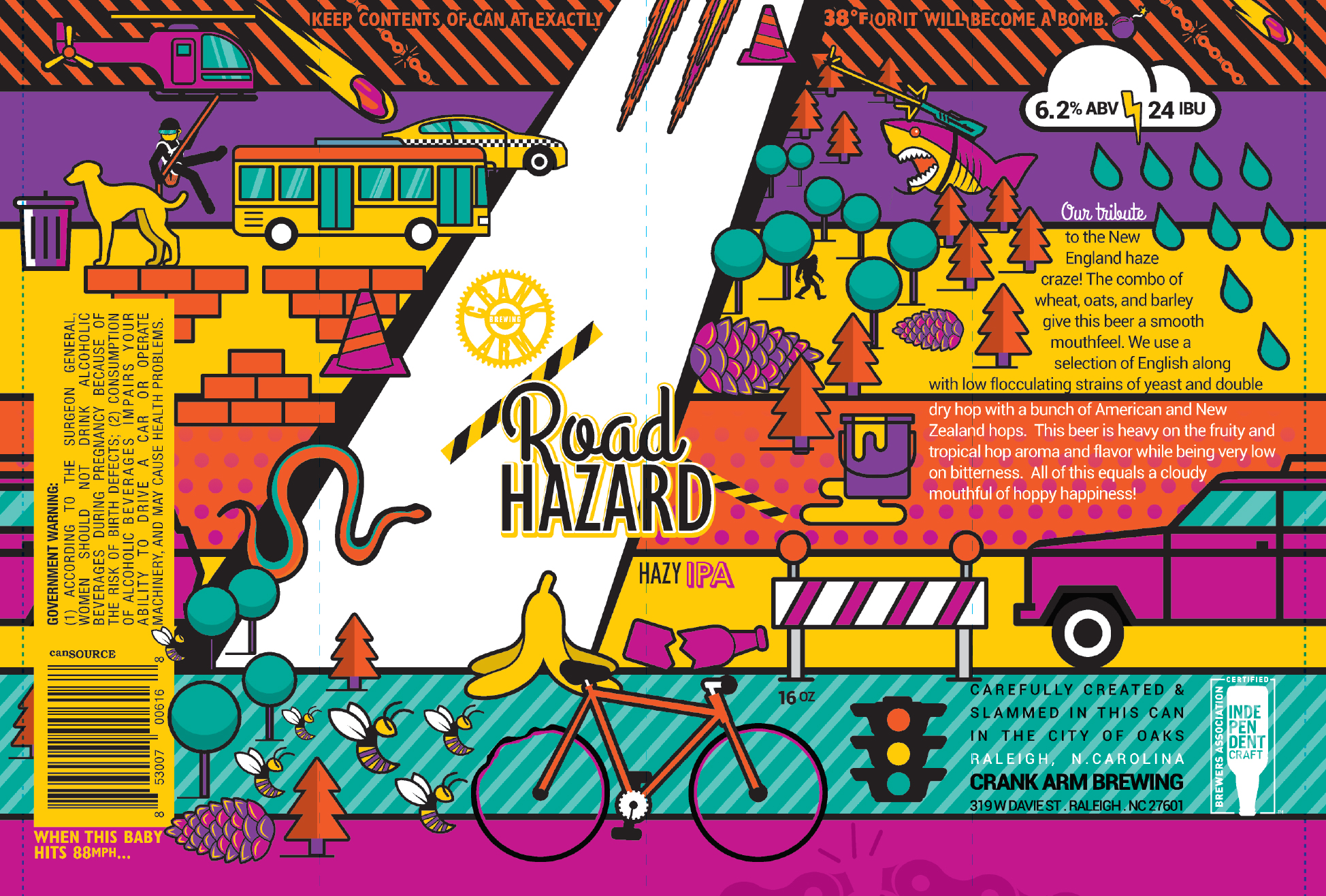
Art By: Adam Balding
Colorful, psychedelic, and packed with the brewery’s iconic cycling references, Crank Arm’s Road Hazard label creatively navigates the potential perils a biker faces on the road. Crank Arm bartender and CEO of design agency Saturday’s Gravy, Adam Baldwin has been working with Crank Arm co-owner Adam Eckhardt on can labels since the brewery first started canning three years ago. It’s a popping, eye-catching design that stands out on the shelf and in our minds.
Belgian & French Ales
Winner: Delicata
Fullsteam Brewery – Durham, NC
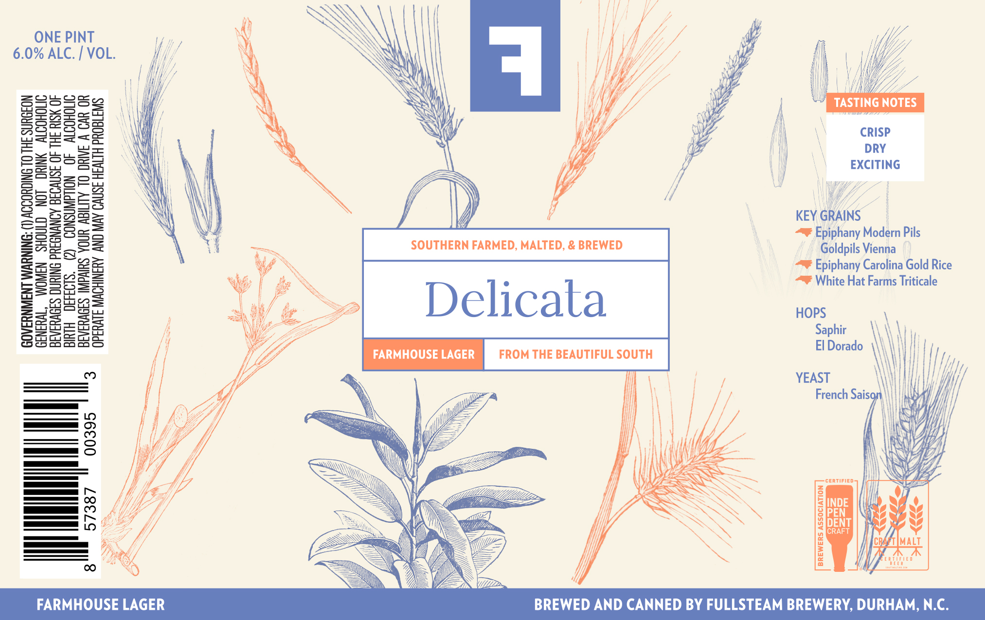
Art By: Chelsea Amato
What we love so much about this design is that it belies the complexity of the beer inside. Delicate drawings of grains sprout across the outside of the can while inside at 83 percent local by weight, Delicata features mostly grains from the Carolinas including barley, rice, and triticale. This limited release farmhouse lager from Fullsteam Brewery in Durham is brewed with saison yeast, but fermented at cooler temperatures and lagered for what the label calls “a bone-dry, crisp, and lively” beer. Likewise, the illustrations on this label are crisp, detailed, and alive.
Sour, Brett, Mixed, & Wild Ales
Winner: GØLDNDÆ
Traust Brewing – Charlotte, NC
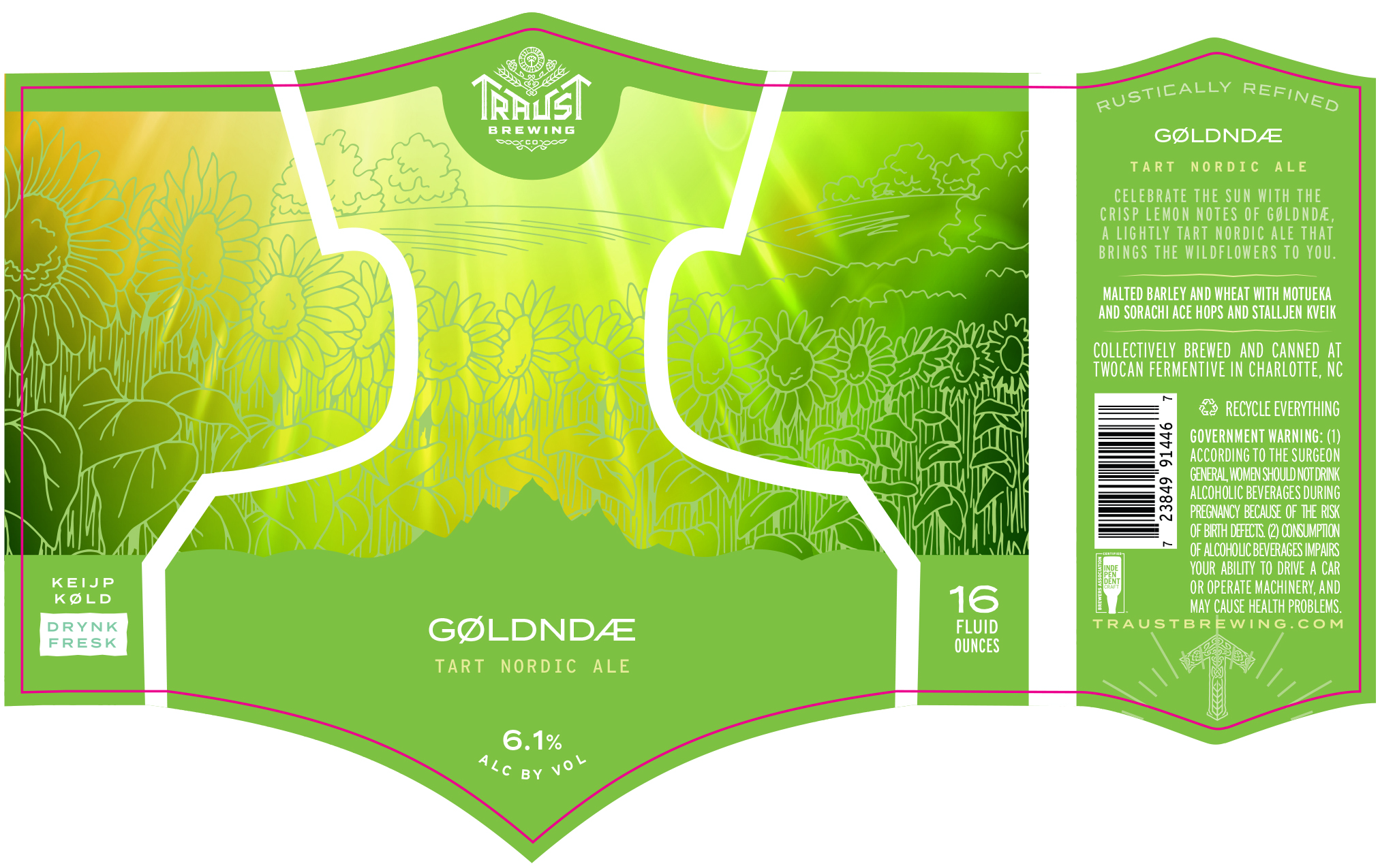
Art By: Eric Stevens
Take one look at this label and you feel like you’re frolicking in a field of wildflowers soaking up the late summer sun. And, while we’re fascinated with the happy vibes we feel from this design, we’re even more impressed with the story behind Eric Steven and Traust Brewing.
At this time last year, Stevens had been in the midst of raising funds to open Traust in Charlotte, NC when COVID-19 hit. Pressing pause on his plans to open a taproom, Stevens instead pivoted and started brewing out of Thirsty Nomad Brewery, which closed its doors last summer. Now, his 3-bbl brewhouse has been churning out four different beers a month in very limited 25 cases per batch quantities. The small scale has given Stevens the chance to wear all different kinds of hats, including designing his own can labels.
We love how the label’s distinct minimalist, Scandinavian feel, reflects the brewery’s dedication to Nordic culture. Consequently, GØLDNDÆ is a lightly tart Nordic ale that incorporates those sunny, vibrant lemon notes that first drew us into Stevens’ design. This label makes us excited to see what else Stevens has coming down the line at Traust in 2021.
Spiced, Vegetable/Herb, & Seasonal Beers
Winner: Ginger’s Revenge: Original
Ginger’s Revenge – Asheville, NC
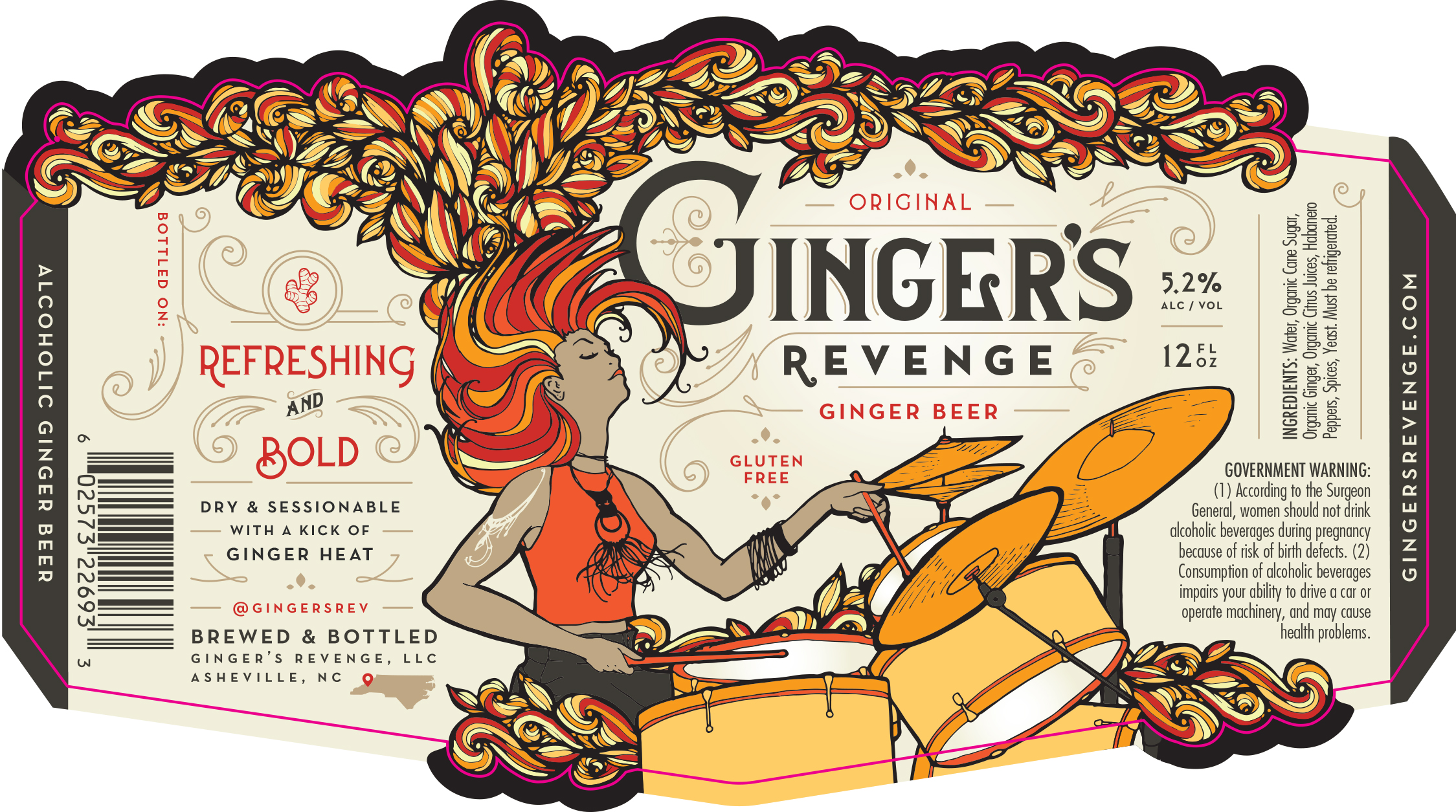
Art By: Atlas Branding
This label is as unique as Ginger’s Revenge itself, our only brewery in this competition crafting an alcoholic ginger beer. The label evokes movement, motion, and music. Drinking this award-winning ginger beer made with Peruvian and North Carolina ginger, cane sugar, grapefruit juice, habanero pepper, and spices, will cause your tongue and palate to do a similar dance.
Barrel-Aged (Wood) Beer
Winner: Appalachian Walker
Olde Hickory Brewery – Hickory, NC
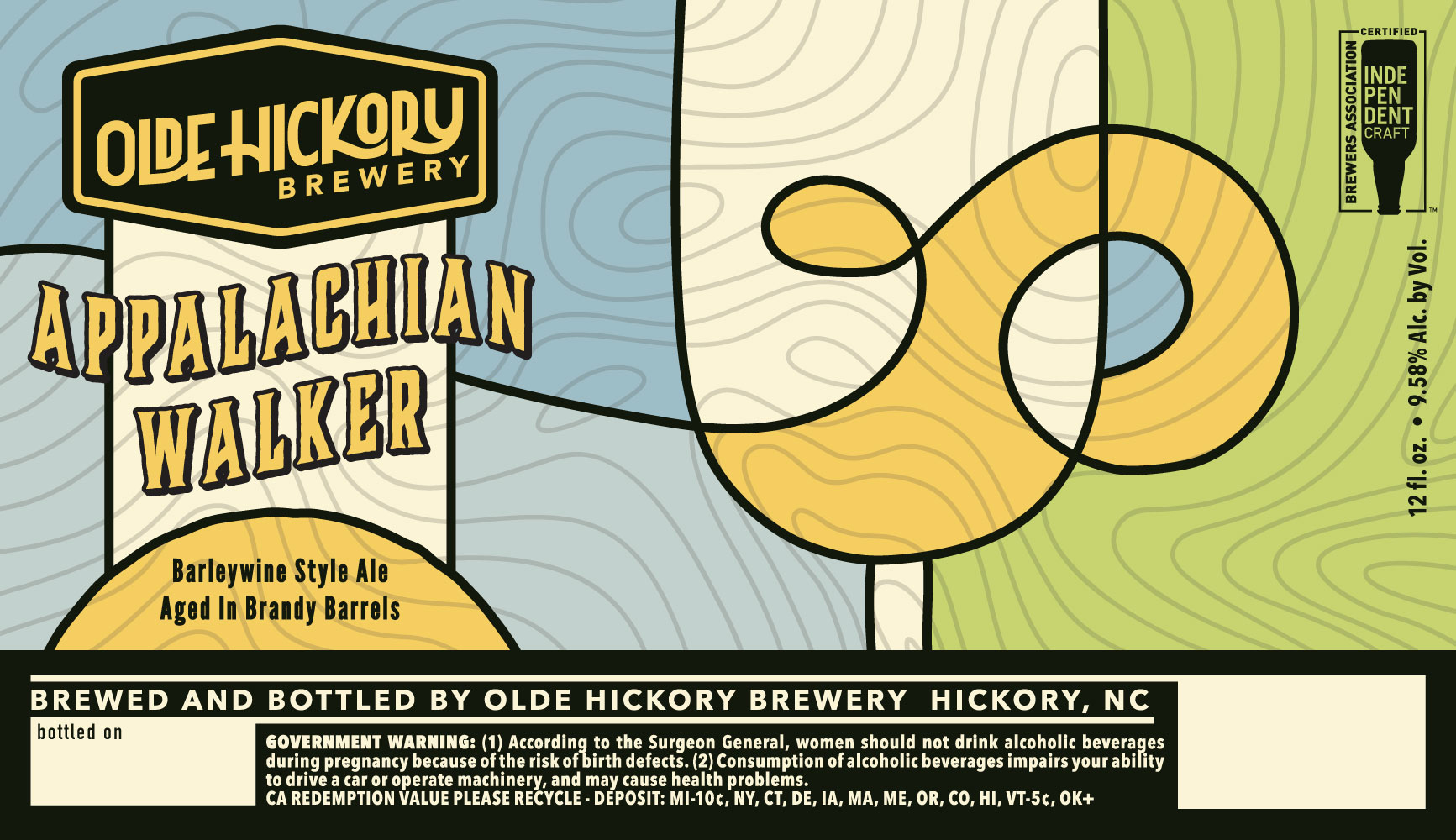
Art By: Patrick Westmorland
Meant to be an annual collaboration with Asheville’s Appalachian Vintner, Appalachian Walker takes Olde Hickory Brewery’s award-winning Irish Walker barleywine base and ages it for over a year in Brandy barrels. Additionally, a portion of this beer’s sales are contributed to the Puzzle Piece Project which supports autism research. We can see a similar theme in Patrick Westmorland’s artwork, appearing almost as puzzle pieces on the label and outlining the shape of a wine glass. This is one of those illustrations that you need to take a moment with, stepping in closer, then stepping back, then coming back in to fully understand. We imagine it’s a similar approach with beer. A barleywine of this quality you need to let breath, sit with for a while by the fire, and sip slowly to truly appreciate.
Liked this article? Sign up for our newsletter to get the best craft beer writing on the web delivered straight to your inbox.
About The Author
Grace Lee-Weitz
Currently Drinking:
Fort Point Beer Co. KSA
Grace is the Senior Content Editor for Hop Culture and Untappd. She also organizes and produces the largest weeklong women, femme-identifying, and non-binary folx in craft beer festival in the country, Beers With(out) Beards, and the first-ever festival celebrating the colorful, vibrant voices in the queer community in craft beer, Queer Beer. An avid craft beer nerd Grace always found a way to work with beer. After graduating with a journalism degree from Northwestern University, she attended culinary school before working in restaurant management. She moonlighted as a brand ambassador at 3 Sheeps Brewing Co. on the weekends before moving into the beer industry full-time as an account coordinator at 5 Rabbit Cerveceria. Grace holds her Masters degree in the Food Studies program at NYU.