As the old adage goes, don’t judge a book by its cover. Most would suggest the same for beer cans and bottles. But, and I sound like a broken record at this point, the best breweries care how their beer looks–they’ve invested in its presentation.
Still, a great label doesn’t mean you’ll end up with a great beer. In 2019 we had some fantastic beer out of some shoddily designed cans and bottles. And we had some less than stellar beer poured from engaging, fun, and well-designed packaging. Caveat emptor I suppose, but at this point we’ve highlighted the usual suspects when it comes to quality beer and design (Hudson Valley, The Referend, Foam, Forest & Main, Brouwerij West, etc., etc.).
Scroll through Instagram and you’ll find dozens of eye-catching designs from a myriad of breweries, but we’ve limited this article to beers we’ve had a chance to sample, photograph, and write about this year.
Below, we’ve listed our top choices. They’re in no particular order except for SHORTS!, which we happily proclaim our best label design of 2019.
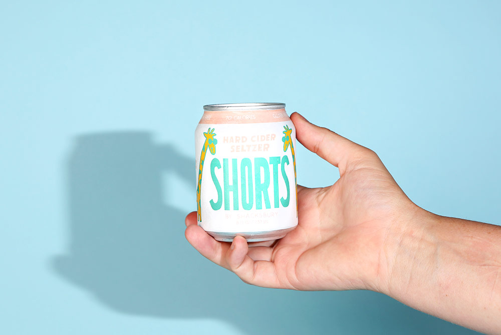
SHORTS!
Shacksbury Cider — Vergennes, VT
Art by Will Bryant
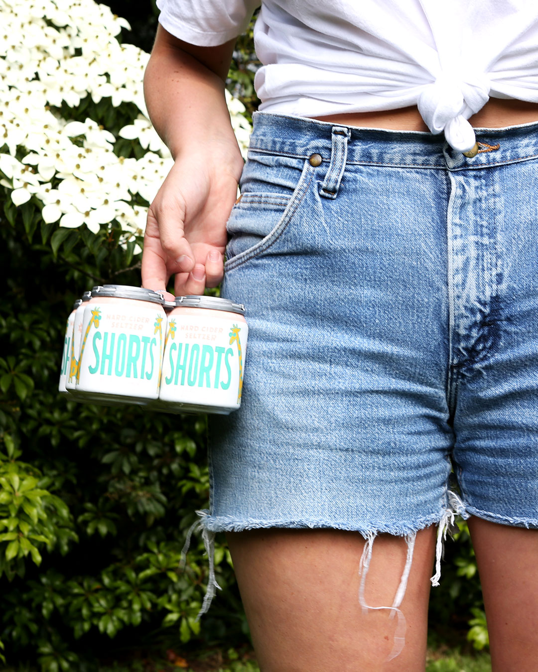
Hard Cider Seltzer– Our friends at Shacksbury have a track record for showcasing endearing label designs, from the simple and traditional Lost & Found bottles to the whimsical Vermonter. But Shacksbury’s 2019 SHORTS!, a hard cider seltzer packaged in 8 oz. cans, was a unanimous decision for the best label design of 2019. The adorable packaging feels fresh in a sea of 16 oz. cans and 750 ml. bottles. The artwork is playful and unfussy. Not to mention the liquid itself is superb; we wrote at length about how charming, refreshing, and flavorful SHORTS! is, but it’s worth highlighting that it’s a great beverage in addition to a great package.
We’re hoping 2020 brings more alternative packaging to the industry, but for now, we’re happy sipping our SHORTS!
Rat-A-Tat
Bearded Iris Brewing — Nashville, TN
Art by Alic Daniel
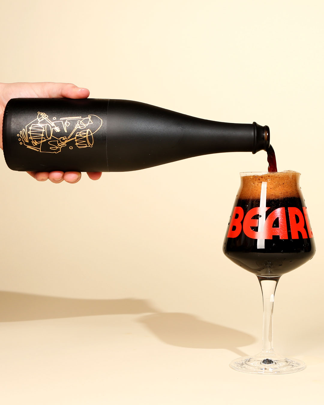
Imperial Stout– In terms of upcoming design trends, we definitely came across several matte black bottles in the wild and one of our favorites from the year was Rat-A-Tat from Bearded Iris. Rat-A-Tat was one of two beers (One Man Band being the other) released for Bearded Iris’ birthday, but we leaned toward the all-black, clean and classy label of Rat-A-Tat. Both labels were stylishly illustrated by artist Alic Daniel. The brewers at Bearded Iris admitted it was a labor-intensive project filling all of these blacked-out bottles, but we think the time and effort were worth it for the final product.
Don Senderson
Humble Sea Brewing Co. + Cellarmaker Brewing Co. — Santa Cruz, CA + San Francisco, CA
Art by Juan Llorens
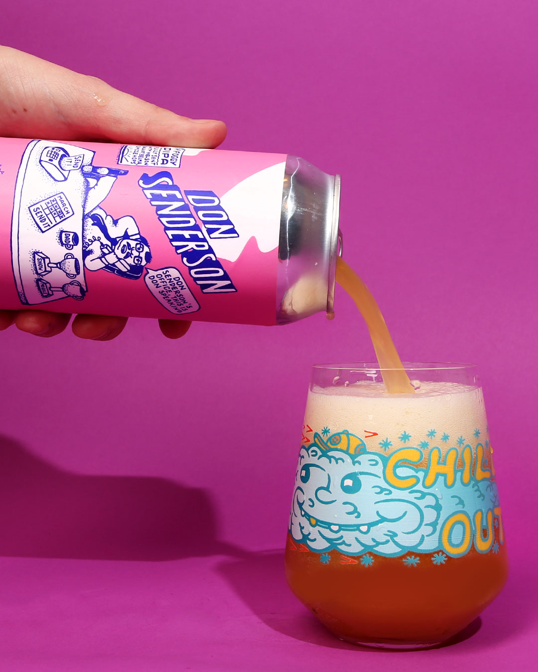
Double New England IPA– Humble Sea takes fun seriously. One look at their Instagram page and it’s obvious that they’ve poured their true personalities into the brewery. Don Senderson, a delicious collaboration between Santa Cruz’s Humble Sea and San Francisco’s Cellarmaker, is an irreverent and delightful can design with fun details that stay true to the Humble Sea brand. We love these kooks and we’re not afraid to admit it.
40 Thieves
Zero Gravity Brewing — Burlington, VT
Art by Andy Morris
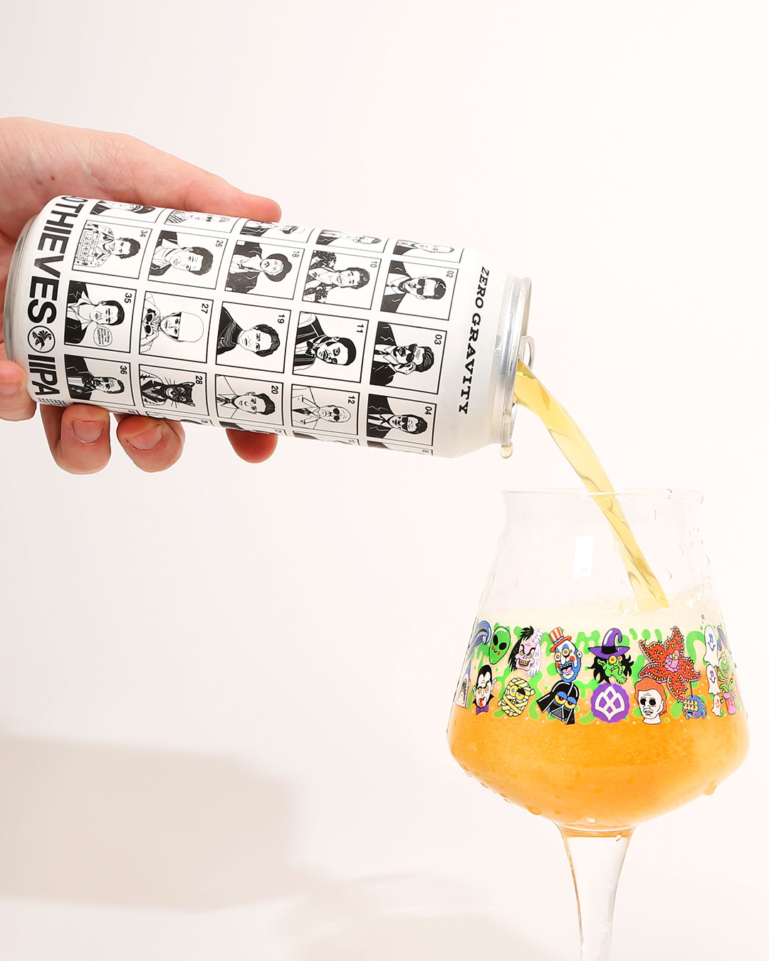
Double New England IPA– It doesn’t take much to get behind a can design with a game built into it. 40 Thieves from Zero Gravity features forty illustrations of classic thieves like The Hamburglar, Fantastic Mr. Fox, and Mr. Pink. There’s a numbered key with the names of all the characters but we’d recommend letting friends take their shot at identifying all forty thieves.
New New
The Rare Barrel — Berkeley, CA
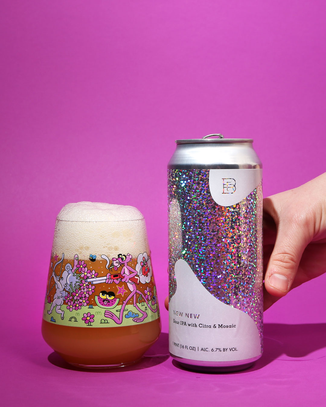
Sour IPA– The Rare Barrel’s first foray into canned Sour IPAs was a show-stopper. What a way to announce a new brand. This shimmering can design was such a fresh introduction for a new lineup of beers and was a thoughtful departure from their typical bottles. Retro, engaging, and memorable, New New was the perfect lead-in for a year of canned beer from The Rare Barrel.
Piece of Future
The Eighth State Brewing Co. + Ponderosa Farm Brewing — Greenville, SC
Art by Nicolas Pabon
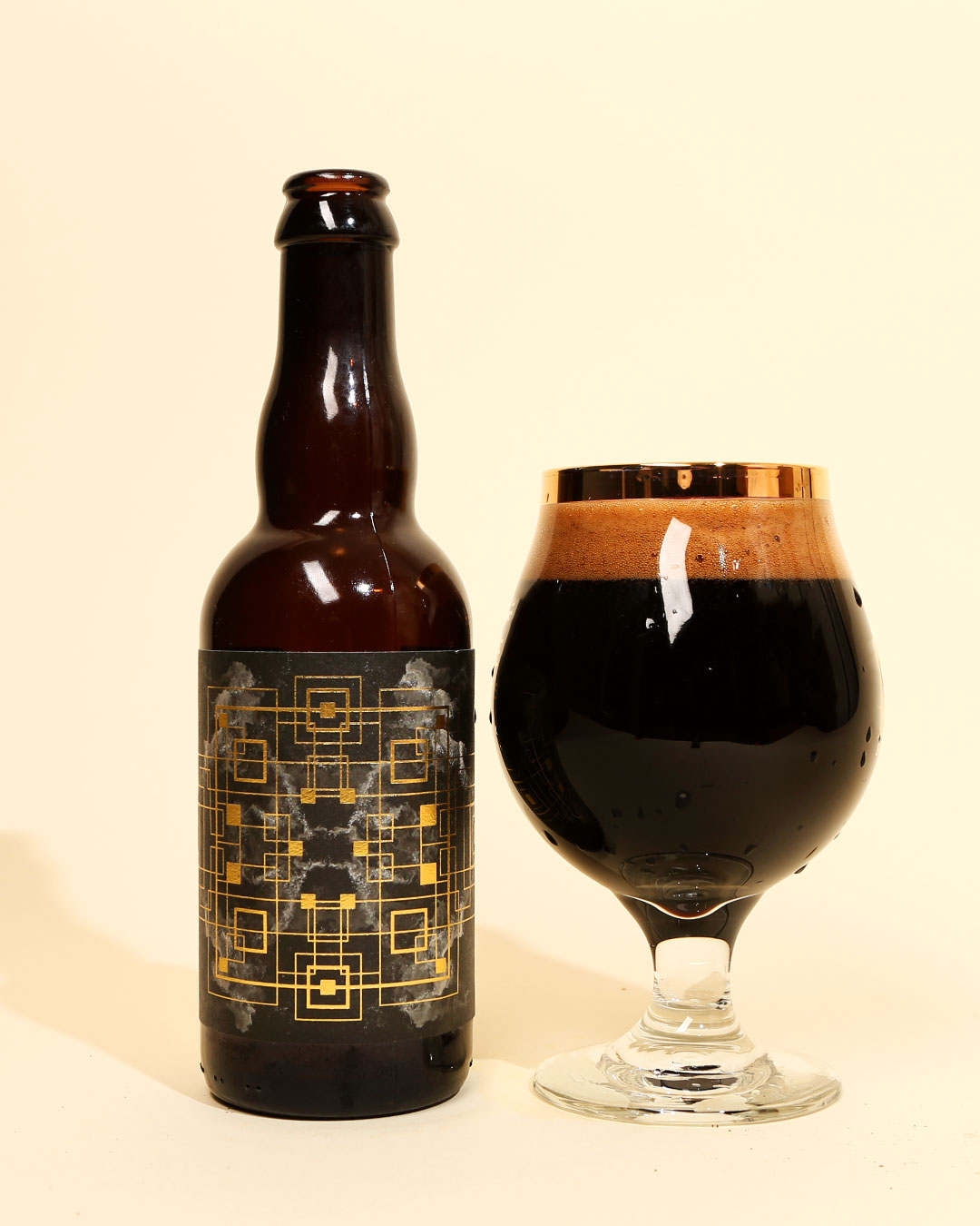
Imperial Stout– The Eighth State has quickly risen from underground hidden gem to venerable East Coast must-try brewery. The Greenville brewery has been brewing a slew of remarkably balanced and well-constructed stouts. Piece of Future was one of our favorite beers of the year and the design on the bottle left a lasting mark. The artwork from Nicolas Pabon is trippy, spiritual, and special. Not to mention the added touch of gold foil for a textured label and the matching gold wax. It’s an artistic label for an artful beer.
Rise
Outer Range Brewing Co. — Frisco, CO
Art by Shannon Kennedy
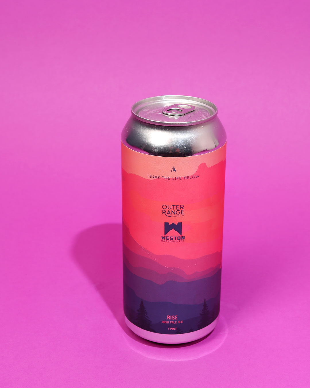
New England IPA– Outer Range is so on brand, it’s ridiculous. They’ve printed cans with trail maps, they have a yurt for crying out loud! The Outer Range team truly lives the outdoors lifestyle, so it was no surprise when they announced they were collaborating with Weston snowboards. The result was Rise, a delicious and juicy New England IPA. The can art was mesmerizing, letting the colors and landscape sing. It’s a label design that’s calling us back to Frisco, CO.
Punks in the Waiting Room
Sideward Brewing Co. — Orlando, FL
Art by Stout Collective
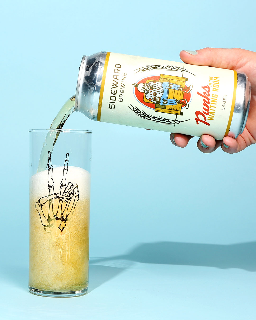
Lager– Sideward Brewing Co. was a recent discovery for us. The Orlando brewery has quietly brewed some of the most consistently delicious beers in Florida that we’ve come across. Not to mention their branding, led by Stout Collective, has helped establish a visual identity that doesn’t take itself too seriously but commands attention. Punks in the Waiting Room was one of our favorite Sideward can designs; reminiscent of classic lager vibes while still modern, Punks got us in a crispy vibe.
Orange Mango Jam
Mikkeller NYC + Hop Culture — Queens, NY + Pittsburgh, PA
Art by Keith Shore
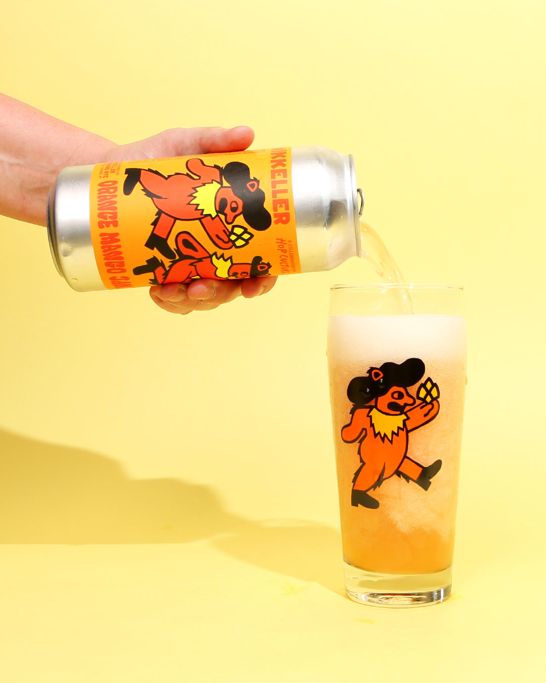
Berliner Weisse– Getting the chance to collaborate with the legendary Keith Shore was truly a highlight for the Hop Culture team. We threw it back to everyone’s favorite jam band with this can and glassware design–of course with the classic Mikkeller twist. It’s a label that unites deadheads and beer nerds.
Chêne Cerise / Chêne Pêche
Our Mutual Friend Brewing Co. — Denver, CO
Art by Justin Pervorse
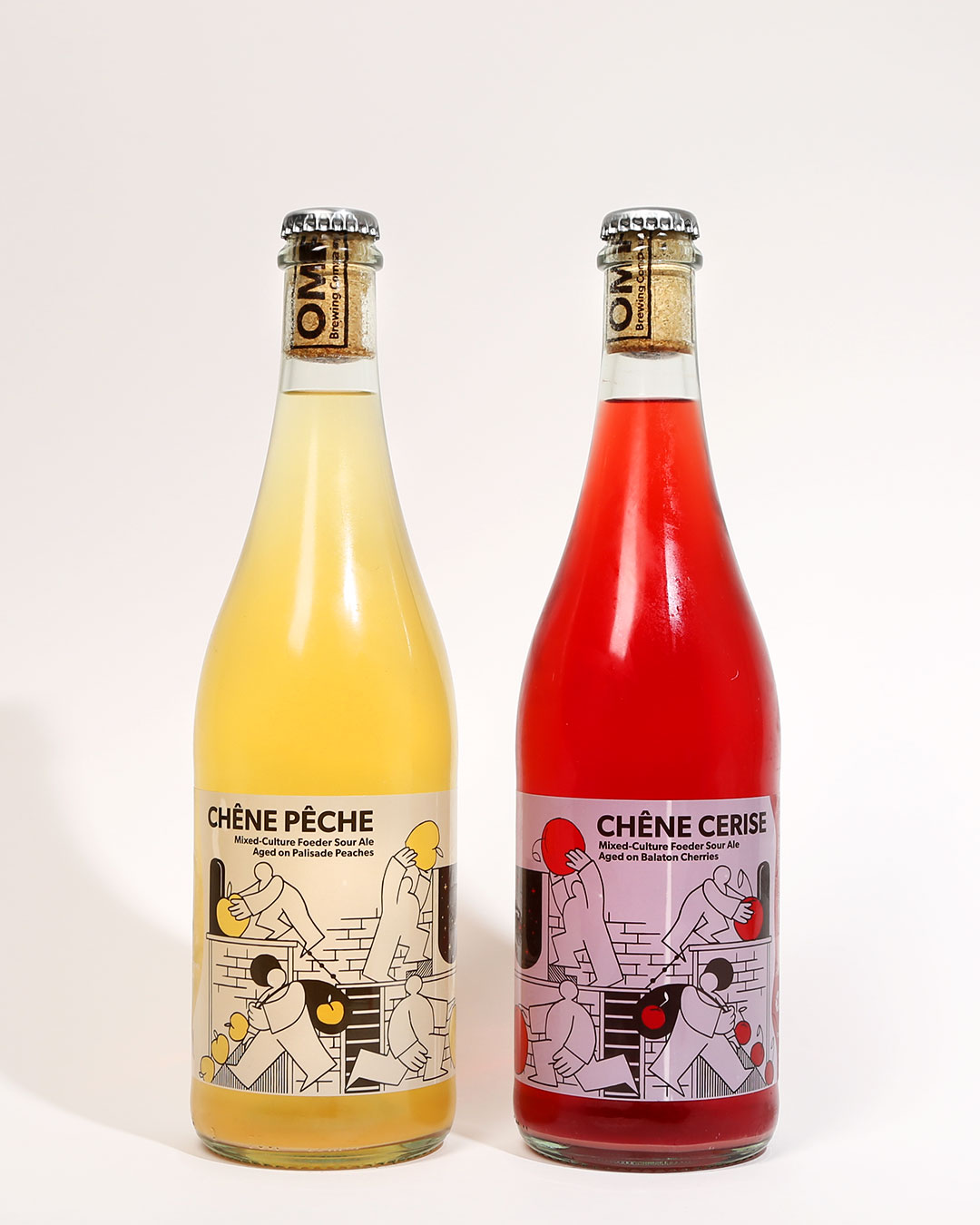
Mixed Culture Sour Ales– We know this beer technically debuted in 2018, but it wasn’t until early 2019 that we had a chance to sample and enjoy these Our Mutual Friend creations. The beers themselves were stunning and the presentation in the clear glass bottles elevated the drinking experience. The labels, illustrated by Justin Pervorse, were playful with a tinge of nostalgia reminding me of old-school cartoons. The open spaces in the art allow the beer to shine through and create a dynamic and purely fun label.
Cowboy Poet
Archetype Brewing — Asheville, NC
Art by Sean Jones
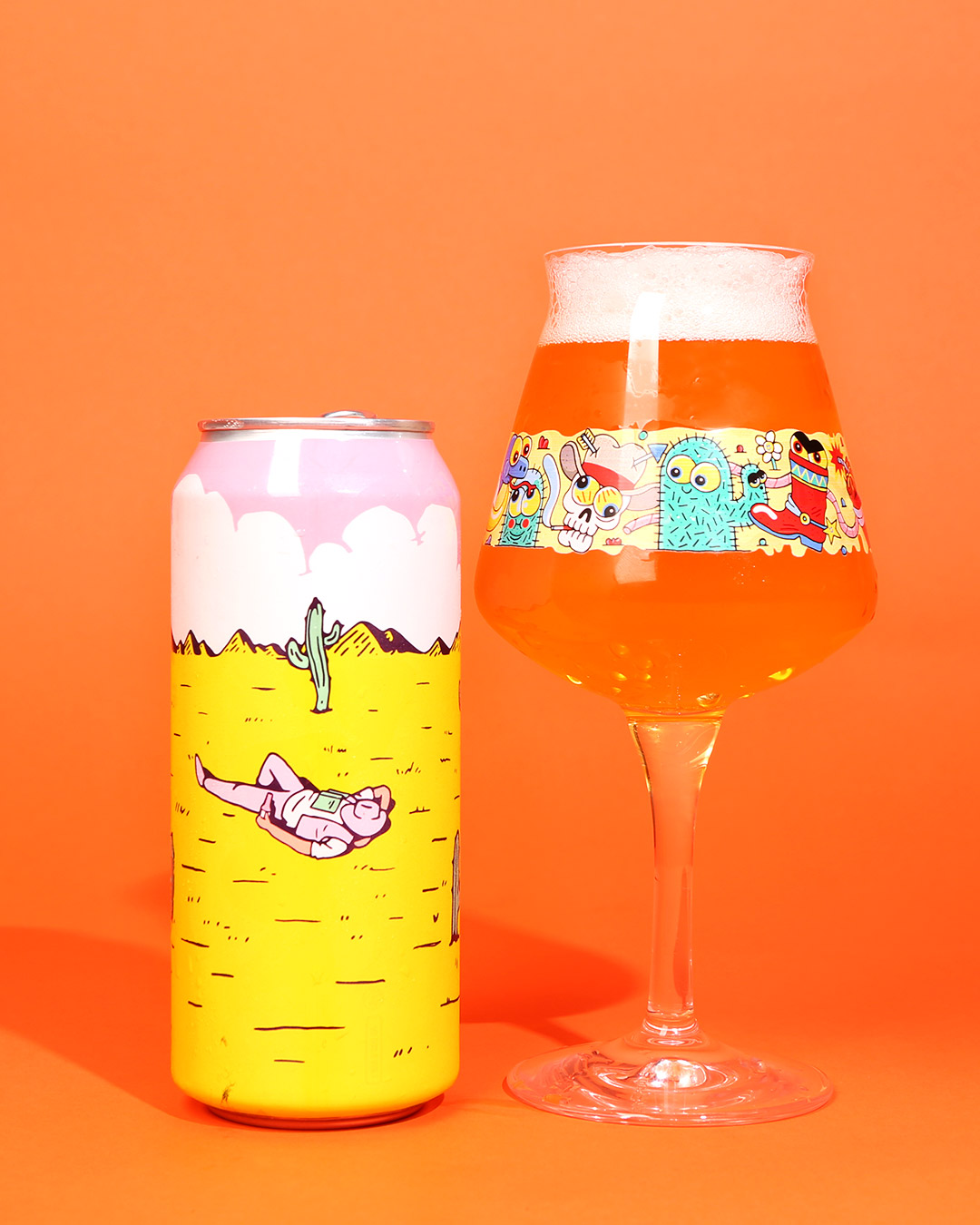
Lager– Another revelation this year was Asheville’s Archetype Brewing. The relatively new brewery won us over with solid beers and lovely can designs, which feature a haiku on every label. Cowboy Poet was a favorite not only for reminding me of the Poet Laureate of the West, but for channeling the romantic view of the American West. Plus that beer was damn good.
Hemingway
Commonwealth Brewing Co. — Virginia Beach, VA
Art by Thirst
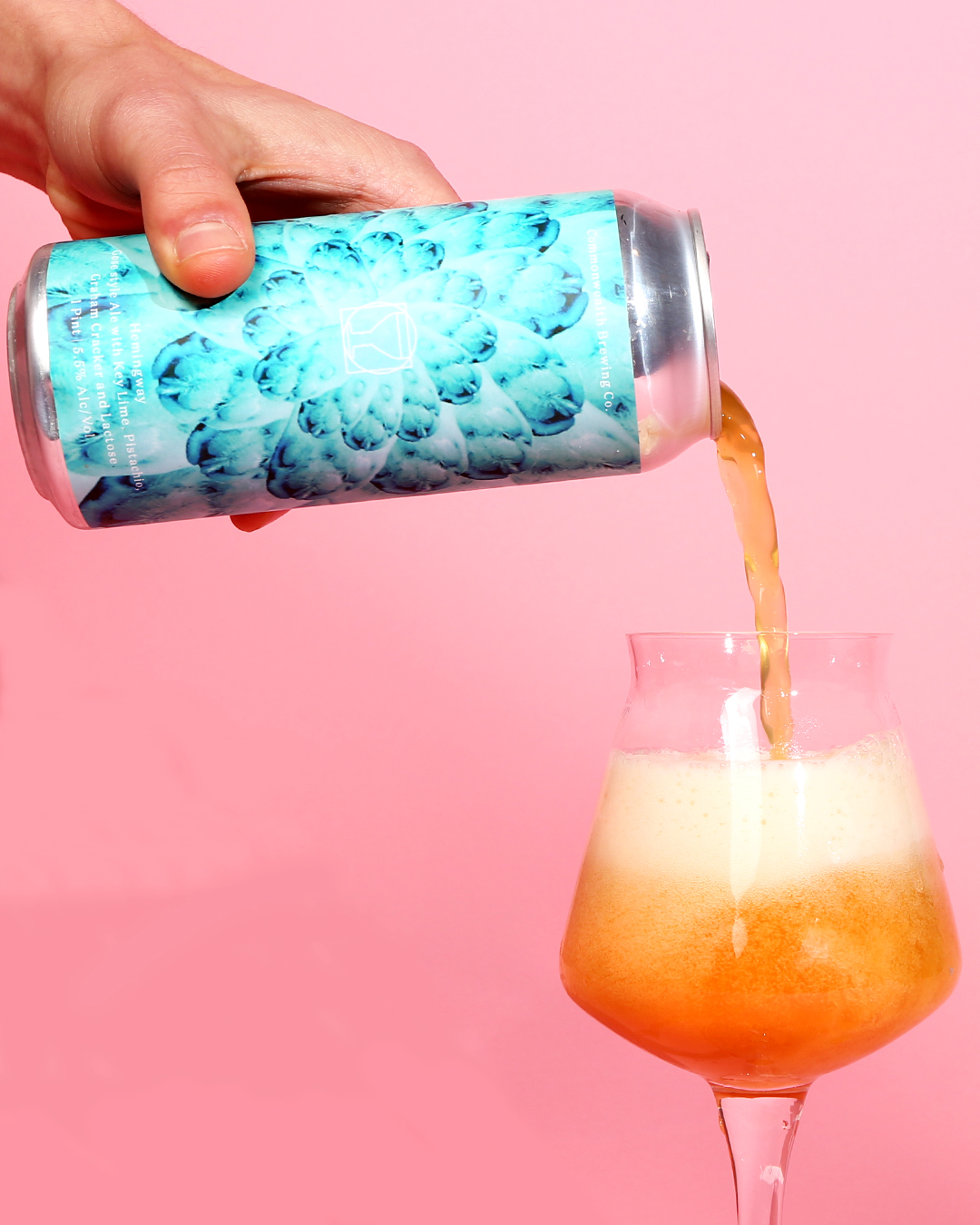
Gose– One of my personal favorite beers of the year, Hemingway was like a key lime pie in a can. And, as per usual, Commonwealth’s can designs helped lead into the drinking experience. When chatting with Commonwealth founder Jeramy Biggie, he shared that he wanted a can label that visualized the taste of the beer. More often than not, Glasgow design studio Thirst delivers with lush labels that feel animated. Hemingway in particular impressed with a coolness and vibrancy.
Project Baccarat
Lord Hobo Brewing Co. — Woburn, MA
Art by Top Hat
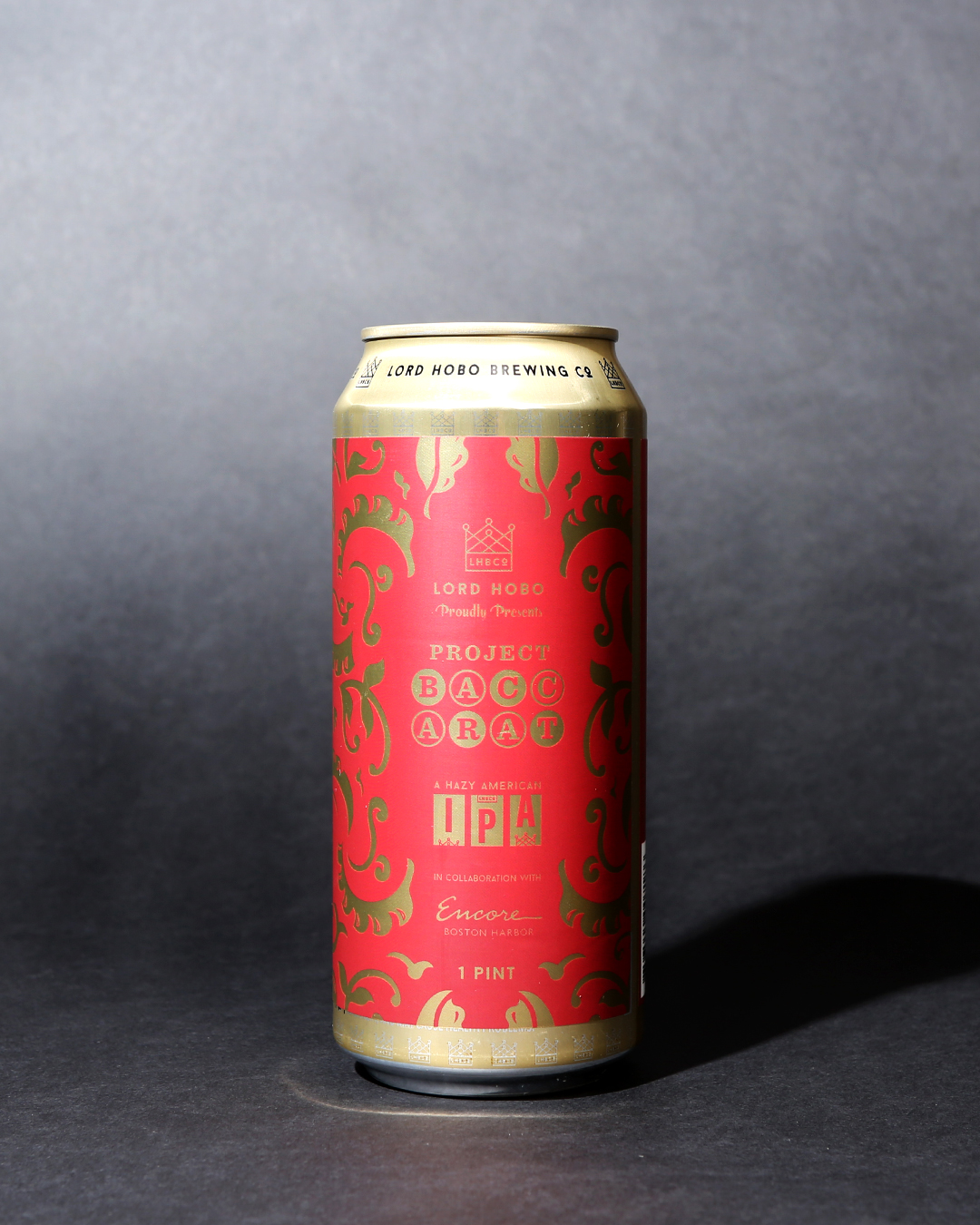
New England IPA– One of the classiest can designs we’ve come across is Project Baccarat, a beer brewed exclusively for Boston’s Encore Casino. Pittsburgh design agency Top Hat handled the branding and delivered a label with casino-worth touches included a slots element for the style and a backdrop inspired by Encore’s actual carpeting.
Compact Disc
Foam Brewers — Burlington, VT
Art by Clark Derbes
Pilsner– Like Hudson Valley, a Foam Brewers can design is a must-include for this article. We struggled to pick just one, but settled on the airy, light, and trippy art from Compact Disc, a crisp and clean pilsner.
Destroyed by Fire
Forest & Main Brewing Co. — Ambler, PA
Art by Daniel Endicott
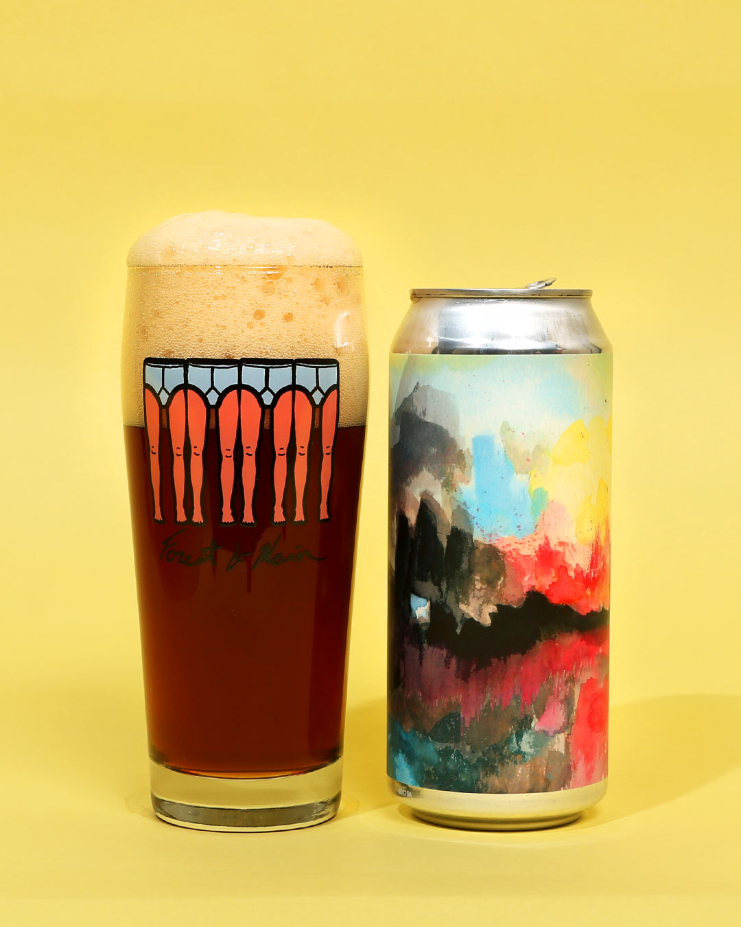
Barlyerwine– Daniel Endicott is easily one of the most inspiring artists in craft beer, and he happens to co-own one of the best breweries in the country. Forest & Main’s thoughtful, evocative, and just plain tasty beers are world-class and Endicott’s art works perfectly with each beer. Destroyed by Fire could’ve been its own piece of art, but it also managed to pair wonderfully with this delicious barleywine.
Dead Water
Brouwerij West + Magnify Brewing Co. — San Pedro, CA + Fairfield, NJ
Art and design by Mazatl and Taylor Springle
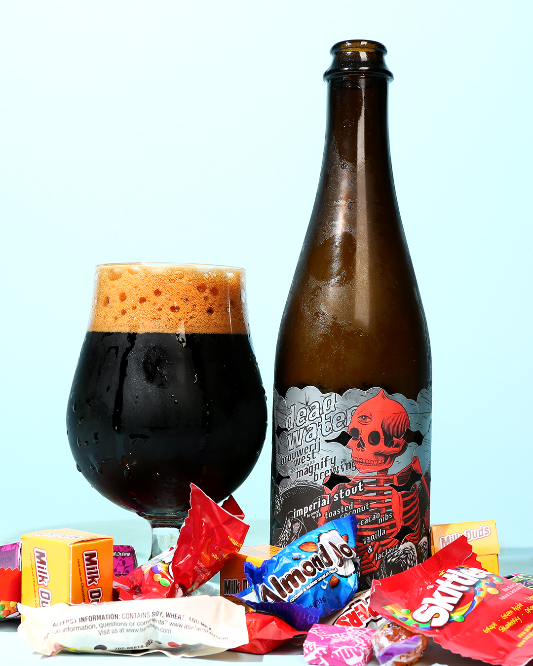
Pastry Stout– This was the pastry stout to rule all pastry stouts. A decadent and devilishly sweet beer from the ever-artful Brouwerij West that featured one of our favorite labels of the year. Incorporating the iconic Brouwerij West layered label, Dead Water was hardcore and stylish, plus the stickered design created a great texture on the bottle.
Anna Fantastic
Good Word Brewing & Public House — Duluth, GA
Art by Rachel Eleanor
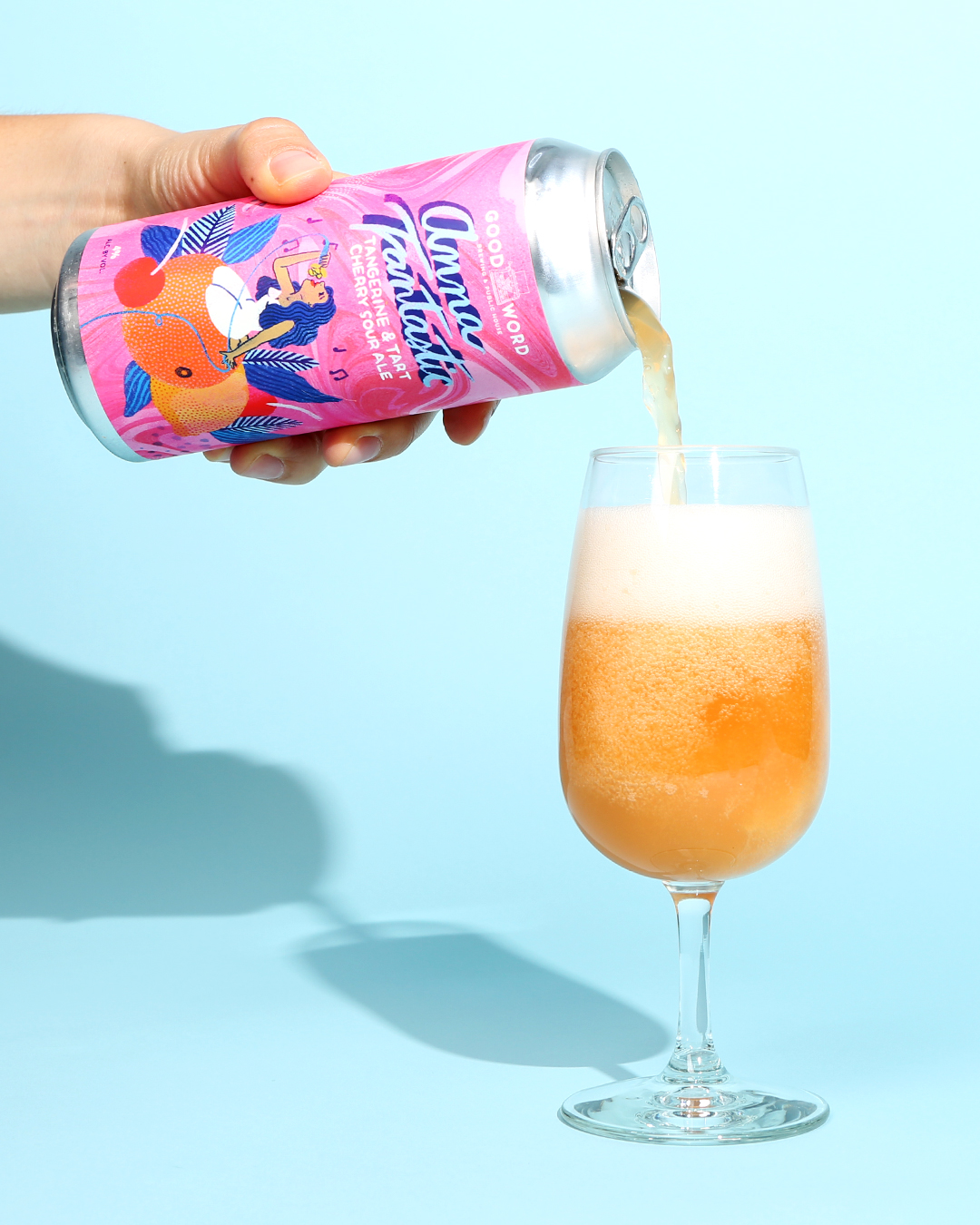
Berliner Weisse– Another label that perfectly matched the vibrant beer within, Anna Fantastic was beautifully illustrated by Atlanta artist Rachel Eleanor. Another of Eleanor’s designs was in the running for this list, but we went with Anna Fantastic because it paired so well with Good Word’s beer. Anna Fantastic is a tribute to Anna Garcia, one of Prince’s former lovers and the inspiration behind several of Prince’s songs.
Ultrasphere
Hudson Valley Brewery — Beacon, NY
Art by Evan M. Cohen
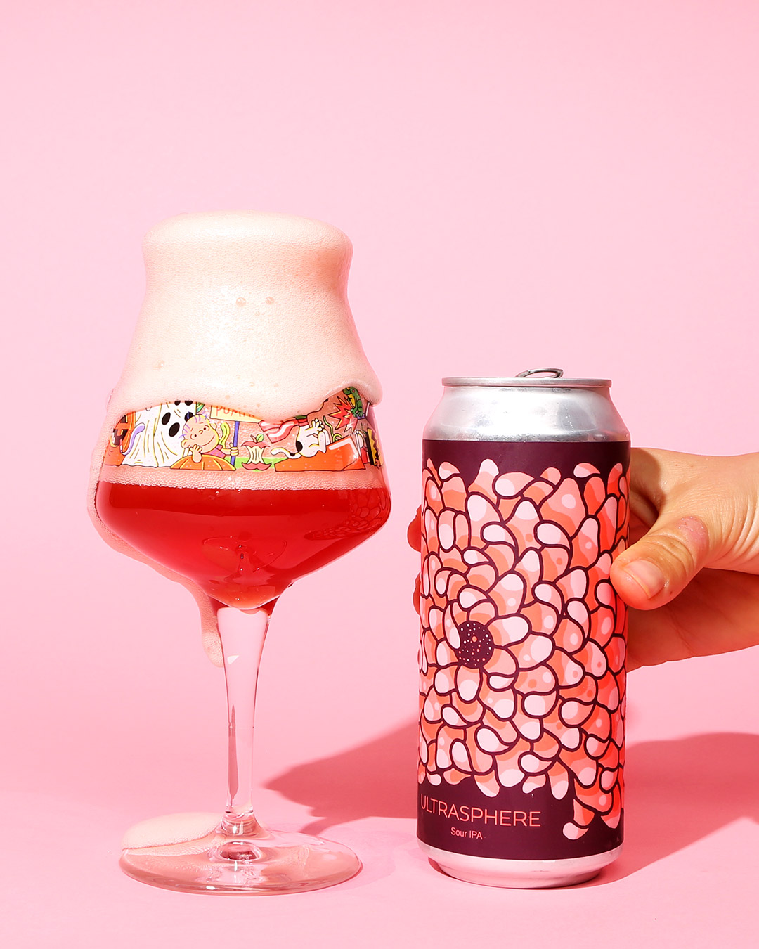
Sour IPA– Just about any of Hudson Valley’s labels could make this list but we were particularly enamored of this year’s edition of Ultrasphere. The beer was stunning and the label was gorgeous. Cohen continues to progress the Hudson Valley visual identity even on a pre-existing illustration. Ultrasphere is inviting and warm, a perfect label for this exceptional beer.
Nude Tayne
Sigma Brewing Co. — Houston, TX
Art by Nick Sorenson
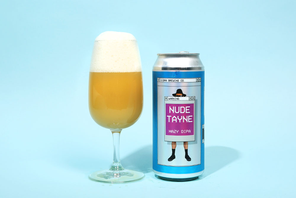
Double New England IPA– We’re suckers for a good obscure comedy reference. This beer from Texan hazy IPA darlings Sigma Brewing Co. was a tasty juice bomb but it was definitely the commitment to the Celery Man sketch that sold us on the label.
Thank You
Southern Prohibition Brewing — Hattiesburg, MS
Art by Matt Phelan
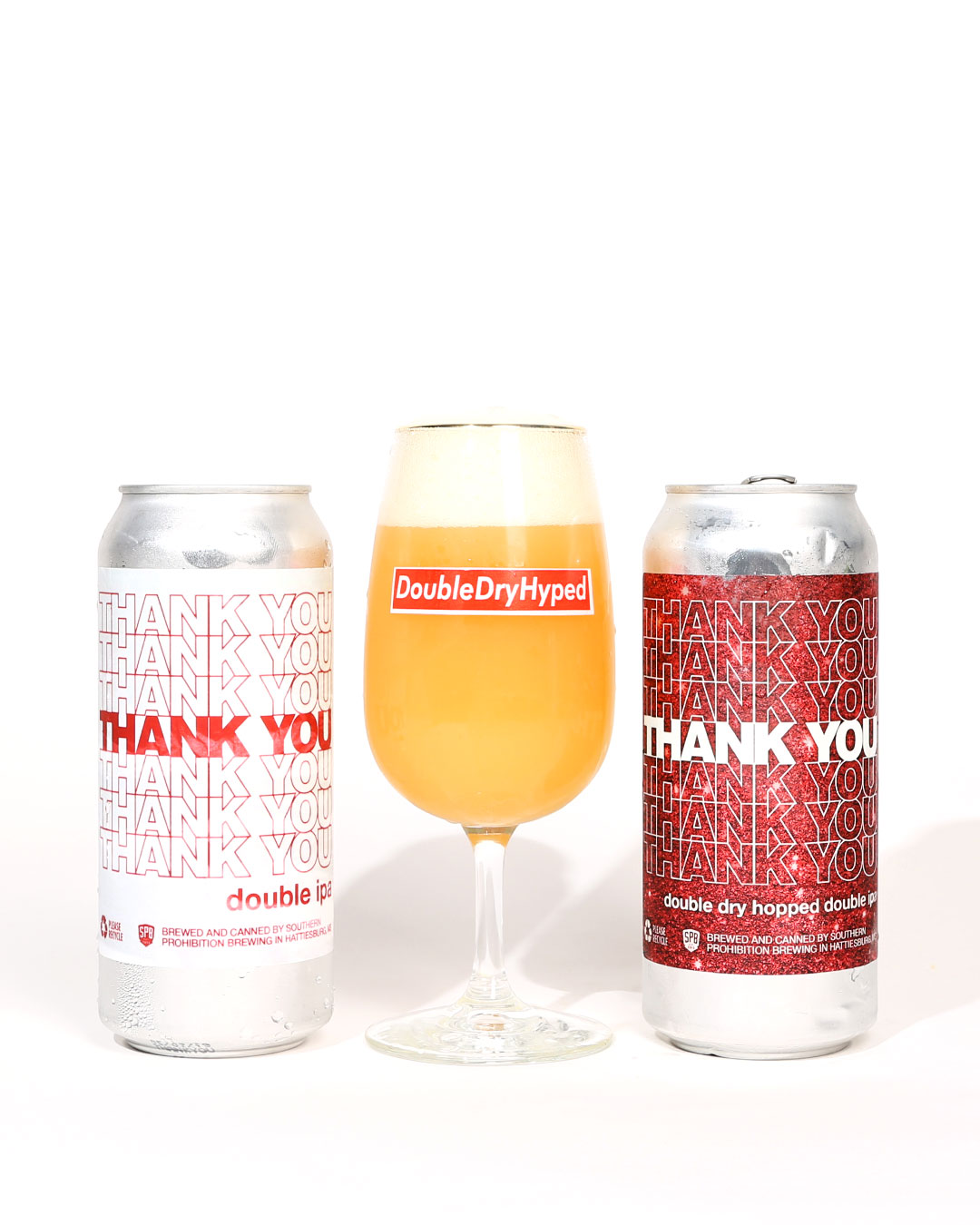
Double IPA– There’s just something so iconic about those “Thank You” plastic shopping bags. It’s no wonder that in the era of bootleg fashion, that repeating “thank you” design has taken off. One of the first examples was the kings of bootleg Chinatown Market, but we were excited to see a brewery take advantage as well. Sure it’s not the most artistic label, but it’s part of a current aesthetic trend that we just can’t ignore.
Liked this article? Sign up for our newsletter to get the best craft beer writing on the web delivered straight to your inbox.